Key Dates
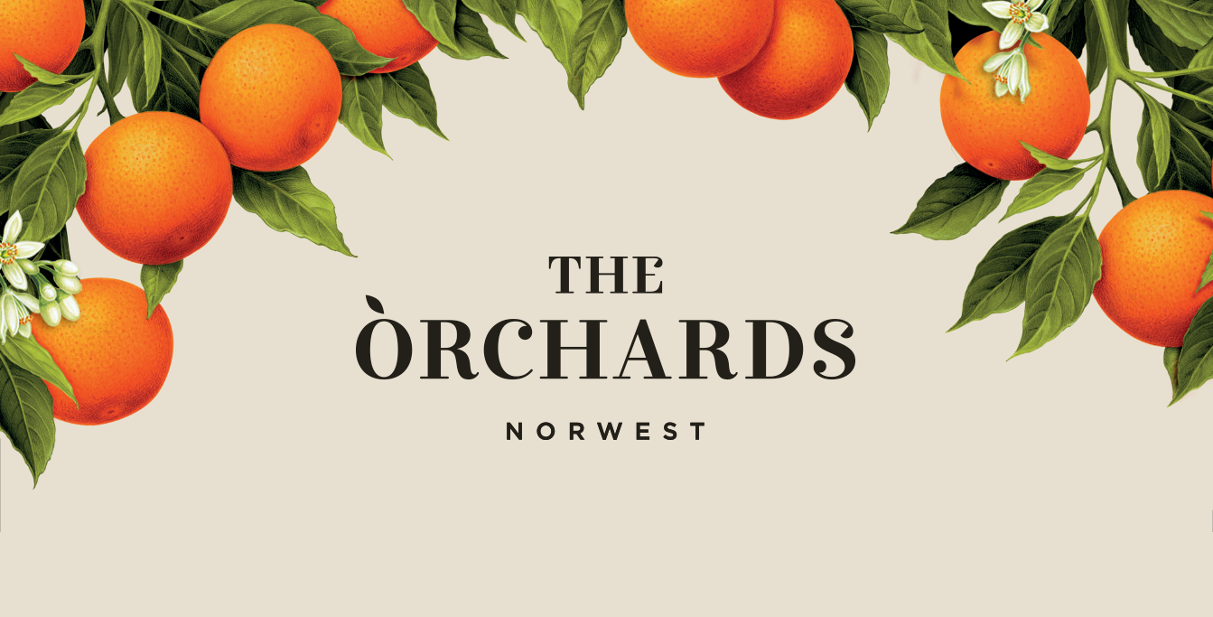
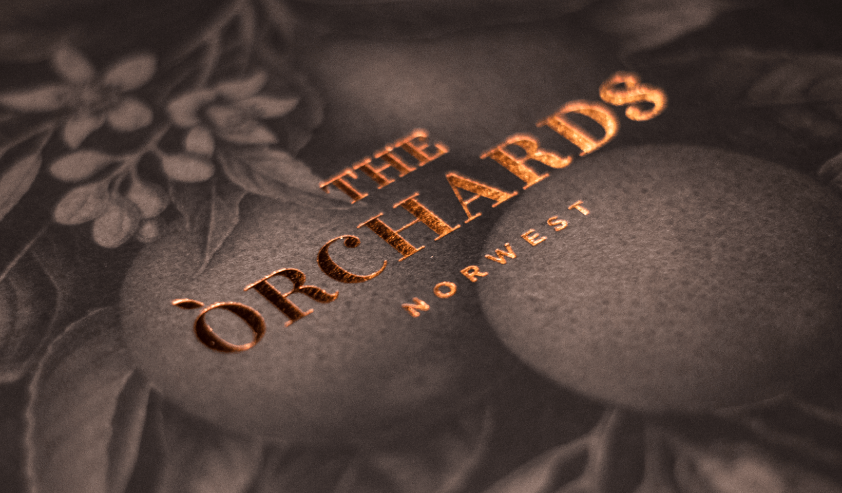
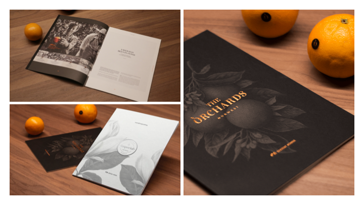
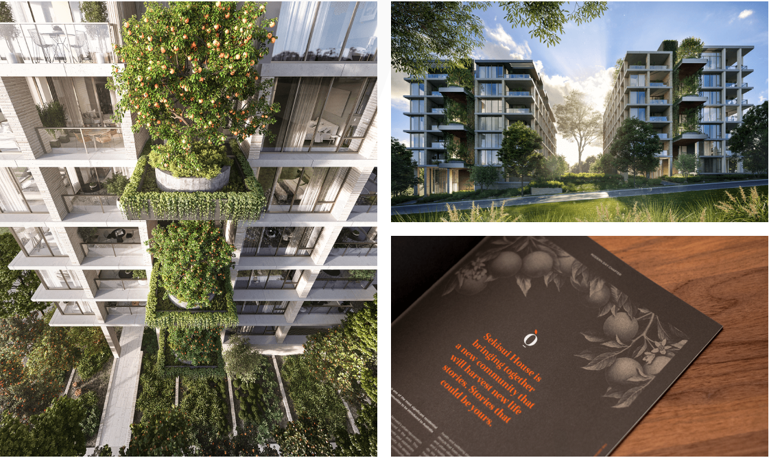
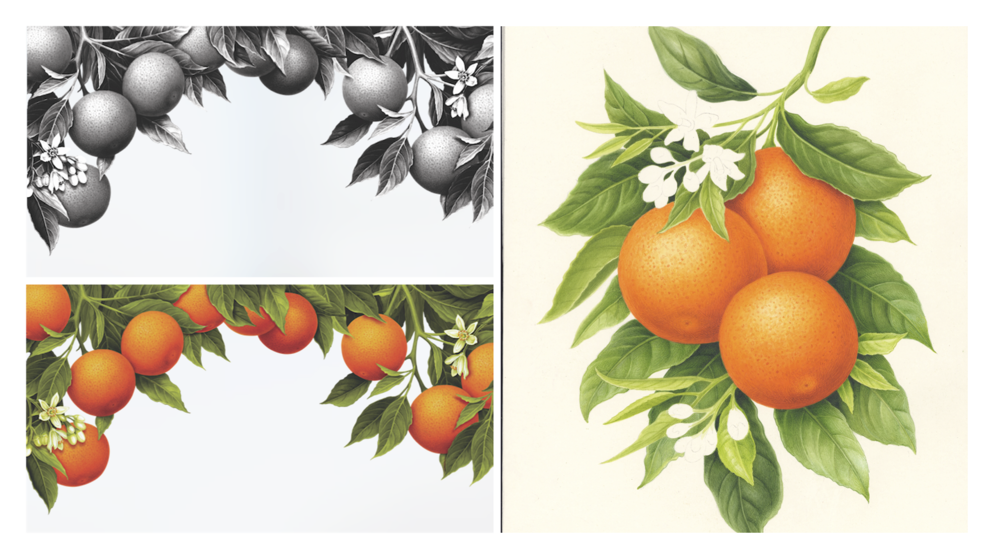
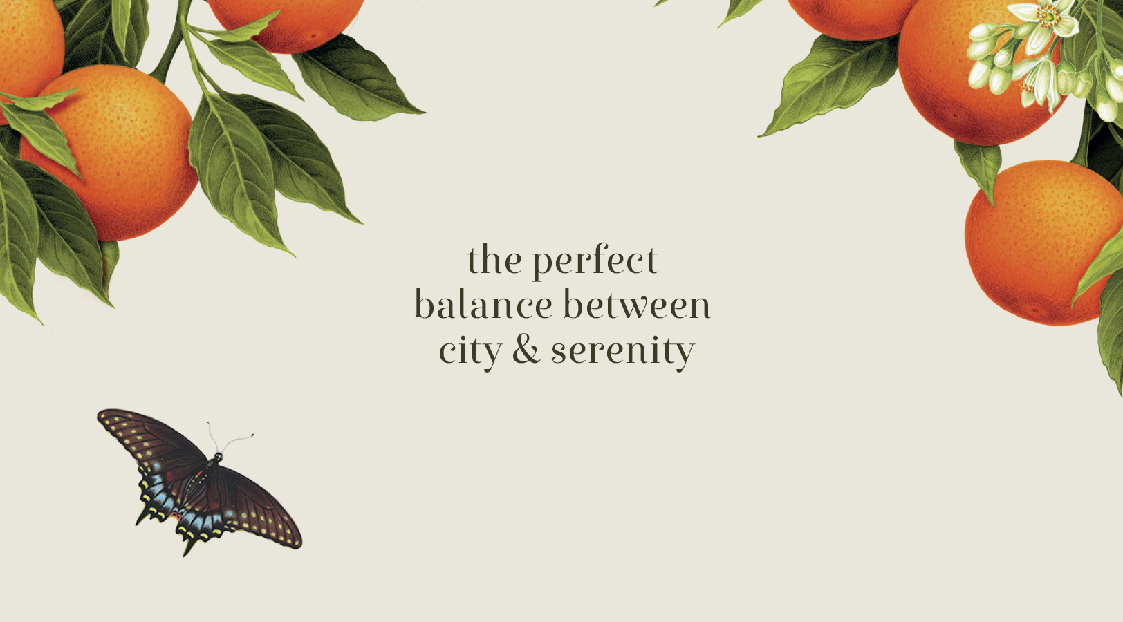
Image Credit :

Project Commissioner
Project Creator
Project Overview
The Orchards is one of the most significant residential master-planned communities to be introduced to Australia in over a decade. This luxury $1.4B residential project is positioned amid the urban renewal of the Norwest and located on what was NSW’s first orangery established in the early 1800’s. The development comprises 7 stages and 1,300 apartments across 8.8 hectares and heralds an exciting new benchmark for Sydney living.
Team
Project Brief
Toast Creative was commissioned by Sekisui House to capture the essence of The Orchards Masterplan with a brand logo mark and visual language. Toast needed to create a real and authentic brand that could masterfully convey a narrative of the site’s deep sense of history and agricultural prosperity.
The brand livery had to retell the site’s historical stories with a connection to the promise of bright futures for new residents while imparting the coming of a world-class residential experience in Sydney’s Norwest. It was to be part of a broader integrated brand marketing campaign that could entice with the prospect of growth and community, and tempt enquiry through design and technology.
Project Innovation/Need
Apart from a 3-month strategic overview which laid the foundation for Toast Creative’s final brand story, the team conducted other field research which touched on behavioural research, germination and sensory environments:
1. A team trip to Japan’s Sekisui House HQ in 2016 allowing the team to learn first-hand about the innovation and user-experience testing applied to all residential developments. We observed and participated in behavioural research to provide a deeper understanding of how and why people live like they do.
2. A day visit to a wholesale plant nursery to observe germination, seedlings and the beauty of plant growth. Used more as a rhetorical reference, the experience inspired ideas around planting the seeds of a new community.
3. A 6-month technical research phase was designed to understand sensory environments to enhance customer experience and to track the sales journey through video/motion and CRM integration.
After conducting this unique series of enquiry, Toast Creative evolved the brand idea of The Orchards, that would touch the project in far reaching ways.
The architectural Masterplan provided a genuine opportunity to reactivate the location’s story of agricultural prosperity and build a modern chapter around the narrative of ‘growth’. This then fed into every aspect of the brand’s articulation, to the point of informing the buildings’ conceptual framework. In this way the brand design influenced the product design, delivering a more powerful outcome to the market.
Design Challenge
Given the size and expanse of The Orchards development, which is new to the Norwest region, market and community challenges needed to be addressed -
Armed with a deep understanding of the market’s needs and awareness that the development faced local opposition, were both key to Toast Creative’s approach. The design and application of the brand mark and its visual language were carefully considered. This ensured consistency with the project vision to become a sustainable, inspired and connected community, infused with nature.
Other challenges included the launch of competitor developments in the area, and the site’s distance from Norwest’s central hub requiring the marketing messages around location to focus on privacy, space and connectivity of a different kind – one with nature.
Effectiveness
To achieve this Toast Creative realised a series of vivid botanical illustrations. These crafted images reflected the disciplined design of the architectural masterplan, while introducing a rich heritage accent.
An ornate, serif typeface was selected to represent the boutique attention to detail which is apparent throughout the masterplan. This typeface beautifully complemented the illustrations, and together they formed a flourishing visual language.
These elements then supported carefully crafted messaging, inspiring the user at every touchpoint, ultimately confirming The Orchards as a ‘place to grow’.
Graphic Design - Illustration and Type
This award celebrates creativity and innovation in the traditional or digital visual representation of ideas and messages. Consideration given to clarity of communication and the matching information style to audience.
More Details