


Image Credit : Frank WANG
Project Overview
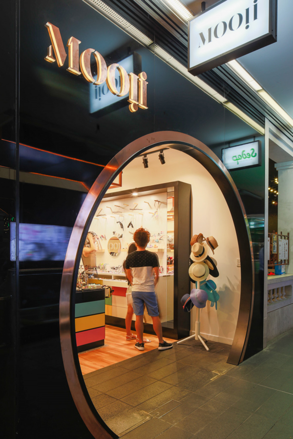
Mooii is a retail store selling various kinds of fashion accessories, jewellery and gifts inside a shopping mall. According to the brand’s inclusiveness. The theme of interior design targets on ‘colour’, and the “Moon” shaped entrance door is designed to lure customers’ curiosity.
Organisation
Team
TONY GUO-DESIGN DIRECTOR
BOWEN TAN-PROJECT MANAGER
JACK ZHU- INTERIOR DESIGNER
CLOVIA CAI- INTERIOR DESIGNER
Project Brief
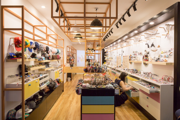
To reduce the visual obstacle, we intend to make the open plan in the small site. Exhibition shelves in different sizes are placed in the middle area to not only maximise the use of the space but also give the space a rhythm of movement and stability.
Considering the variety of products displayed in the narrow space, we use the light grey floor tile carved into timber floor to unified the tone of the retail. At the end of the area, a multimedia projector project the video to a full height white wall. The projection is arranged to enhance the brands and give the customers more pleasant shopping experience, and also it is a method for the advertising to let the clients know more about the brand story.
Project Innovation/Need
We regard this small site as an exhibition area; each accessory should have the appropriate way to display in front of the client. The lighting, shelving layout, circulation all these elements have to be designed carefully in this small space to make sure all the elements can cooperate very well. Track lights installed along the two side of shelves with a 45-degree angle to distinguish the spaces. Lively colour is applied to the customised joinery to give a contrast of the timber frame and flooring. By following the meaning of brand “mooii”, the moon shape entrance and background logo were designed to match with the theme.
Design Challenge
To fulfil the keywords “colour” as the main design strategy for this shop, the actual colour configuration on joinery is the challenge. Five bright colours were chosen to give a lively atmosphere in the space along with appropriate light and contrast with timber frame decoration.
Sustainability
Energy-saving LED lights with the dimmer are used in the retail to reduce the power waste in the shop. Recycled timber panels are used as the decoration board which cladding on the wall.
Interior Design - Retail
This award celebrates innovative and creative building interiors, with consideration given to space creation and planning, furnishings, finishes and aesthetic presentation. Consideration given to space allocation, traffic flow, building services, lighting, fixtures, flooring, colours, furnishings and surface finishes.
More Details