
[interview] the project story


Project Overview
The Audience Agency is a Sydney based communication assembly, dedicated to promoting premium brands and emerging talent through sophisticated, influential PR strategy.
Lead by PR mogul, Montarna Mcdonald, the company exists to reinvent traditional PR, believing there is such a thing as bad press! They take a bold, multi faceted approach to creating high quality content and messaging, utilising both traditional and digital communication platforms for hard-hitting results.
The Audience Agency speak for the people to the people.
Project Commissioner
Project Creator
Team
Cord & Berg are a specialised branding agency, enabling business leaders to regularly adapt their brand’s strategy with confidence and ease.
Using an advanced 5 step process, targeted at company growth, Cord & Berg create bold, innovative brands- equipping clients with the design tools and collateral they need to ensure customers are actively interacting, engaging and loyal to their brand.
Project Brief
The Audience Agency already had a savvy, forward thinking team and required a bold, socially relevant look, feel and philosophy to support them in shaking up, and winning clients in a stagnant, over saturated industry on launch.
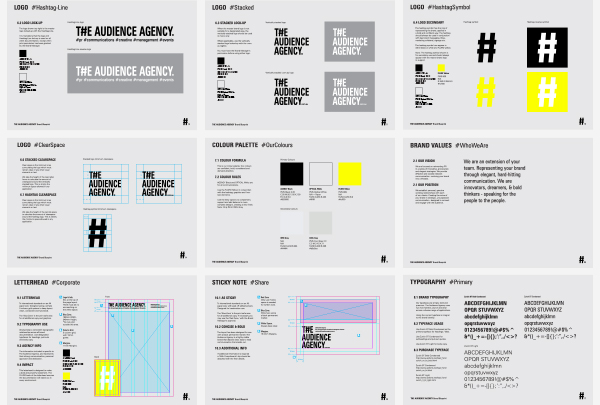
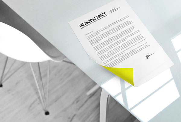
They needed a brand bible and essential kit of brand collateral - each element to be powerful and bold on its own, yet complimentary to the brand as a whole.
The launch of the company was to be swift and savvy. To achieve this, the brand needed to look fresh, organised and confident, for maximum impact, and to launch into the industry with the longevity to stay there.
Project Innovation/Need
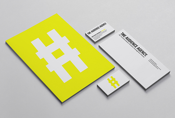
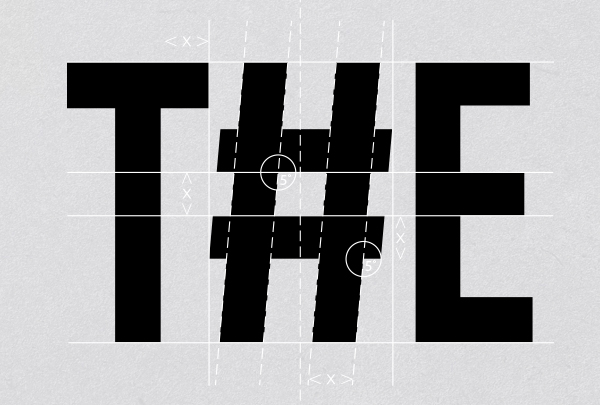
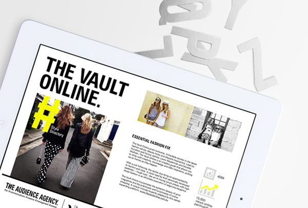
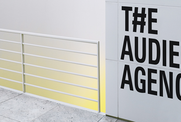
To create a brand identity representative of The Audience Agency's unique service (a new way of approaching PR), we took a well known symbol (the hashtag) and crafted it into a unique shape, complimented by bold, established letter forms to represent the 'new' digital era of PR and strategy, that clients would come to know as The Audience Agency method.
Teaming this with the fluro yellow again sets the brand apart from Sydney competitors. Yellow was chosen for it's happy, innovative properties, that when teamed with the hard hitting font and hand crafted hashtag symbol used in the main logo represent a well rounded, approachable, yet professional brand.
The hashtags used in the tagline, let people know exactly who The Audience Agency are and what they do. Representative of the transparent and efficient manner in which they work.
Design Challenge
The challenge was in creating a brand that could be seen as fresh, new and disruptive, with a look that felt established and trust worthy to attract large, premium clients straight away.
The Sydney PR market is highly saturated and clients tend to stay loyal to their existing PR agencies for life. We needed to create a lifestyle around the brand that people were drawn to and HAD to be a part of.
Making bold, elegant design choices with just the right amount of sophistication and luxury, picking the fluro yellow (despite the additional budget for printing and translating this throughout the collateral), and teaming this with concise, straight forward language created a highly visible, powerful statement that forced people to pay attention.
Effectiveness
The Audience Agency launched with the impact they had hoped for, receiving multiple enquiries immediately after launching the look and feel of the brand across social media and a physical send out, that included the main logo, a touch of fluro.
People then started to send on different pieces of fluro furniture, clothing, footwear, signs, ANYTHING using fluro yellow was immediately associated with the stand out brand. Since launch, The Audience Agency has rapidly expanded, taking on high-end clients and growing their core team.
Founder Montarna McDonald gave this statement when interviewed about her immediate success recently, "One of the best moves for my business was the decision to work with a branding expert to develop The Audience Agency ethos ahead of launch. We devoted months to crafting the brand and its creative, which meant I could launch a professional agency that has a unique voice in the industry."
While the 'months' part was a fib, we did work long hours to pull together a bold, long lasting brand, representative of the company's present and future goals.
Graphic Design - Identity and Branding
This award celebrates creative and innovative design in the traditional or digital visual representation of ideas and messages. Consideration given to clarity of communication and the matching information style to audience.
More Details