


Image Credit : Rowan Turner

Project Overview
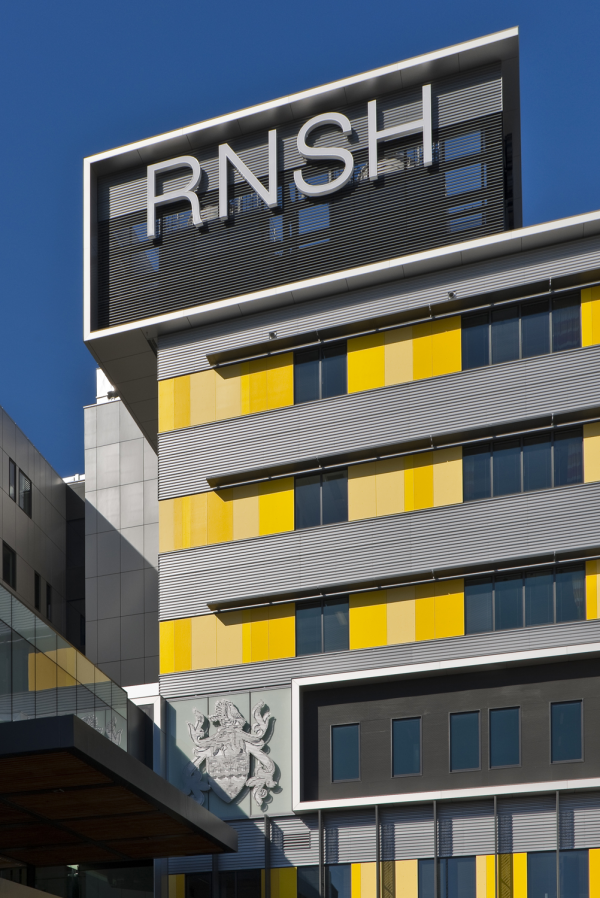
The Royal North Shore Hospital is one of Sydney's oldest research, healing, trauma and teaching hospitals. The year 2009 marked the beginning of a huge redevelopment, a unique combination of private and public funding brought together under one consortium. BVN Donovan Hill architects designed the Acute Services Building, winning the bid with a design that used three colours. One building was going to replace the disjointed departmental campus scattered about in old buildings.
Visitors, patients and staff were excited about this new facility but at the same time, apprehensive about its massive scale and size. The old and established circulation pathways to wards or departments were going to change dramatically.
This was an enormous change for the campus and an enormous three year wayfinding challenge for us.
Project Commissioner
Project Creator
Team
Creative Director : Anne Gordon
Design Director : Tim Walker
Senior Designer : Coco Reynolds
Senior Designer : Juanita Franzi
Junior designer : Cherie Mable
Junior designer : Jessica Owen
Project Brief
As wayfinding consultants our brief was to resolve how to constitute the building’s most important visual asset into a comprehensive and simple wayfinding strategy and give warm ambience through environmental graphics that would compliment the interior design.
The architect's vision was that the colours cladding the outside wings of the building would be embraced internally to identify the lift cores, but it needed specialist wayfinding thinking, so Anne Gordon Design was asked to use the basis of their colour scheme to solve and create a wayfinding strategy for the Acute Services Building.
As such, a comprehensive suite of signage was designed to help staff, patients and visitors from the moment they entered the campus on a journey which may have taken some all the way through to finding bed numbers. The experience for the visitor had to be as seamless as possible, given the nature of the visit and so many people arriving at the new building would be first time visitors. We had to make sure that visitors were kept comfortable in their spatial environment, they were easily and naturally oriented and logically informed to use the coloured lift cores to best find their destination.
Project Innovation/Need
Given the acute services are combined into a building with one main entrance, the legibility of the coloured lift cores were central to the wayfinding strategy. The innovation was truly the use of colour as a wayfinding tool to correspond with vertical circulation rather than the usual solution which would have been to colour code levels within a multi-storey building.
The solution led to the translation of the external colours to each lift core, using the lobby ceiling ‘tongues’ which protruded the internal corridor spaces, for that extra punch and connection to a colour that was not only to assist users in finding their way, but help them remember their steps for the return journey. We ensured that we had the right balance of contrast for maximum legibility for the messages on the signs, without losing the purposefulness of the colour strategy.
The clarity and directness of the wayfinding system is enhanced and enlivened by the use of colour. Having a coherent visual strategy is essential to avoid confusing vulnerable and easily disoriented patients. In addition a well balanced and attractive environment is of major importance to patients’ health and well being and to staff and user enjoyment.
Design Challenge
Health care facilities offer their own specific challenges - they are very fluid environments with the propensity to change department and office locations when specific demand or space allocation shifts. The most pressing challenge for us was making sure that the client, the final owner of the signage, would have the flexibility built into the design to adapt to any of these changes. Without that flexibility, we knew that signage messages would not reflect change and the ugliest of temporary solutions would result - the staff do-it-yourself sign!
Our solution to this challenge was to specify cost effective production methods using modules rather than a traditional slat-based system which would not have offered the visual cohesion or impact required. Our solution also offered a much higher level of vandal resistance and if damaged, replacement was simple.
Sustainability
Sustainability in wayfinding is ensuring and reinforcing that all materials specified are as long lasting as possible. We chose materials which incorporated the capacity to be up-cycled either back to raw material, for example aluminium, or be re-used as the same component in another sign if and when its message needs to be updated and it can be reprinted.
Ultimately the result of good wayfinding is minimal signage which of course means less energy used to manufacture, a modular 'kit-of-parts' design solution and maximum damage resistance for sustainable results.
Wayfinding
This award celebrates creative and innovative design in the ways people orient themselves in physical space, and navigate from place to place. Consideration given to signage and other graphic communication, clues in the building's spatial grammar, logical space planning, audible communication, tactile elements and provision for special-needs users.
More Details