


Project Overview
Hudsons Coffee had a problem. A new owner recognised massive potential in the business but customers were less than enthusiastic. Hoyne went straight to the source – coffee drinkers themselves – to discover what would make Hudsons a brand worthy of international expansion.
Hudsons had grown from a flagship store on Elizabeth Street in 1998 to a national coffee store network. The new owner, Emirates Leisure Retail, planned to grow the store base from 50 to 250, ready for international expansion. To achieve this, repositioning and re-branding was required. For the past decade customer response to Hudsons had slipped substantially. Hoyne commissioned research to pinpoint why.
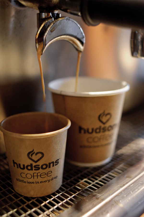
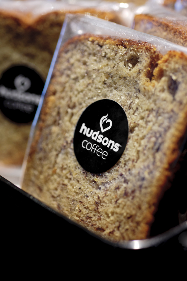
The re-brand embraces the spirit of independent cafés, moving away from pedestrian aesthetics associated with chains. A new mindset around quality and perfection is expressed in the strap line: ‘A little love in every drop’.
Prior to this project, customer approval ratings for Hudsons Coffee outlets was alarmingly low. Research post-launch of the new trial store showed a lift in approval rating to a staggering 98 percent. Store size and location remained the same, so the only contributing factor to the improved result was the re-branding and new store design.
Project Commissioner
Project Creator
Team
Creative Direction: Dan Johnson
Design: Anthony Teoh, Huey Lau, Domenic Minieri
Typography: Anthony Teoh
Finished Art: Jamie Grima
Copywriting: Dan Johnson
Project Brief
When Emirates Leisure Retail acquired the Hudsons business the plan was to grow the store base from 50 to 250 and prepare for international expansion. This was impossible as long as the Australian franchise remained as lacklustre and generic as it had been. A fundamental repositioning and re-branding was required. Success depended on a clear understanding of the habits and preference of coffee drinkers.
Hoyne’s work began with a research study to develop a more nuanced understanding of consumer buying and consumption behaviour and attitudes.
We found consumers generally frequented at least two coffee shops to fulfil different needs. One was their weekday or work day spot where they simply ‘picked up a coffee’ as part of a busy day. The second was where they indulge in ‘coffee moments’ – relaxation and socialising – mostly on weekends.
We felt Hudsons could cater to both markets and positioned the brand to have the heart of a local coffee shop but the convenience of a chain.
Project Need
A new mindset around quality and perfection is expressed in the strap line: ‘A little love in every drop’.
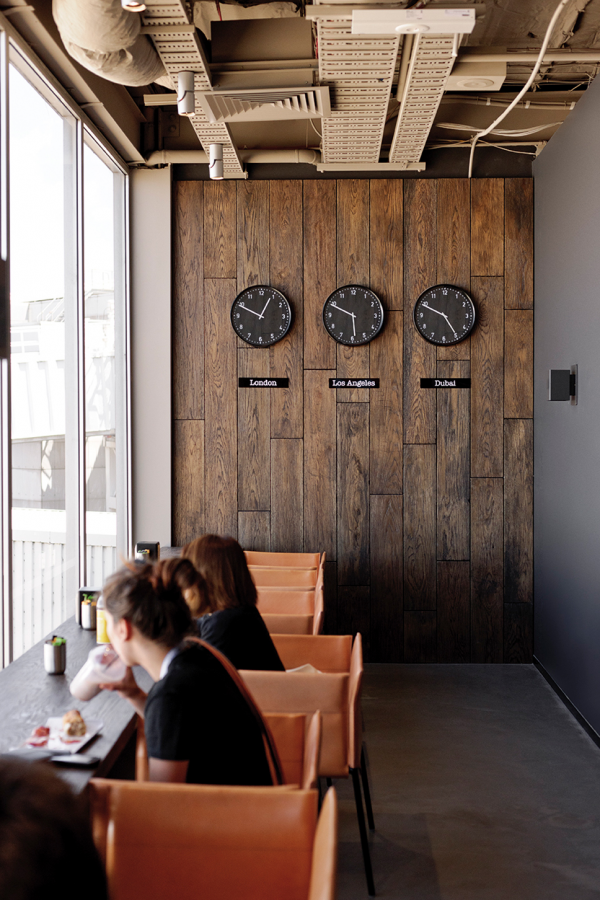
A finely crafted new look incorporates handwriting, soft ambient lighting, hand-painted graphic panels and a natural material palette. Store designs reflect an ‘industrial rustic’ aesthetic.
The rebrand of Hudsons Coffee’s pilot store has proved hugely successful. Hudsons Coffee’s new trial store experienced double digit growth following Hoyne’s rebrand. The store has sustained this exponential increase in sales, even after established franchises such as Hungry Jack’s have started trading nearby.
The new brand’s pilot store can be seen at Melbourne Airport’s international terminal.
Design Challenge
Part of the challenge with Hudsons was to create a brand that had the warmth of a local coffee shop but was translatable nationally and, potentially, internationally.
The expression of the brand, in packing and in store design, had to express warmth, comfort and familiarity but be capable of national roll-out and use by various franchisees.
Our finely crafted new look, incorporating handwriting, soft ambient lighting, hand-painted graphic panels and a natural material palette, were manipulated to suit large scale application.
Sustainability
Only local suppliers were sourced. Renewable and sustainable materials were specified where possible to keep material usage, wastage and carbon footprint to a minimum.
Graphic Design - Identity and Branding
This award recognises traditional or digital visual representation of ideas and messages. Consideration given to clarity of communication and the matching information style to audience.
More Details