


Image Credit : Photography by:
Hobo and ProductPhotography.com.au
Advertorial by:
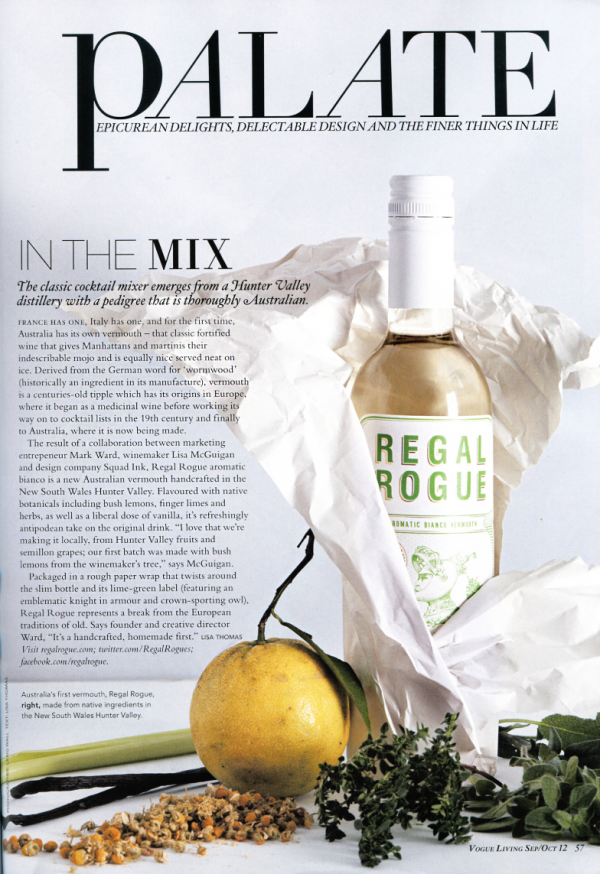
Vogue Living Australia

Project Overview
Regal Rogue is the first native Australian aromatic vermouth in the market – and a damn fine drop!
Squad Ink was brought into the mix to create the brand identity, packaging and launch material for this innovative small batch vermouth.
Vermouth is mostly a European tradition. Regal Rogue turns this upside down with a daring blend of native aromatics to flavour fortified Hunter Valley Semillon with bush lemons, finger limes, vanilla and thyme: a new world vermouth that is thoroughly Australian.
The Regal Rogue brand has received an amazing response, rejuvenating a dusty alcohol category with a fresh and innovative approach. From the beautifully illustrated bottle to the cleverly crafted launch material, the brand takes shape around a charismatic knight and his devoted owl companion. We’ve created a new and exciting story with a classic tone to introduce an innovative product to the Australian market.
Project Commissioner
Project Creator
Team
Creative director: Matthew Squadrito
Creative director: Terry Squadrito
In collaboration with Mark Ward (Bureau Six), winemaker Lisa McGuigan and Gilles Merry (Yakusan).
Project Brief
FACT: Vermouth is the most overlooked and misunderstood drink around.
Our job: To make vermouth cool again while creating an attractive package for this brilliant drop of fortified aromatic wine at the same time as educating and exciting the consumer.
We needed to take into account the way established European brands like Cinzano and Martini dominate the market and how Regal Rogue should introduce itself into the vermouth category as the ‘new kid on the block’.
We knew the handcrafted nature of this small batch vermouth was a key selling point, and more than that: its unique flavour. How can we let the world know just how good this drink is and how do we bring to light the story of the first native Australian vermouth?
Project Innovation / Need
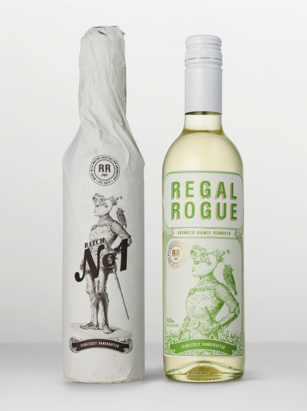
For a product from down under, we wanted to flip around old conceptions to be current and progressive. Firstly, we have changed the shape and size of the traditional vermouth bottle, by reducing it from a 750ml to a 500ml bottle. Vermouth is often the sad half-empty heavy bottle collecting dust at the back of your liquor cabinet. Mistake number one: a wine-based product like vermouth actually goes bad after two weeks. The smaller and slimmer bottle not only minimises wastage but also compliments the light and fresh flavour palette of Regal Rogue.
Our research of wine packaging and transportation led us to create a further point of difference. If wine is wrapped, it’s usually wrapped in unbranded tissue paper for protection. We’ve evolved this concept, designing our own custom wrap, which has become an integral part of the brand. The use of heavier, uncoated 100% recycled paper gave a coarser, handcrafted appearance. It also gave us the opportunity to extend the label graphics and highlight the first run as ‘Batch One’ – again playing to the handcrafted nature of Regal Rogue and letting the consumer know: this is a unique product.
Design Challenge
The Challenge: Broaden the consumer demographic by tapping into a younger market and rejuvenate a tired alcohol category. Make vermouth cool again, but also align the brand with the age-old craft of vermouth-making.
We adopted a traditional etching style to give a ‘new’ brand a sense of history and credibility.
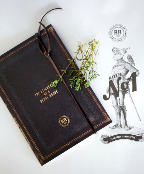
The ‘Regal’-themed illustrations were the start of a greater story – of a rogue knight and his roguish ways – that provided the opening to develop it further through supporting material. We created the tag line – ‘Fearlessly Handcrafted’ – to capture the bold and adventurous spirit of the brand and wittingly and purposefully play on the handcrafted nature of this small batch vermouth.
Regal Rogue is the ‘rogue of the vermouth category’ because it challenges traditional European vermouths: through its uniquely fresh flavour palette and the fact that it’s made from native Australian organics and Hunter Valley Semillon.
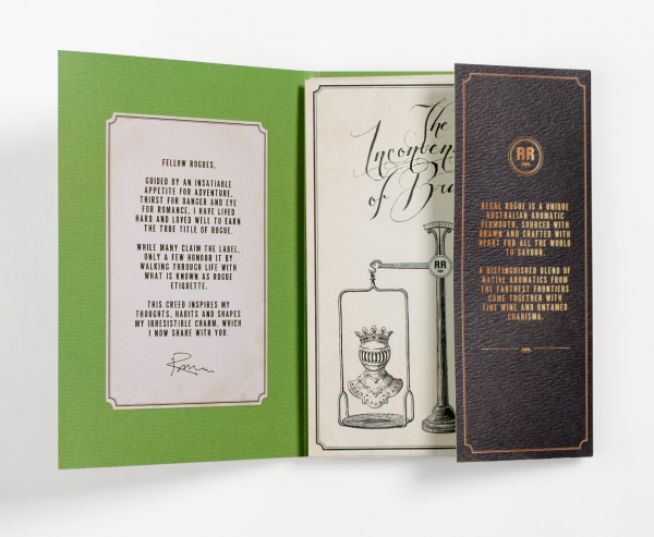
Positioning Regal Rogue as the ‘rogue vermouth’ is at the core of our strategy to engage the youth market. To further develop this theme, we created launch material comprising a series of witty rogue etiquette tips and serving suggestion cards, which we packaged as ‘The Etiquette of a Regal Rogue’. Humour and charm are at the core of our strategy with rogue insights such as ‘There are two things I cherish most in life: a woman’s love and a glass of Regal Rogue. Fortunately, the two get along famously and together we make the perfect ménage à trois’.
Sustainability
Regal Rogue packaging is environmentally sustainable, from its downsized glass bottle to its paper wrap, printed on 100% recycled carbon-neutral stock. This conveniently lends itself to the key message of its handcrafted style which is an integral part of the brand story, and something that fits perfectly with today’s commitment to sustainability: handmade not mass-produced; small not gigantic; and natural not artificial.
Graphic Design - Identity and Branding
This award recognises traditional or digital visual representation of ideas and messages. Consideration given to clarity of communication and the matching information style to audience.
More Details