


Project Overview
Andrew Sweeney’s backpacking holiday took a life-changing turn when he visited Cambodia. Andrew was shocked to see young children living without adequate shelter, healthcare and educational basics. These smiling children could have a much brighter future with donations of just a few dollars.
On his return to Ireland, Andrew created SCOOP (Supporting Children Out of Poverty) and began fundraising for diverse programs such as schools, healthcare, equipment and infrastructure. Since then, the dedication of passionate volunteers has seen SCOOP grow in reach and diversity, and it is set to launch into the Australian market.
Brand by Name was engaged to help capture attention of this launch with a new brand look and feel.
Project Commissioner
Project Creator
Team
SCOOP – Andrew Sweeney & Lisa Rennie
Brand by Name – Fiona Brand
Project Brief
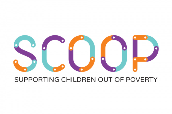
SCOOP’s original logo was designed quickly in order to ‘get something up on the website’. The logo lacked visual clues to the organisation’s raison d'être, lacked instant recognition, and the mission statement wasn’t well integrated with the logo mark.
It was important that the new identity contained a visual element relating to children, without being overtly childish.
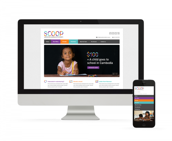
Crucial to the launch of SCOOP in the Australian market was to convey a professional outlook to potential corporate sponsors and supporters, and attract the attention of new volunteers and participants at fundraising events.
Project Innovation/Need
We worked closely with the Irish and Australian leadership to ensure the brand identity fulfilled both team’s needs. And we were sensitive to cultural differences in both supporter and recipient countries.
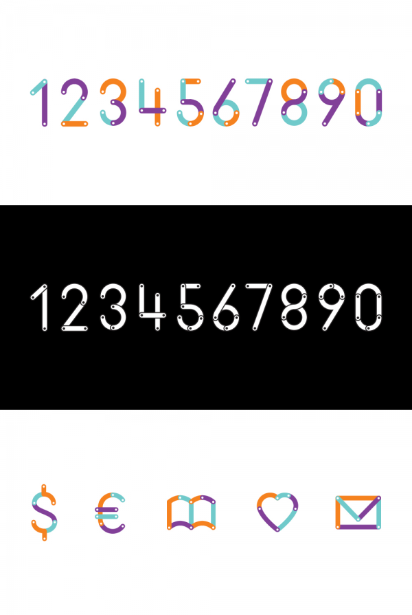
SCOOP’s vision statement features altruism, innovation, technology and education. Using these key values as our starting point, we designed letterforms to reflect these elements, symbolically connecting up the pieces that must come together to bring about change for children in need.
The pieces also represent the aligning of all the different groups of people – teachers, volunteers, campaigners and fundraisers who make SCOOP’s achievements possible.
Reminiscent of childhood toys, the final brand features a non-primary bright colour palette and an element of fun and gameplay. It reflects the importance of children in SCOOP’s work.
Design Challenge
A specific design challenge we identified initially was found in the brand name.
A convenient acronym, it nonetheless makes sense only when placed alongside the mission statement/tagline. Without it, the brand could be mistaken for an ice cream brand, a kitchen utensil or something related to journalism.
As with many charities, available money is spread thinly. Resourcing future design work would predominantly fall on the shoulders of ad-hoc design students, in house staff and non design-savvy volunteers.
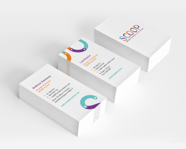
Therefore it was critical that the identity be simple to apply, flexible enough to be used across multiple mediums, whilst allowing freedom for creative interpretations.
Effectiveness
The client is thrilled with the new identity, and it is currently being rolled out and implemented across the organisation in Ireland and Australia.
When presented with the logo, the SCOOP leadership team were very positive. They ‘got’ the concept, liked the contemporary look and could see how the new logo gave them more flexibility.
It also answers the question ‘Why are you called SCOOP?’ by integrating the acronym with the logo mark itself. It is Andrew’s hope that as awareness of SCOOP grows, he will have to answer the questions less frequently, and believes the new logo is helping clarify the rationale behind the name in the minds of consumers.
Graphic Design - Identity and Branding
This award celebrates creative and innovative design in the traditional or digital visual representation of ideas and messages. Consideration given to clarity of communication and the matching information style to audience.
More Details