


Project Overview
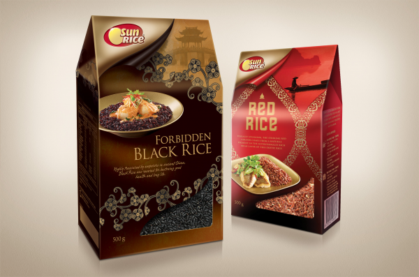
The Gourmet Range is a suite of exotic, premium, gourmet rice varieties ideally suited to entertaining at home, such as SunRice wanted something that would position this range at the top end of supermarket rices.
Project Commissioner
Project Creator
Team
Creative Director - Mark Haygarth
Production Manager - Fiona Smith
Project Director - Gwen Blake
Project Brief
The challenge to Boxer & Co. was to create a new and unique packaging look for the innovative gourmet range. Variants include Forbidden Black Rice, Red Rice, Koshihikari Sushi Rice, a Mountain Rice blend and Sticky Rice, which is suited to desserts. It was important to portray the premium vision of the new range, whilst leveraging the trust and loyalty that the SunRice brand has gained during its 63 years.
Project Need
The design solution is a series of 5 entirely unique packs, each with their own personality and an entirely individually considered approach. The range is united through form, window shape and logo execution, which form an element of shelf-blocking and brand punch amidst the uniqueness of each pack. The SunRice logo is used to endorse and add credibility to the offering, using SunRice’s new ‘reveal’ device which is present on each range within the SunRice portfolio.
Design Challenge
This Gourmet range was a new foray for SunRice. Boxer & co. the agency’s design solution for this range allows consumers to quickly and easily understand each product. Origins and usage are articulated through typography, imagery and graphics, which transport the viewer to exotic destinations. Boutique and premium design techniques were used to underlay the quality of the offering.
Sustainability
The elongated gable-top board box enhances the premium offering, is streamline and tessellates well for efficient transportation. An inner film provides an airtight storage solution, while the outer, recyclable cardboard container provides structure, a sizeable canvas for graphics, and creates a suitable, easy to close pantry-ready storage container. A cut-out on the box creates a window to the sealed product to aid consumer confidence and comprehension of the rice varietal.
Graphic Design - Three Dimensional
This award celebrates creative and innovative design in traditional or digital visual representation of ideas and messages used in packaging. Consideration given to:
- clarity of communication and the matching information style to audience;
- the approach, including marketing and branding concerns, the dynamics of the retail environment, environmental considerations, and legal requirements;
- the component parts of packaging graphics such as colour rationalisation, information layout, feel and tone of illustration and photography, and finishes, and how they are used in isolation and in relation to each other; and
- the relationship to the anatomy of the structural design.
More Details