


Image Credit : © Mucca Design, 2019

Project Overview
How do you beat well-established national brands with zero advertising and marketing budget? Mucca repositioned this independent regional market's private label by challenging dated notions about product display.
With select products leading sales within their category, the project is a prime example of how smart design can add measurable value to a company’s bottom line.
Project Commissioner
Project Creator

Team
Matteo Bologna, Creative Director, Designer
Maria Silva, Art Director
Andrea Brown, Art Director
Chris Caldwell, Designer
Maya Stepien, Illustrator
Rachel Eleanor, Illustrator
Stephanie Serpick, Production Artist
Project Brief
Fairway is an iconic New York City retailer known for its vast selection and hard-to-find goods. Mucca was tasked with rebranding their basic and premium product lines, with hundreds of SKUs between them. The beloved store has strong brand equity and popular private label products, but its packaging system lacked consistency, appeal, and most importantly, a point of view. They needed to create a clear differentiation between the lines, while giving them a stronger presence on the shelves.
Project Innovation/Need
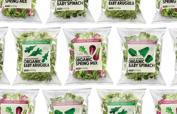
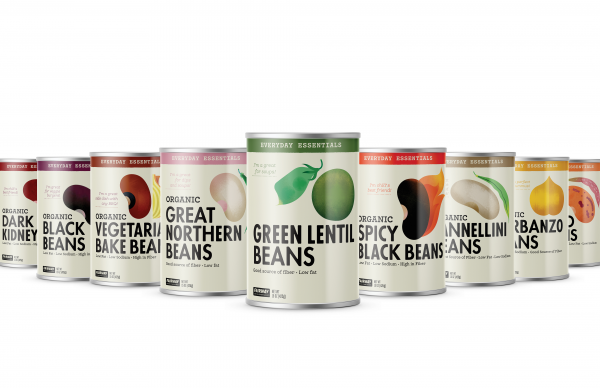
Everyday Essentials carries the items we use everyday, from butter to milk to beans. The simplicity of the system, with its distraction-free layout and strong focus on the product, makes it an effortless choice for busy shoppers. Defined by bold type and a distinctive illustration style not typically found in the grocery aisle, the design has a no-nonsense approachability. Unprecedented sales have shown that bread and butter can truly be a retailer’s bread and butter.
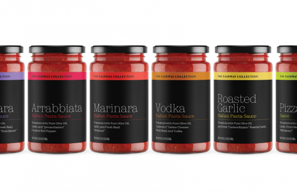
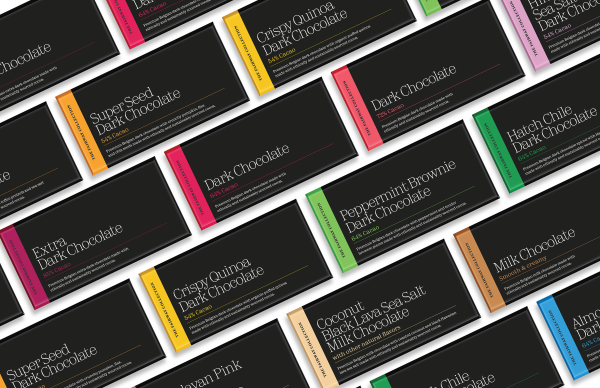
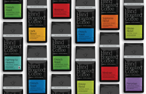
The Fairway Collection is a carefully curated line of premium products from all over the globe. With a minimalist but warm approach, a striking black color palette and a distinctive typeface, the packaging has an elegant presence on the shelf, forming an oasis of quiet sophistication. The resulting spike in sales proves that a whisper
can be heard over a shout.
Design Challenge
With more than 300 SKUs, it was essential to create systems that could be implemented efficiently over a diverse range of packaging sizes, forms and materials, while retaining design consistency and integrity.
It was equally important to retain the uniquely approachable personality of the brand—a large part of what makes it special to its loyal customers—while keeping design standards at the high level New Yorkers expect.
Effectiveness
The project has transformed customers’ perception of the store's private labels and reinvigorated the 86-year-old brand. The redesigns have elevated its packaging with a shelf presence strong enough to compete with deep-pocketed brands many times their size, even without an advertising budget or marketing support.
Tags
Graphic Design - Three Dimensional
This award celebrates creative and innovative design in traditional or digital visual representation of ideas and messages used in packaging. Consideration given to: clarity of communication and the matching information style to audience; the approach, including marketing and branding concerns, the dynamics of the retail environment, environmental considerations, and legal requirements; the component parts of packaging graphics such as colour rationalisation, information layout, feel and tone of illustration and photography, and finishes, and how they are used in isolation and in relation to each other; and the relationship to the anatomy of the structural design.
More Details