Key Dates
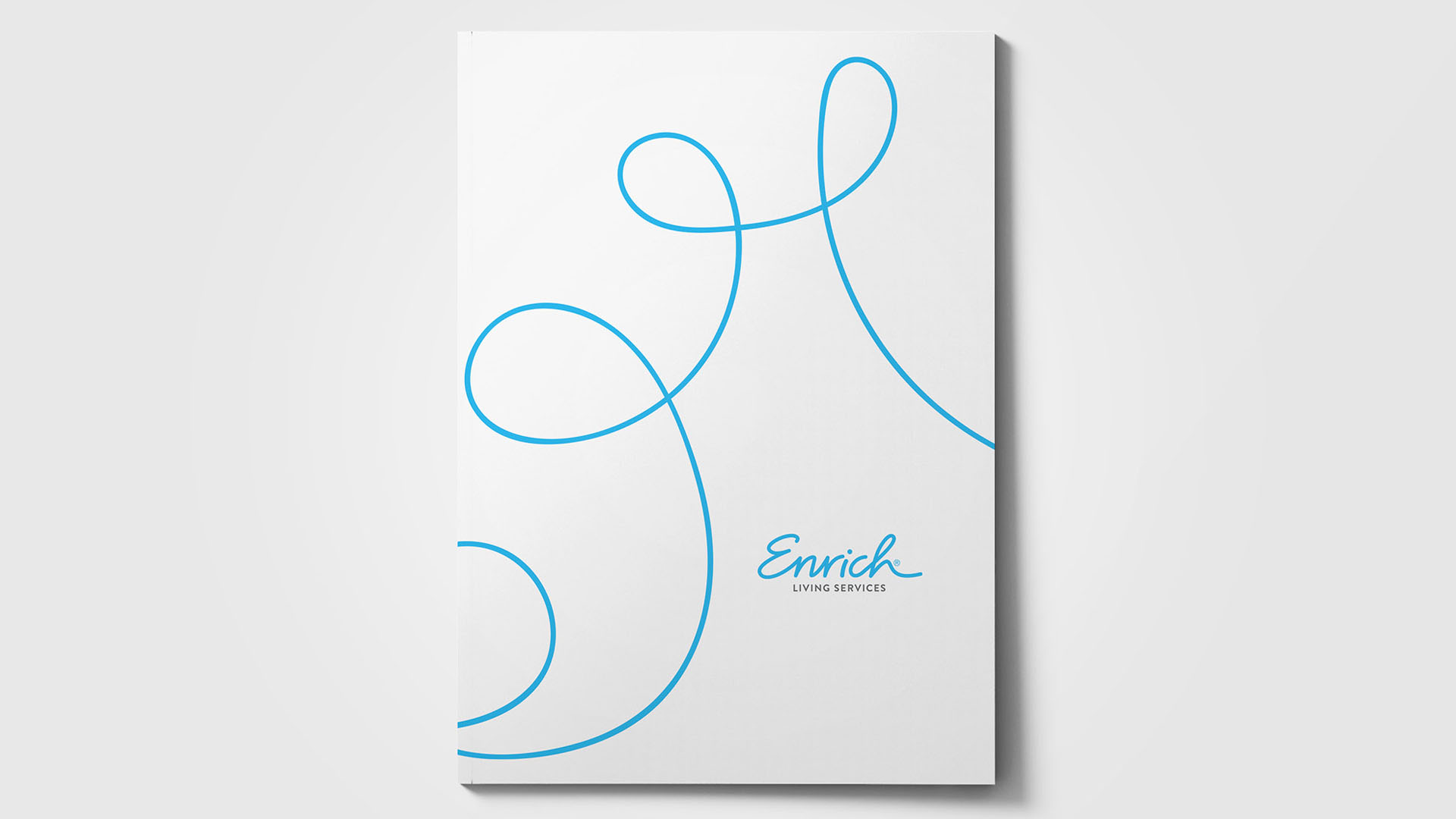
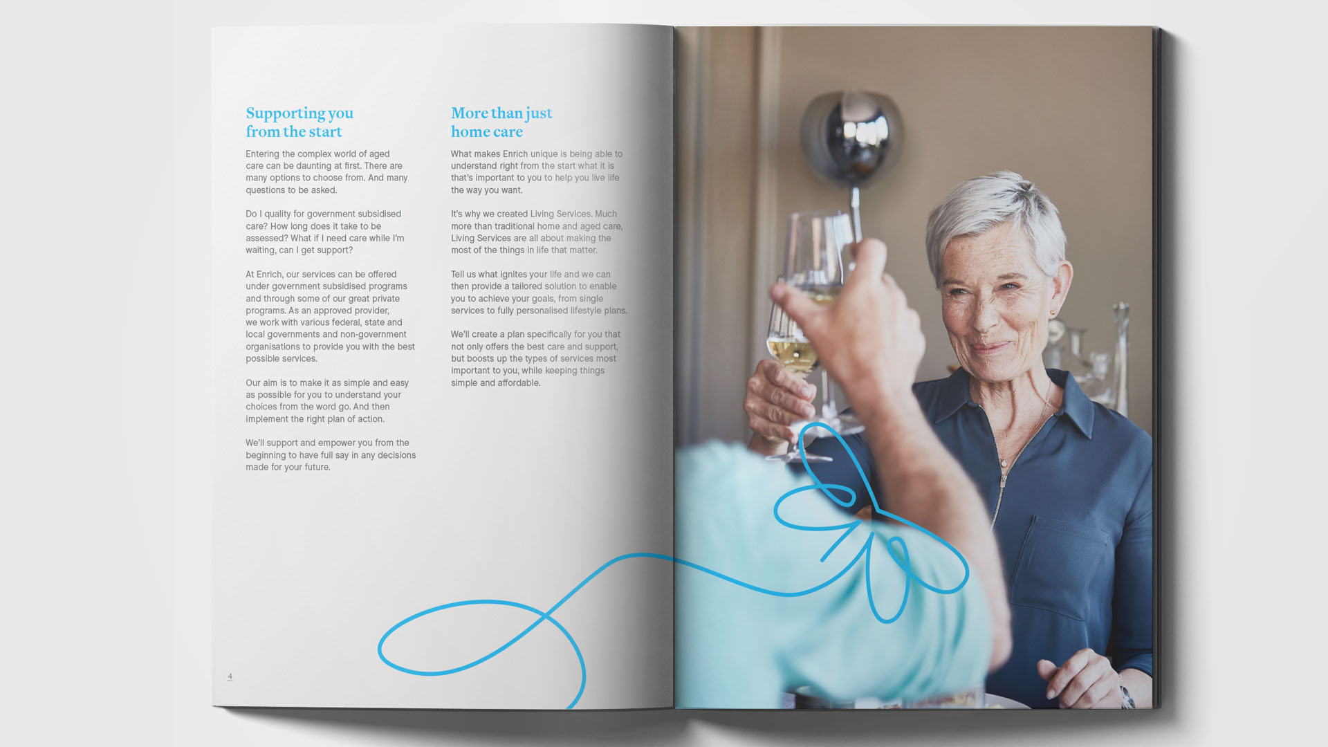
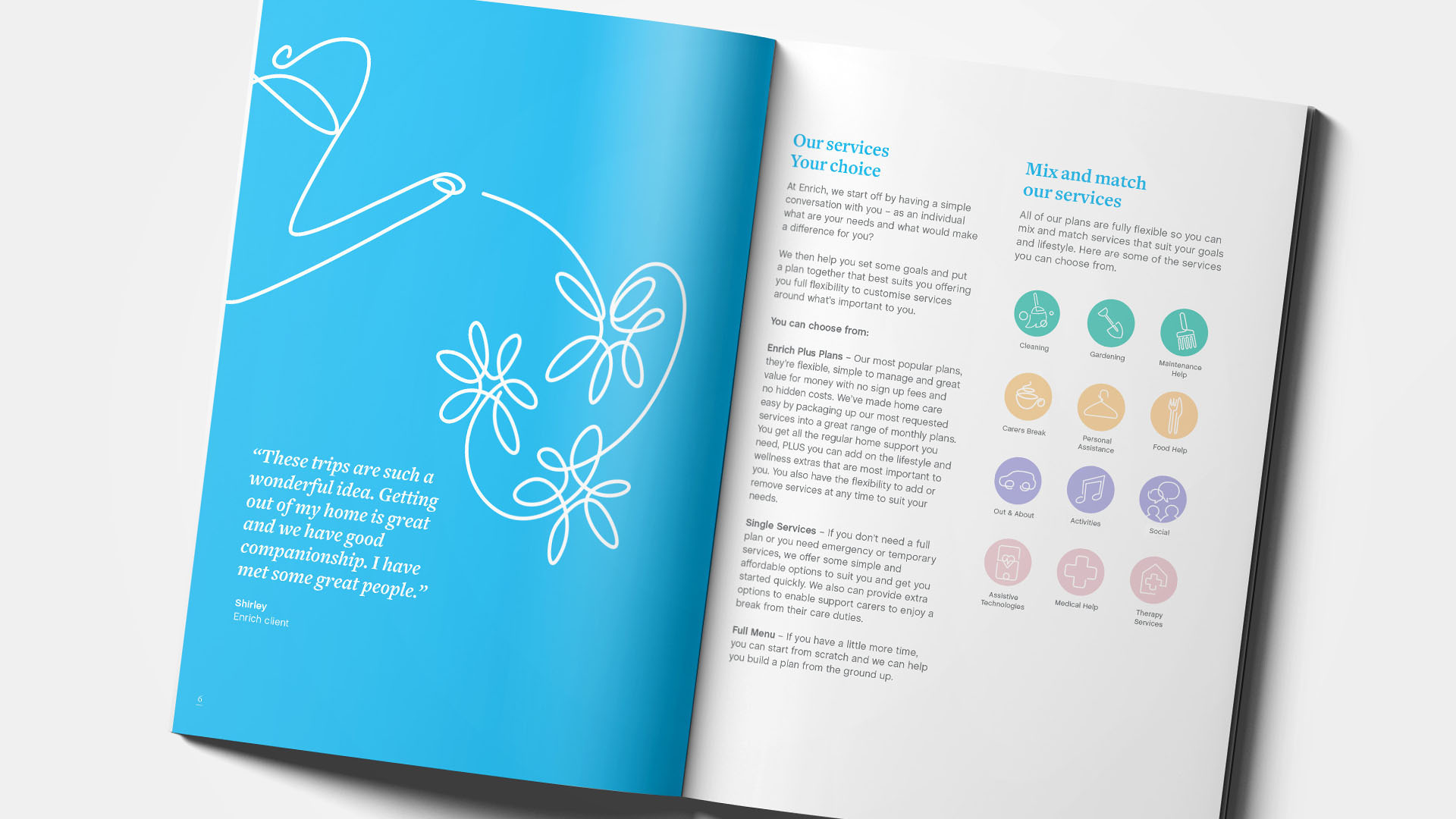
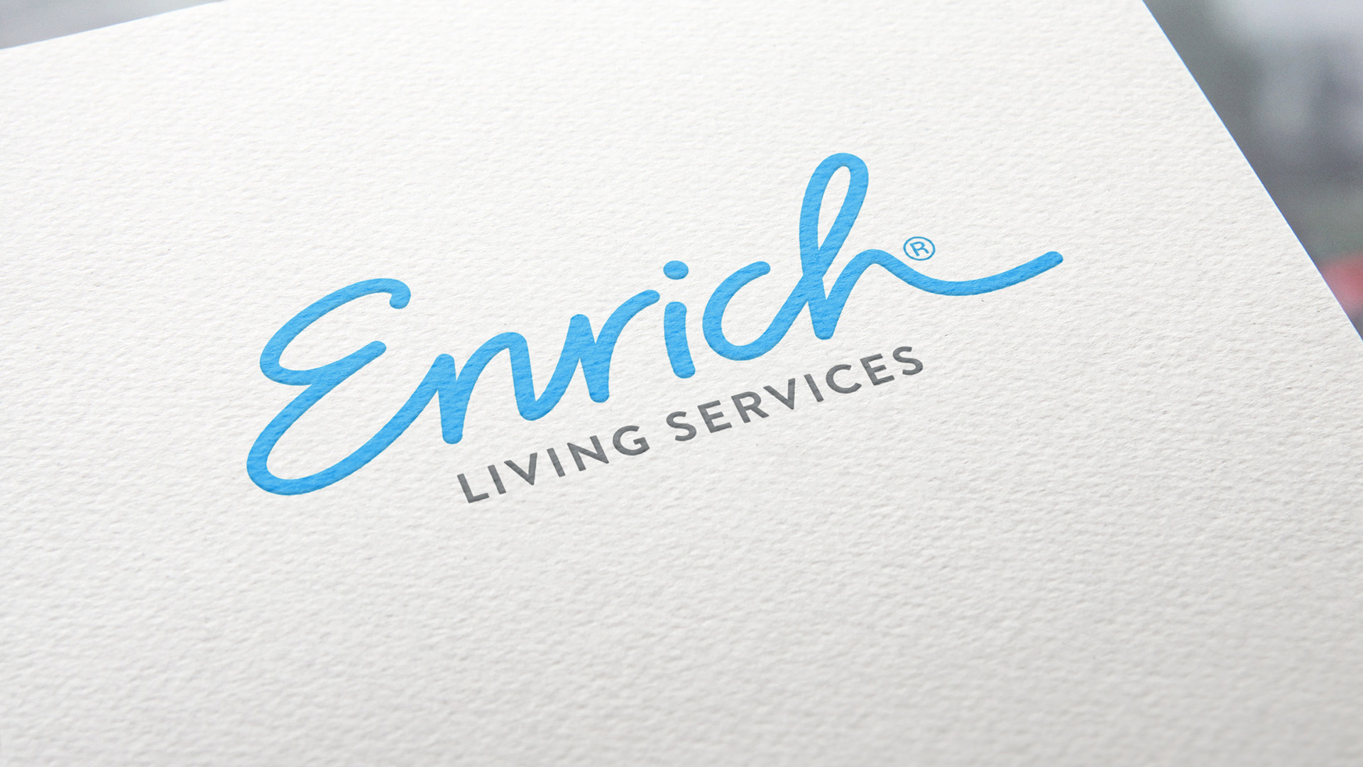
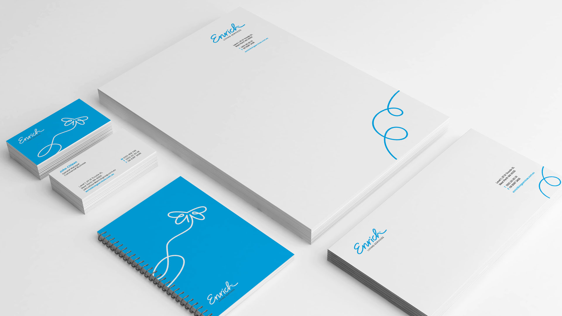
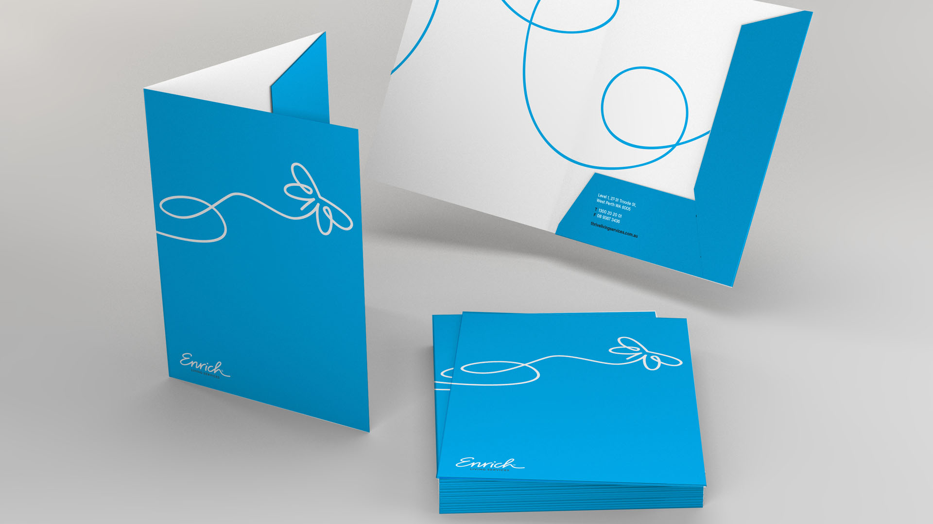
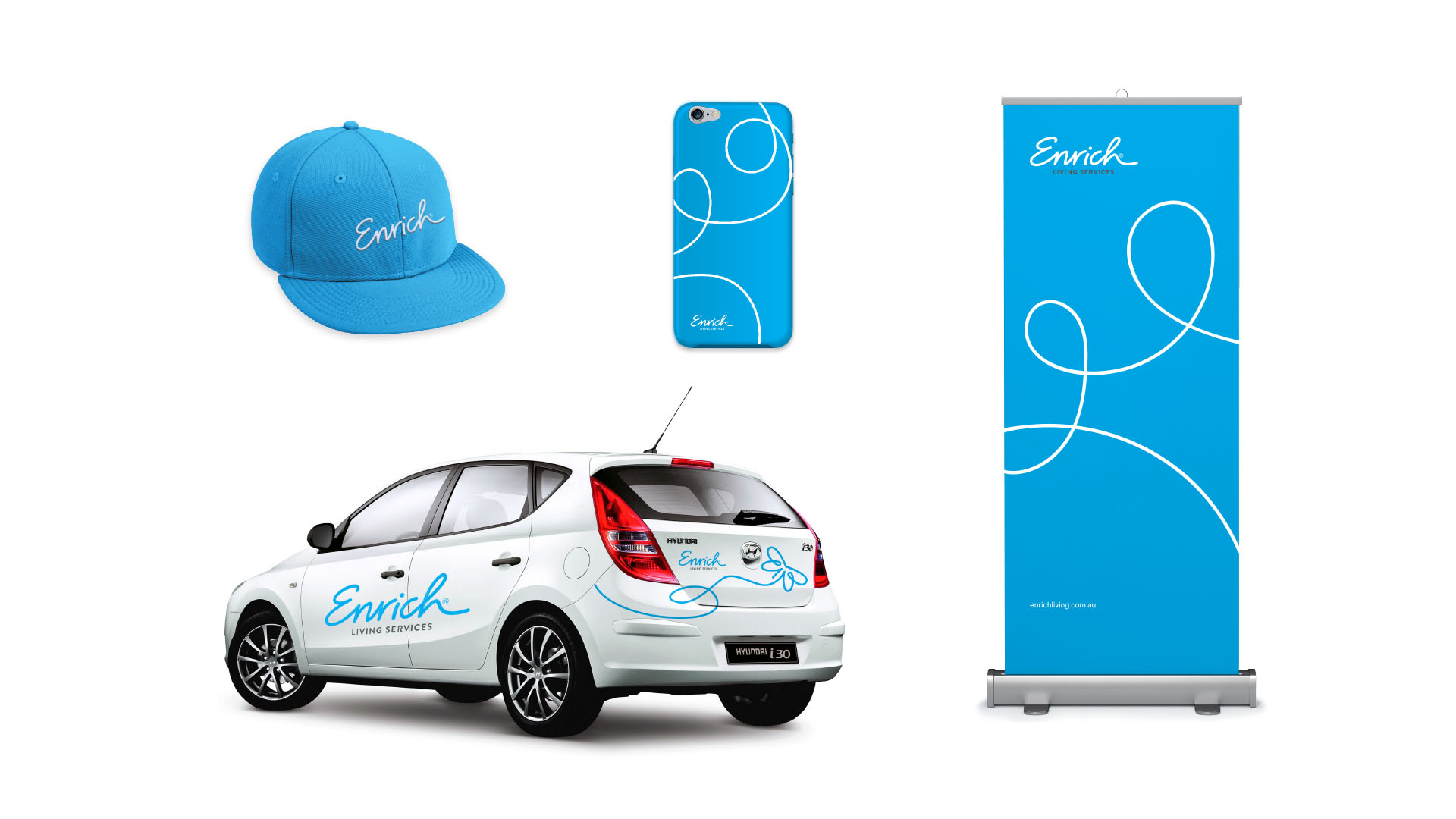

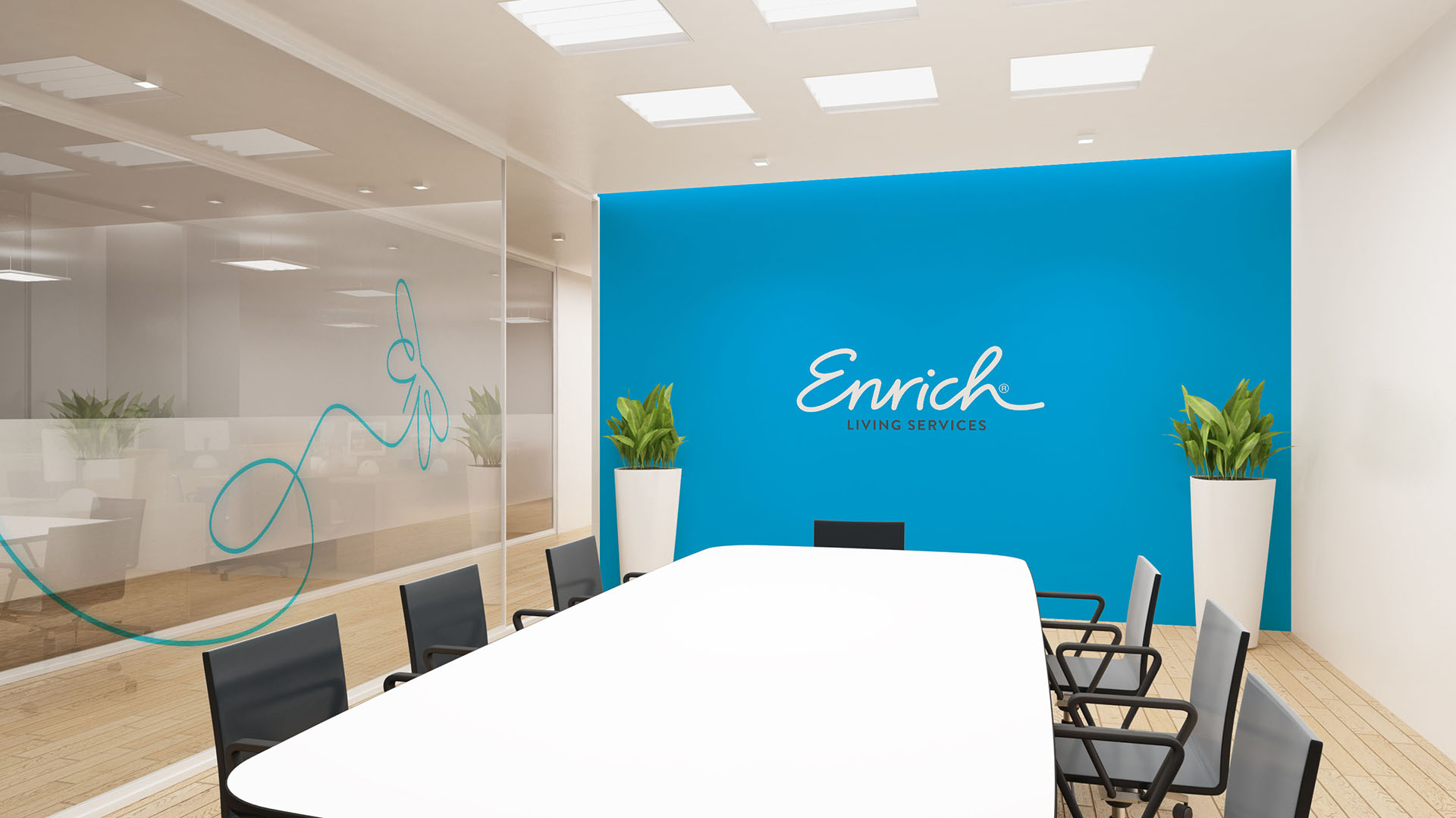
Image Credit :

Project Commissioner
Project Creator
Project Overview
To take an existing aged care brand and break the barriers of the aged care category by creating a totally new brand including a new name. The new brand had to appeal to modern adult Australians who's needs had changed and required support beyond just traditional home care that would suit their lifestyle.
Team
Project Brief
St Ives had been operating in the aged care sector for 30 years, specialising in home care services. During that time they noticed a societal shift in perception towards aged care and an increase in reluctance for adult Australians to seek assistance. The desire to remain independent and stay at home often led to a decrease in health and wellbeing and isolation. St Ives took this insight and completely redeveloped their organisation in line with the times. Our brief was to create a new brand identity including a new name to express this new philosophy and resonate with our audience.
Project Innovation/Need
Through our strategic process, we developed a brand promise that would align the team on a unified vision - 'cultivating purpose and connectedness of adult Australians through the provision of bespoke services influenced by the unique needs of individuals'. To counter the perceptions of ageism, we created an illustrative style, very different for the traditional aged care category as the primary visual to convey the endless possibilities and emotions. The photography style featured distinctive portraiture with abstract skies that reflected a new optimism for our clients.
Design Challenge
A completely new brand identity was developed to support the strategic direction and unify the organisation. The first challenge was to go through an extensive naming process, eventually creating the name Enrich to reflect the brand promise and dedication to fostering a sense of self-worth in every client, support their independence and cater to their unique needs. The brandmark to express the sentiments of Enrich was a handwritten signature that represents a new energy for each individual customer. This illustrative line technique created encompassed experiences and new possibilities that help support a person to thrive in life - from a caring hand to the comfort of a pet to an uplifting butterfly to symbolise a new lease in life. The graphic line can create endless possibilities, communicating Enrich as a business that is agile and innovative as we develop living services around each individual.
Effectiveness
The brand has just launched and has already received overwhelming support both from existing clients and staff, as well as from external healthcare professionals who welcome the shift in strategy to encourage and promote adult Australians to seek support to ensure prolonged health and wellbeing in their home and avoid isolation through engagemnet within the community.
Graphic Design - Identity and Branding - Corporate
This award celebrates creative and innovative design in the traditional or digital visual representation of ideas and messages. Consideration given to clarity of communication and the matching information style to audience.
More Details