


Project Overview
Vodafone has rebranded its well known ‘speech mark’ logo as part of repositioning the telco as looking to an exciting future. The new rebrand is the first significant change since its ‘Power to you’ brand positioning in 2009, which will now become ‘The Future is Exciting. Ready?’.
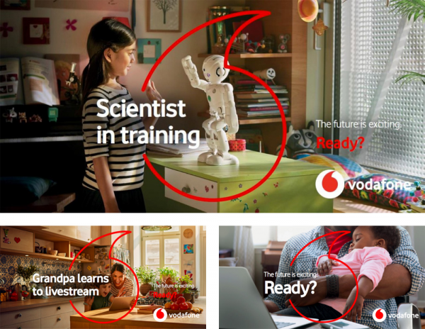
The new speech mark, instead of having a white outline with red inside, has been inverted to display a red outline with white colouring.The new visual identity will place much greater emphasis on Vodafone’s iconic 'speech mark' in the biggest change to one of the most recognisable symbols of Vodafone since the ‘speech mark’ logo was created in 1998. The ‘speech mark’ will now appear as the central graphical focus overlaid on all marketing and marketing communications activity. The logo will also appear in a new 2D design in place of a skeuomorphic 3D approach.
Project Commissioner

Project Creator
Project Brief
On 5 October 2017 Vodafone announced a significant evolution of its brand positioning strategy, strapline and visual identity worldwide – the first changes to one of the world's best-known brands since the introduction of the 'Power to you' strapline in 2009. The strategy – implemented across all 36 countries in which the Vodafone brand is present – is designed to underline Vodafone’s belief that new technologies and digital services will play a positive role in transforming society and enhancing individual quality of life over the years ahead. Vodafone’s brand positioning strategy focuses on the theme of optimism about the future, using the new strapline, "The future is exciting. Ready?".
Design Challenge
The old applications had an interesting visual going, which was the icon stretching a red layer across a white or photo background, creating a focal point for it. It created some odd layouts but it was an easy way of making applications consistent as well as establishing a recognizable graphic device. The new applications rely on a much more “fragile” graphic device which is a stroked version of the speech mark on its own. Removing the circle around it takes a way a lot of its visual presence.
Graphic Design - Identity and Branding
This award celebrates creative and innovative design in the traditional or digital visual representation of ideas and messages. Consideration given to clarity of communication and the matching information style to audience.
More Details