

Project Overview
The Wisconsin Department of Employee Trust Funds (ETF) is responsible for managing the pension and other retirement benefits of over 600,000 state and local employees in the state of Wisconsin. With approximately $98 billion in assets, the Wisconsin Retirement System is the 9th largest U.S. public pension fund and the 25th largest public or private pension fund in the world.
In addition to overseeing the Wisconsin Retirement System, ETF also provides benefits such as group health insurance, disability benefits, and group life insurance. Over a half million people rely on the information ETF provides in order to make decisions that impact not only themselves, but their children, and their children’s children.
ETF engaged Palantir to re-platform their website from HTML templates to the Drupal 8 content management system, including a complete visual and user experience redesign. After partnering with Palantir, the new user-friendly ETF site:
- Provides ETF staff and all website visitors with a seamless experience
- Allows ETF employees, retirees, and employers to efficiently access accurate and current information
- Incorporates best practices for content publication for the ETF digital team
Project Commissioner
Wisconsin Department of Employee Trust Funds
Project Creator
Team
Palantir.net: Kate Eyler-Werve, Patrick Weston, Meghan Davis, Kelsey Bentham, Sarah Lowe, Carl Martens, Nate Striedinger, Malak Desai, Greg Leroux, Jill Farley, Ken Rickard, Lesley Guthrie, Ashley Cyborski, Bec White, Jes Constantine, Byron Duvall
ETF: Al Florence, Mark Lamkins, Nicole Linskens, Brittney Kruchten, George Matykowski, Monica Vertz, Kristen Schipper, Cheri Seeger, Collin Dsouza, Rhonda Rohn.
Project Brief
With the fully responsive design system in place, the new ETF site offers a significantly upgraded user experience for their customers:
- Task-oriented: Our data-based top tasks approach ensured that we kept the focus on the user’s journey through the site. Everything from the menus to the page-level strategy to the visual design was geared towards making it effortless for visitors to achieve their most important tasks.
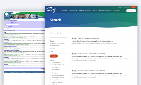
- Structured content: Not only has the website’s content been rewritten to be more scannable for readers, it’s also now structured for SEO. Our initial user research uncovered search as one of the most frustrating aspects of the site: “The main thing for me is really the search results: the most up to date version is never the first thing that turns up” By adding metadata to ETF’s library of PDF forms and transforming their content from freeform text to structured data, ETF’s search experience has made a complete turnaround (see glorious before/after of search)
- User testing: Our strategy and design work was validated throughout the engagement with real ETF users, which kept us all grounded in the outcomes.
- Accessible and responsive design: The design system isn’t just WCAG A.A compliant according to accessibility testing software - we worked with users to ensure that the site delivers a good experience with site readers. Incorporating a11y standards from the very beginning of the design process ensured that accessibility was baked into our design rather than a last-minute add on.
Project Need
Given the extent of services provided by ETF, their website is large and complex with a wealth of vital information. When ETF first approached Palantir.net, their website hadn't been updated since the early 2000s, and it lacked a content management system. The site wasn’t accessible, it wasn’t responsive, and its overall user experience needed a drastic overhaul.
The biggest negative factor of the previous ETF site’s user experience was its confusing menus. The site presented too many options and pathways for people to find information such as which health insurance plan they belong to or how to apply for retirement benefits, and the pathways often led to different pages about the same topic. Frequently, people would give up or call customer support, which is only open during typical business hours.
Palantir knew the redesign would have the most impact if the site was restructured to fit the needs of ETF’s members. In order to guarantee we were addressing members’ most important needs, we used the Top Task Identification methodology developed by customer experience researcher and advocate Gerry McGovern. Through the use of this method, we organized ETF’s content by the tasks site users deemed most important, with multiple paths to get to content through their homepage, site and organic search, and related content.
User Experience
One of the most notable features of the new site is the Benefits Explorer. An important function of the ETF site is offering information regarding healthcare and other employer benefits. On the old site, employees were required to know the exact name of their plan before they could find information about their benefits. This task was made even more difficult by the fact that the plan names themselves are not descriptive or intuitive. ETF’s previous solution was to send physical mailers with distinctive photos on the covers, and then direct visitors to the website to select the plan that had the same image as their mailer.
Palantir and ETF knew that the “find my benefits” user experience needed a complete overhaul. In our initial onsite, we identified a potential solution: creating a database of every employer in the ETF system and the benefits plans they offered. With this list, we built an explorer tool that allows ETF’s customers to search for benefits by the one piece of information they will always definitely have: the name of their employer.
With the new explorer experience, site visitors begin by typing in the name of their employer and are immediately provided with their benefit options. We built two versions of the tool: one for the specific task of identifying health plan options, which are typically decided once a year during open enrollment, and one for identifying all benefits offered by your employer, which can be used any time of year.
Project Marketing
Official press release: https://etf.wi.gov/news/etf-launches-new-website
https://twitter.com/WI_ETF/status/1149353037409820672
Project Privacy
The ETF website is public and fully accessible by all audiences.
Digital - Government Services
The provision of timely government services has been transformed as applications and sites are developed and implemented to either replace or complement previous methods. Be it the delivery of current and up to date critical information, compliance, community support and engagement, notification and registration or providing greater accessibility to government resources.
More Details

