


Project Overview
We had the pleasure of naming, branding, designing the packaging and website for Long Paddock, an artisan fromagerie and cheese school in Castlemaine.
For Long Paddock’s branding, we wanted to visually represent their close relationship with the land and the intricate interplay of fresh produce and traditional processes that go into creating great artisan cheese.
Long Paddock’s story was the marrying of two different worlds — traditional French methods of cheese making and contemporary Australian flavours — when renowned cheesemakers, Ivan and Julie Larcher moved to Castlemain to make, and teach about, cheese. It was our job to change the dated perception of artisan cheese being only an international luxury. We needed to show Australians that exceptional cheese can be made right here, in our ‘own back yard’.
Project Commissioner
Project Creator
Project Brief
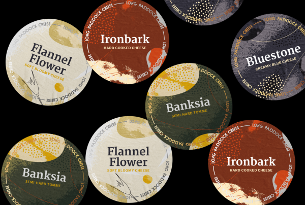
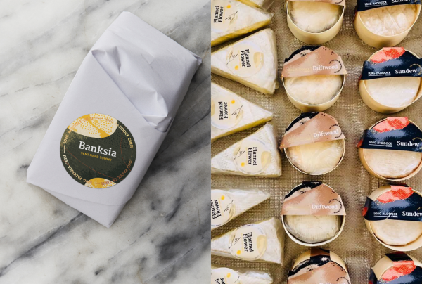
With Long Paddock’s close relationship with nature in mind, we examined their cheese-making process up-close — literally! For their branding and packaging, we considered elements found in nature that are vital in producing Long Paddock’s cheese and honed in on them at a micro-level. From the grasses that a dairy cow would graze on to the natural microscopic cultures critical in the process of making high-quality cheeses.
We illustrated these micro-elements onto the packaging in a stylised manner. When adding the Long Paddock logo to the packaging, we employed a bold yet approachable typestyle. We wanted something that was noticeable but that wouldn’t overshadow the intricate designs on the packaging.
We were heavily inspired by the iconic Australian landscape, drawing on ‘colour fields’ and photography, and focusing on Australia’s unique flora which offered us inspiring colours, textures and even flavours.
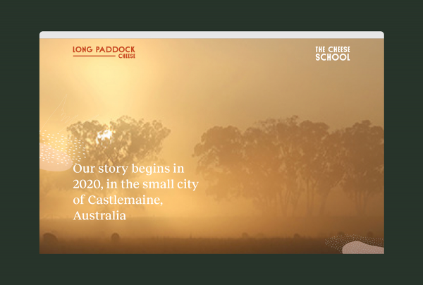
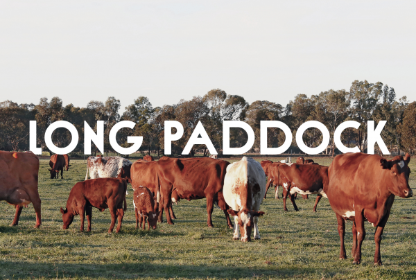
For their website, we used imagery taken by a local Castlemaine photographer, of the area, to help set the scene for digital visitors. The Long Paddock logo is integrated into beautiful images of sweeping Australian landscapes and cows grazing in fields to demonstrate the close relationship Long Paddock has with their environment.
Project Innovation/Need
We managed to evoke a sense of the natural world without explicitly evincing nature. We also managed to create a feeling of flavour through our imagery.
We also forged a contemporary and Australian voice for a traditional and international product — going against the grain of branding style that has been upheld for a long time. We think the results were refreshing!
Design Challenge
Because of the nature of making artisan cheese, and the maturation process, timing was somewhat of an issue for the packaging. Also, we were creating the branding for the cheese school while it was still under development.
Creating a contemporary and Australian voice for a traditional and international product was also a challenge but one that we really loved undertaking.
Effectiveness
Our overall design helped to create a unique, sophisticated, and flexible visual language for the Long Paddock cheese brand and allowed scope for a full gamut of product packaging and branding.
Customers have been engaged with the cheese and sales are looking promising, despite some setbacks caused by COVID.
Graphic Design - Identity and Branding - Retail
This award celebrates creative and innovative design in the traditional or digital visual representation of ideas and messages. Consideration given to clarity of communication and the matching information style to audience.
More Details