


Project Overview
Against a backdrop of acute effects of climate change, more frequent natural disasters and growing social inequalities, the nature of vulnerability was evolving. A sea change in how people give, contributing to specific causes rather than general charitable donations, meant that Australian Red Cross was experiencing pressure on resources and funding like never before.
We repositioned Australian Red Cross to strike a chord with a new generation of givers, while staying true to the beliefs and values of committed staff and supporters. At its heart was a commitment to being an organisation of doers, who express themselves through authentic and meaningful actions. The new design system modernised a trusted Australian icon, while demonstrating Red Cross’ focus and the philosophy that drives the organisation to build human dignity, peace, safety and wellbeing for all.
Project Commissioner
Project Creator
Team
Moensie Rossier, Strategy Director
Wayde Bull, Planning Director
Marine Piersotte, Strategy Executive
Renée Stekel, Senior Account Director
Dan Bradley, Director, AlphaLab
Simon Wright, Executive Creative Director
Rhiannon Folpp, Design Director
David Cunningham, Head of Production
Ben Williams, Artworker
Carolina Relander, Illustrator
Project Brief
Stretching themselves in line with their motto, ‘the power of humanity’, Red Cross had spread themselves too thinly over the years. They wanted to help everyone, but found they weren’t necessarily focussing on their trusted brand’s unique strengths in tackling big, fundamental human issues. This created an urgent need to focus and prioritise, in order to maximise their humanitarian impact and grow support and donations.
A brand reset was needed to reinforce this shift, driving a new business strategy, which refocussed efforts around six key areas of humanitarian aid. A revitalised brand was also essential to build pride and commitment across the Red Cross organisation and supporter base and recruit a new generation of volunteers and donors.
Project Innovation/Need
We identified an opportunity for Australian Red Cross to become the go-to, to connect with what matters, so all involved can take effective action together, maximising their humanitarian impact. We expressed this in a purpose statement, ‘To spark people’s power by activating the humanitarian in everyone.’
Principals’ interviews across the organisation, from the leadership team to people volunteering in Red Cross Shops, revealed a truth about what compels people to get involved with charities. We found that, for many people, these actions are expressions of who they are and what really matters to them.
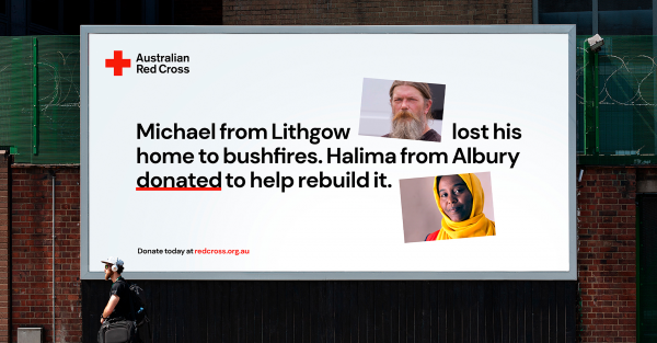
The philosophy, ‘We are what we do,’ resonated strongly with people connected to Australian Red Cross. It also spoke to a wider group, including younger people, who are sick of institutions that promise much and do little, and who place high stock on authenticity and doing what you say.
We expressed the central brand idea ‘We are what we do’ as a manifesto: Actions don’t just speak louder than words, they reveal more about our true selves. What I do reveals what I believe in and hope for, who I’m here for, what I’m willing to sacrifice and what’s non-negotiable. Australian Red Cross is a powerful change maker. It connects individuals to the means to amplify and activate their hopes for communities and the world.
Design Challenge
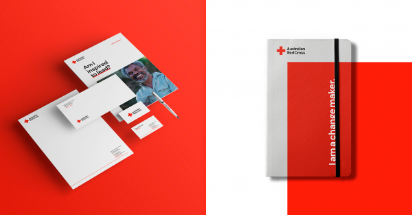
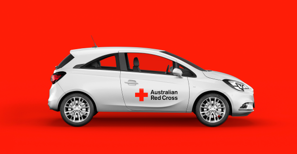
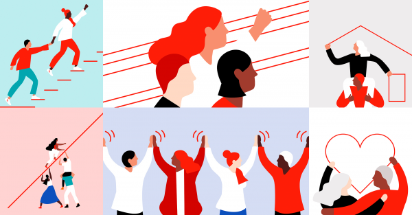
Principals created a design system that was stripped back, modern and minimal, raw in its honesty. Swiss inspired and built around the most recognised emblem in the world – the red cross – it includes a typographic style, graphic devices, illustration style and human-focused photographic approach. It encourages people to reflect and push themselves to do more, individually and collectively. It includes a suite of strong, distinctive brand assets, including an underline device, cross corner device, several tiers of active imagery and illustration. All of this is set out in detailed brand guidelines.
Australian Red Cross’ central brand idea and tagline was ‘The Power of Humanity.’ While it was considered worthy and grand, this idea was a bit overwhelming for Red Cross supporters. Complementing work on expression and voice for the rebrand, Principals’ in-house Brand Voice agency XXVI evolved the line to ‘Act for Humanity,’ which gives people a sense of personal empowerment and directly supports the doing ethos we aimed to foster.
Effectiveness
All in all, the brand builds on and makes sense of Red Cross’ Fundamental Principles of Humanity, Impartiality, Neutrality, Independence, Voluntary Service, Unity and Universality. It transforms principles into practice and rallies people to act for humanity.
The refreshed brand has been well supported across the organisation, with a brand video helping to reinvigorate and unite the culture. Following the turmoil of 2020, it creates a new platform for Australian Red Cross to re-engage with renewed focus at a time when the organisation, more than ever, plays a critical role.
Graphic Design - Identity and Branding - Community
This award celebrates creative and innovative design in the traditional or digital visual representation of ideas and messages. Consideration given to clarity of communication and the matching information style to audience.
More Details