


Image Credit : Fab Ferrante

Project Overview
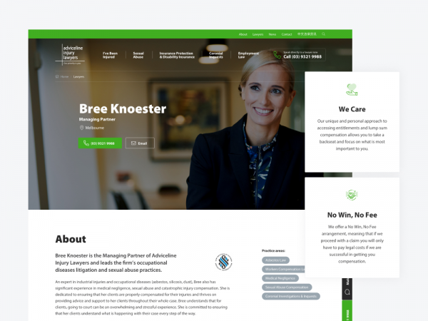
Adviceline Injury lawyers is a leading personal injury practice that has been helping Victorians get their lives back on track for more than 50 years. The firm had a website that was clunky and difficult for content administrators to update. Navigation had also become very difficult for users, and the site was in need of a design refresh.
This project involved a complete rebuild of the site, beginning with a content audit and strategy to redesign the site’s information architecture. The outcome was a vastly simplified and more intuitive information architecture and a much cleaner design that more appropriately reflects the firm’s positioning in the market.
Project Commissioner
Project Creator

Team
Account Director: Marty Drill
Producer: Renae Englert, Kim Dezen
Designer: Fab Ferrante
FED: Sarah Dam, Catherine Cattach, Drew Foster, Reggie Rombang,
BED: Andy Thompson
DevOps: Andrew Radburnd
Project Brief
The main objectives of this project were to:
- improve the overall user experience for website visitors
- deliver the brand with a more people-first approach, and
- improve the layout of content and access to information.
Project Innovation/Need
The site needed a refresh to position Adviceline Injury Lawyers in the online legal marketplace among top-level peers, while also setting the brand apart for its client-first and boutique approach to providing legal services.
Design Challenge
The design of the old site was very focused on stock photography and failed to convey the sense of caring and empathy that Adviceline Injury Lawyers are known for. The new design replaces stock photography with a warmer, and more personal style, putting the emphasis on the firm’s people in natural and relaxed settings.
User Experience
The foundation for the project was a comprehensive content audit and discovery phase. This allowed the project team to take a step back and reimagine the information architecture and navigation in a way that was more aligned with how the client sees legal services. In some cases, this involved translating legal jargon into more commonly used terminology. The new site has also simplified the customer journey so there is a clearer path to finding information.
Conversion rate optimisation was front of mind when redesigning the customer journey, with the new design making it much easier to find locations and people to speak to. There are also clear calls to action on the pages, with contact forms being embedded in various pages.
From a content admin perspective, the incorporation of reusable, modular content makes the site far easier to update and maintain, without the need for developer intervention.
Digital - Corporate
This award celebrates innovation and creativity in design of a unique user experience in the combination of text, audio, still images, animation, video, and interactivity content for websites. Consideration given to clarity of communication and the matching information style to audience.
More Details