


Project Overview
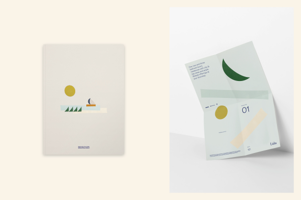
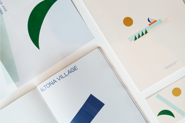
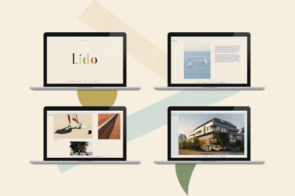
Designed by Interlandi Design Architects, Lido is the latest residential development from Point Polaris, located on Sargood Street in Altona. Comprised of 23 one, two and three bedrooms luxury apartments, the project’s target demographic is predominantly first homebuyers. As such, Earl.St crafted a vibrant and playful brand tailored to this younger market while also drawing inspiration from the project’s coastal surrounds.
Project Commissioner
Project Creator
Project Brief
Ultimately, our brief was to find a way to stand out in the currently saturated property market. We were tasked with depicting a fun, relaxed and beachy brand that conveyed the warm, sun-drenched lifestyle of Altona as well as the suburb’s strong community vibe. The client also specified that this was to target first homebuyers without polarising mature buyers, and was to be applied across a full suite of marketing collateral including brochures, digital, eDM, hoarding and more.
Project Innovation/Need
To achieve this uniquely tailored aesthetic, we utilised shapes within the brand typography to curate an abstract beach scene that perfectly encapsulated the Altona landscape. The shapes used to construct the beach scene were then used in a series of dynamic asymmetric compositions, creating a sense of movement and vibrancy.
We took an artistic approach to the marketing, using colour, texture and shape to convey a message instead of relying on renders and photography. The collateral and accompanying graphic language is unique in its loyalty to the brand – all shapes and colours used in the collateral are used in the original logotype. The bold use of colour in the print collateral and on-site signage to this degree is also something rarely seen in property branding.
Design Challenge
Along with finding a way to stand out in such a saturated market, our biggest challenge was capturing the attention of young families and first homebuyers without polarising other demographics. We tackled this by using the more dynamic elements of the brand as sparingly and sympathetically as possible. With such a limited selection, celebrating local amenities also proved challenging, which in some ways put more pressure on the performance of the brand.
Effectiveness
Half of Lido’s apartments sold on opening weekend, indicating that our playful approach to the brand and marketing has resonated strongly with buyers. We expect substantial traction to continue to build in coming weeks, with much of this owed to the unique and eye-catching nature of the brand. The client and other collaborators have also expressed they are incredibly pleased with the outcome of the design, further indicating its overall effect.
Graphic Design - Illustration and Type
This award celebrates creativity and innovation in the traditional or digital visual representation of ideas and messages. Consideration given to clarity of communication and the matching information style to audience.
More Details