



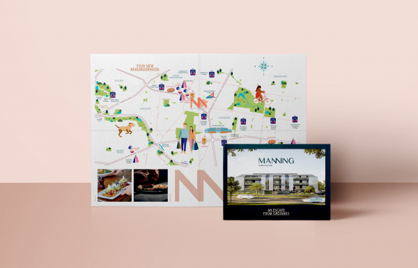

Project Overview
Our decision to name a new apartment development on Manningham Road, Doncaster, the Manning was just the first of many inspired choices we made as we embarked on this immersive brand development journey.
Project Commissioner
Project Creator
Team
Lars Weisenberger - Creative Director
Alysha Sandow - Design Director
Katie Fraser - Senior Graphic Designer
Janine Evans - Copywriter
Elizabeth Burns - Photographer
Ian Hickey - Account Director
Karina Gilmour - Account Manager
Project Brief
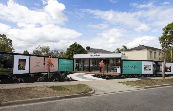
When the client briefed us on their new boutique, apartment development in the leafy suburb of Doncaster, they stressed that it had been conceived as a union between the natural and urban environments.
They were keen for us to develop a brand that would highlight this feature, but also feel premium and established to appeal to an affluent, local Asian-Australian target market.
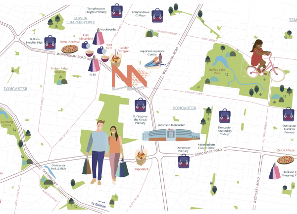
The building itself had been designed by the highly regarded RotheLowman Architects, and was quite unique both externally and internally. From a location perspective, it was close to every amenity you might need, but still somewhat secluded from the hustle and bustle of daily life.
A great product in a stellar location. What more could you ask for?
Project Innovation/Need
The materiality of Manning was a really important part of the proposition. Everything had been specifically chosen in order to portray the residences as unique, bespoke and prestigious.
We seized upon this and endeavoured to do all we could to imbue all aspects of the brand with references to these materials. Some were incredibly subtle, while others were very obvious.
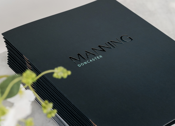
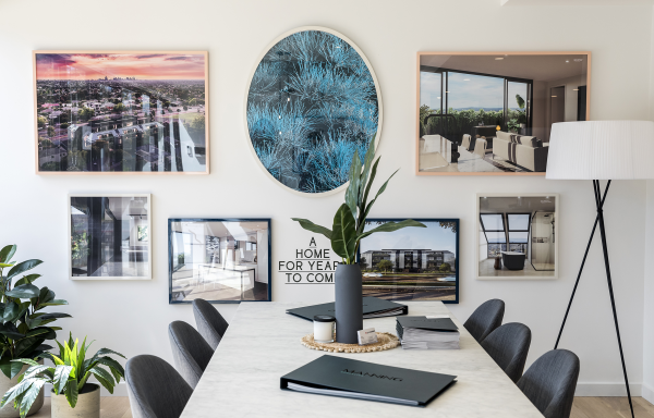
The plants used in our imagery referenced the types of timber within the building. We also used this timber to create frames for the images in our display suite. Textures and tones from tiles and stone were used as backgrounds within our printed collateral and we even recreated one of the textures on the cover of our brochure.
Even though we're sure that no one would ever be able to pick up on all the references we made, just their mere presence seemed to help tie the entire campaign together in an intangible, but meaningful way.
Design Challenge
Probably the biggest challenge we faced with Manning was ensuring that we met our deadlines. From the moment we were appointed to the job, set expectations around a launch date were in place and naturally we were obligated to meet them.
The time we were given was roughly half of what we usually state as standard, meaning we needed to be strict with our suppliers regarding their deadlines and ensure that we were optimising work flows internally. This often meant working on multiple items concurrently, or across different designers, which in itself posed a problem around ensuring consistency across all elements of the brand.
Effectiveness
Since launching Manning in February this year, enquiry has been strong, even though the market for larger, owner occupier apartments in Doncaster has been quite slow for the last 18 months.
Our research into the local market shows that purchasers tend to take longer than average to make a purchase, possibly because they are generally more mature purchasers who are settled in a current home and in no rush to move. They like to thoroughly investigate their options, content to remain where they are until they find exactly the right product for them.
Currently the development is approximately 30% sold. Now while that may not seem like a lot, when you take the market conditions and buyer profile into account, it is actually on far with where we thought we would be at this stage of the campaign. In fact, the really pleasing statistic is that while sales are modest, our conversion rate once we get a purchaser to the display suite is above average.
Advertising - Print
This award celebrates creative and innovative design for visual communication intended to persuade an audience to purchase or take some action upon products, ideas or services. Consideration given to the technical, conceptual and aesthetic elements, audience engagement and message delivery.
More Details

