


Project Overview
dip collective was tasked with providing a new identity and website for Premier IT - a software, cloud computing and training company - that aligned with their new focus in the healthcare sector.
Project Commissioner
Project Creator
Team
Dip collective - branding and web design team
Daniel Neville
Sara Borrelli
Zephyr digital consultancy - project management and web build
Xan Blacker
Nick Rushton
Project Brief
The project brief was based on Premier IT's need to consolidate their brand identity, visual language and online presence.
Premier IT started out as a tech training and software development company in 1991. During the 2000’s the company grew to provide a wide array of different software solutions for different sectors; this rapid growth meant the original branding and web design had been stretch and was no longer fit for purpose.
In more recent years Premier IT has focused on specialised services in the healthcare sector and become one of the number one workforce planning, development and performance software creators.
Deliverables:
- Create a fresh, new visual identity for the brand that reflects the new business direction focusing on the healthcare sector, without alienating the existing customers
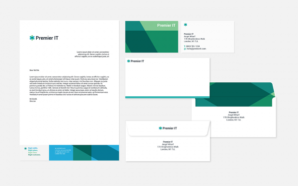
- Create a Brand Book that explains the new design direction of the brand
- Create consistent collateral and graphic language that can be applied to individual products
- Create a new image and iconography system: Premier IT had been struggling to find appropriate imagery to communicate their professional but accessible nature
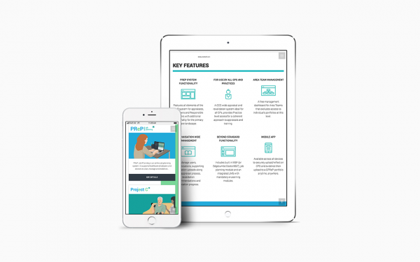
- Consolidate and unify the online presence for Premier IT
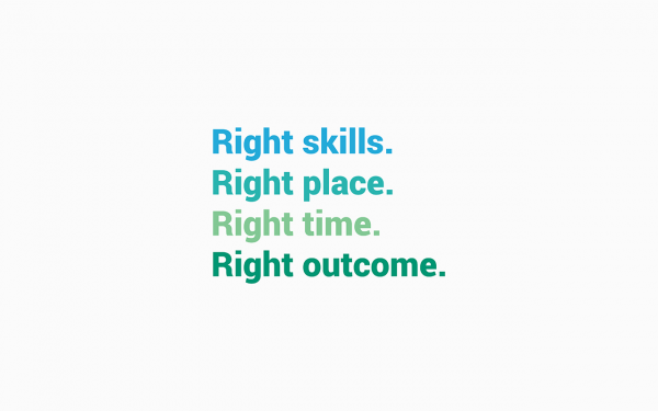
- Create a user friendly, approachable but professional look and feel
- Provide a responsive site accessible from any device
- Create single page URLS easy to share and access
- Provide downloadable assets to learn more about the brand
Project Innovation/Need
When operating within the healthcare sector, strict guidelines and rules must be followed, often photography and stock imagery conflict with these guidelines. By using an illustration style, dip collective was able to create a flexible and adaptable solution that followed these strict guidelines.
Premier IT was in need of a strong and clear identity that consolidated every aspect of the brand, focusing on both healthcare and technology, the asterisk shape was perfect for communicating the following:
- The Star of Life has traditionally been used as a means of identification for medical personnel, equipment, and vehicles – Healthcare
- In HTML web forms, an asterisk can be used to denote required fields – Digital Solutions and developing
- An asterisk is a punctuation mark that you can use to note something in writing, or to stand in for something you've left out – Learning
Design Challenge
Modernising a long establish brand, whilst focusing their offering without alienating existing customers was a big challenge.
Effectiveness
Very positive feedback on the new branding, collateral and usability of the new site has been received thanks to:
- Simplicity and effectiveness of the logo
- Consistency of the branding elements
- Imagery and iconography to support
- User friendly website
- Accessibility and hierarchy of information in the website
- One stop solution for all Premier IT products and sub-brands
Graphic Design - Identity and Branding
This award celebrates creative and innovative design in the traditional or digital visual representation of ideas and messages. Consideration given to clarity of communication and the matching information style to audience.
More Details