


Project Overview
Since 2001, The Fruit Box and The Milk Box have been delivering fresh fruit and milk to Australian businesses. Through their easy online delivery service, it's never been more simple to help create healthier workplaces. In 2016, Davidson Branding was commissioned to create a new visual identity that would inspire office managers to join the movement towards a healthier, and in turn, more productive workplace and standout in a marketplace populated with functional ‘me-too’ brands. The challenge was to design an identity that was in itself, a fresh take on what it means to deliver fresh food to businesses—a healthy workplace is a happy workplace.
Watch the brand story animation here: https://youtu.be/xrbf8ig3sIc
Project Commissioner
Project Creator
Team
Strategy - Grant Davidson / Sam Osborn
Design Director - Michael Callan
Designers - Kevin Lam / Daniel Cheong
Finished Artist - Matthew Forbes
Copywriting - Grant Davidson / Sam Osborn / Michael Callan
Illustrators - Kevin Lam, Michael Callan, Celina Laurilla, Helen McLean (The Fruit Box Group)
Movie storyboarding - Michael Callan, Kevin Lam
Movie animation - Chris Northey
Website wireframe and design page layout – Visual Identity (V.I)
Website development – The Fruit Box Group
Project Brief
The brief was to create a new visual identity for The Fruit Box and The Milk Box (and by extension the parent company The Fruit Box Group) that brings to life the idea of 'fresh thinking'. The product and service is simple and nimble, therefore, the identity needed to be flexible, energetic and dynamic. At the same time, to fully capture the essence of 'fresh thinking', an element of fun and quirkiness is important to provide surprise and inspiration.
Project Innovation/Need
'Fresh thinking' means more than the physical benefits of fresh food to the workplace. It's core (pardon the pun) to The Fruit Box Group approach: from the seamless process in the back-end; to being at the right place at the right time; to whatever offices need delivered, perishable or not; and to the on-time delivery in the middle of the night or at the crack of dawn—that's fresh thinking.
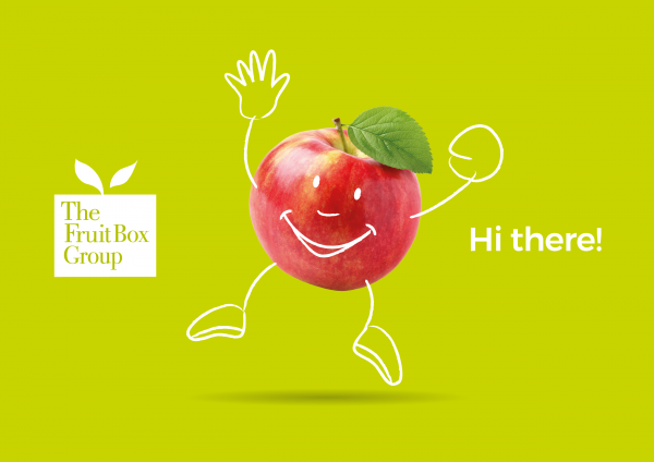
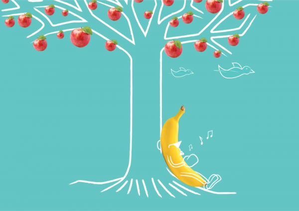
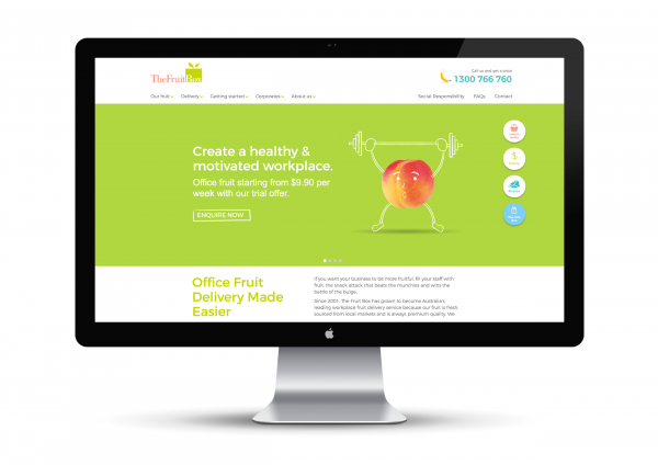
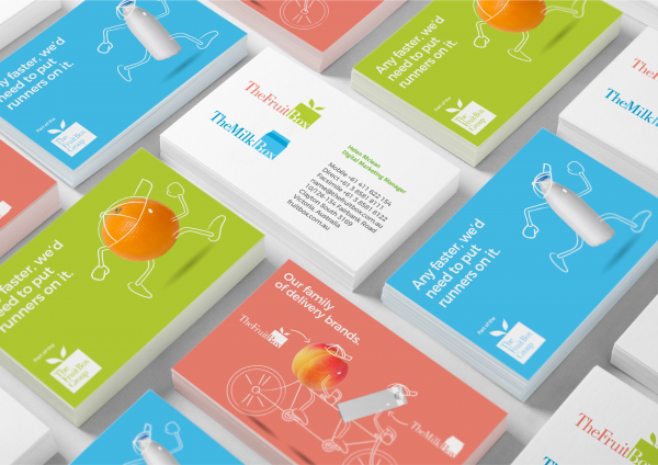
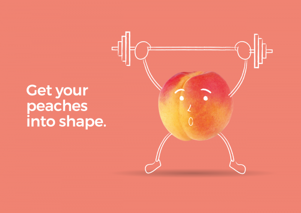
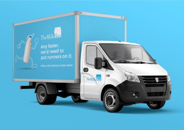
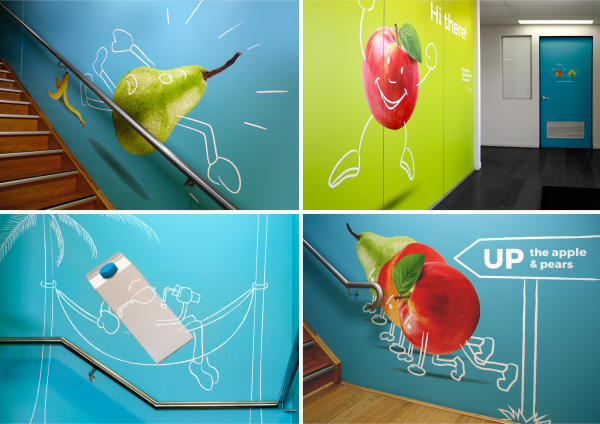
Forming the key element in the visual identity, fruit and milk images are brought to life with character illustrations overlayed on top. Coupled with quirky, clever (and sometimes humorous) headlines, the characters provide a flexible vehicle for communication that can be constantly reinvented and refreshed. Bold, vibrant, complementary colours are paired with the fruit and milk images to provide dynamic and energy.
Design Challenge
The challenge was to develop a visual identity that communicated the idea of fresh thinking in a way that was in itself, a fresh take on fruit and milk delivery. In addition, the identity needed to work across both fruit and milk delivery, differentiating them while also tying them together.
Effectiveness
The new visual identity captured the essence of 'fresh thinking', brought to life in a unique manner differentiating The Fruit Box and The Milk Box from its competitors and helping accelerate the growth of the business.
Graphic Design - Identity and Branding - Corporate
This award celebrates creative and innovative design in the traditional or digital visual representation of ideas and messages. Consideration given to clarity of communication and the matching information style to audience.
More Details