


Project Overview
Freedom Furniture was an icon of 90’s retail. But through a lack of innovation over the last 20 years it had fallen into a sea of sameness within the category. Sales had been in a downward spiral for years and the business had failed to attract the younger audience that was critical to its survival.
Our job was to breathe new life into this much loved brand before it faded into oblivion. We needed to attract a new audience to the brand and urgently arrest the sales decline.
Here’s how we did it...
Project Commissioner
Project Creator
Team
The General Store
Matt Newell, Founder & CEO
Reeshma Bhanji, Creative Director
Genevieve Read, Design Lead
Olivia Kaufman, Group Account Director
Pat de Silva, Project Manager
Chee Productions
Matt Chee, Producer & CEO
George Antoni, Photographer
Ribal Hosn, Videographer
Project Brief
There were three key objectives to this brief:
1. We needed to attract a younger audience, with a higher lifetime value;
2. The brand research scored high on awareness but low on relevance. So we had to create a brand that felt contemporary and aspirational;
3. We needed a distinctive brand platform to differentiate the business from increased competitive pressure.
Project Innovation/Need
Our brand strategy revolved around ‘objects of desire’.
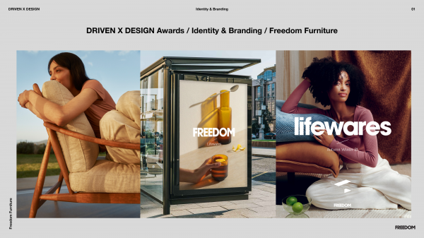
It was a strategy that invited us to elevate the brand platform considerably, so we went for it. We broke the conventions of the furniture category and instead turned to techniques used by the fashion industry.
The brand identity shifted to a bolder, more monochromatic platform that would allow seasonal stories to wash over the top. We developed a restrained icon that is subtly born out the F in Freedom. And we developed a distinctive aural mnemonic to assist with sonic branding.
We teamed up with legendary fashion photographer, George Antoni. We made the effort to shoot in stunning locations (rather than shooting in a studio like most furniture retailers). And we collaborated directly with the furniture design team at Freedom to dramatise the design intent of the product itself.
Design Challenge
The key design challenge was to create a brand platform that was pointed and aspirational. But it also needed to be a brand with mass appeal stylistically.
We addressed this by leaning in hard on ‘aspirational Australian living’. It’s a combination of relaxed vibes with an obsession over the details. Affordable and luxury. Crafted and carefree.
The colour palette features uniquely Australian tones. The talent celebrated cultural diversity. And we leaned hard on a tone of voice that was knowledgeable and approachable.
Effectiveness
Since launching the new brand platform in October 2020, there has been an immediate impact on sales, with an increase of +24% on the same period YoY.
And, the new brand platform has since been rolled out across over 3000 assets, from stores, to signage, web and brochures. All within a 6-month period and with meticulous precision.
“Dynamic, deliberate and visionary” is how Freedom CEO, Blaine Callard described the agency’s work on the creation of this new brand.
Graphic Design - Identity and Branding
This award celebrates creative and innovative design in the traditional or digital visual representation of ideas and messages. Consideration given to clarity of communication and the matching information style to audience.
More Details