Key Dates
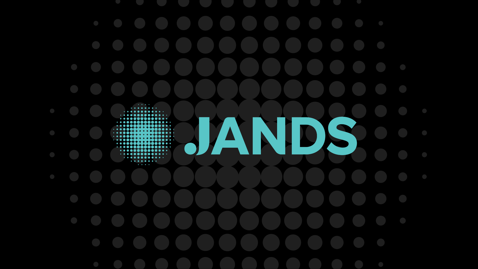
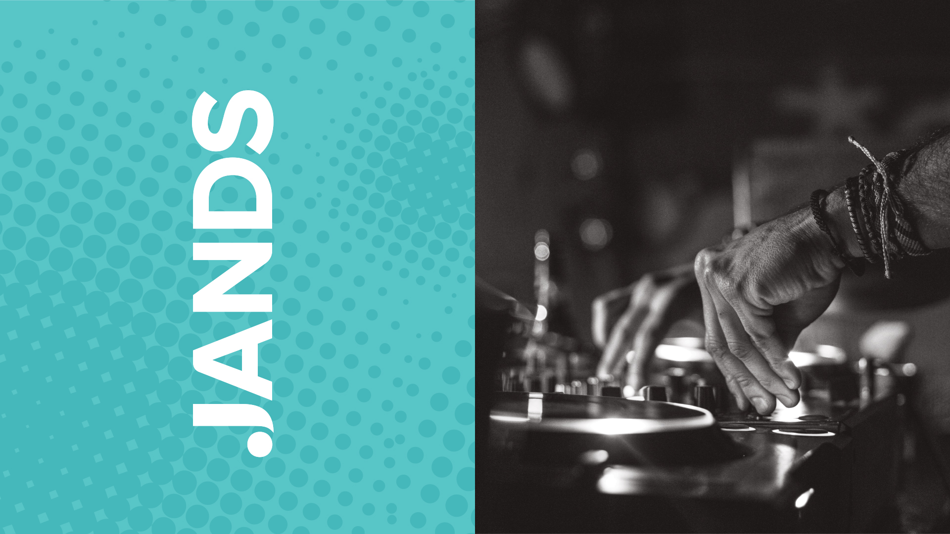
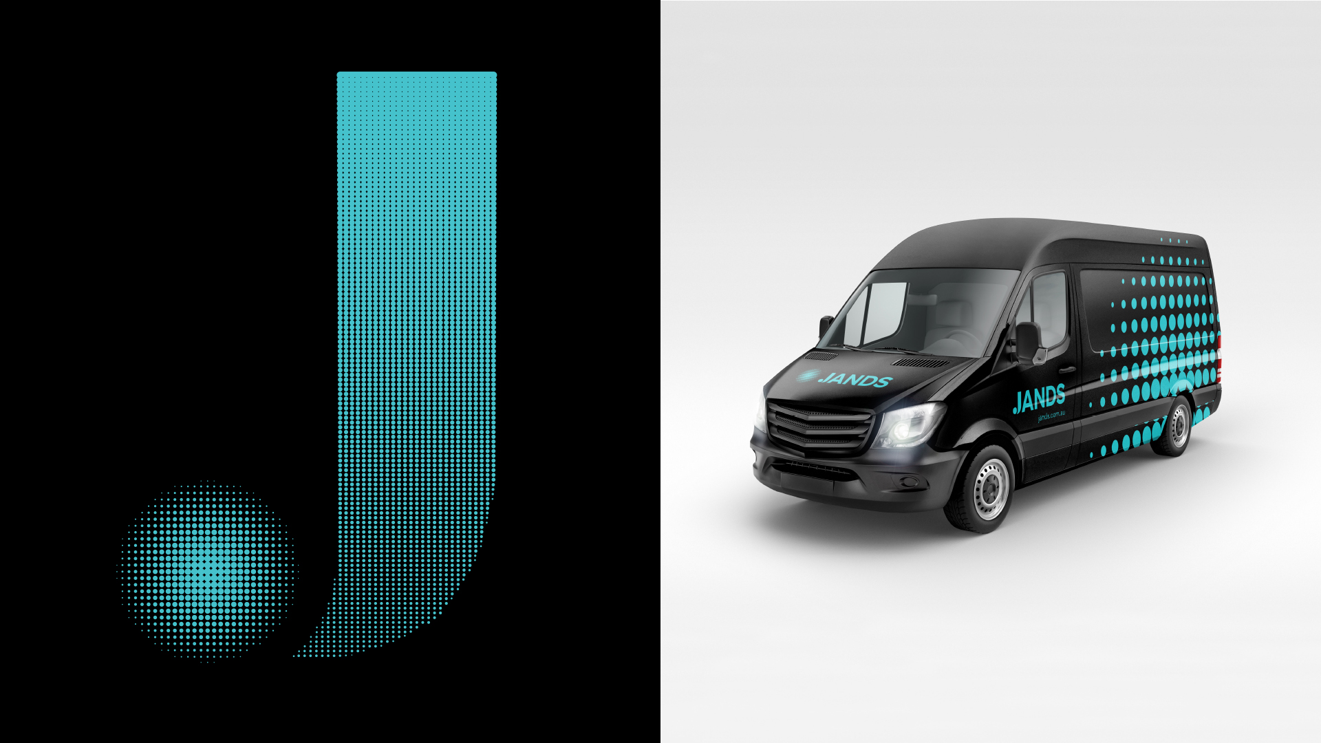
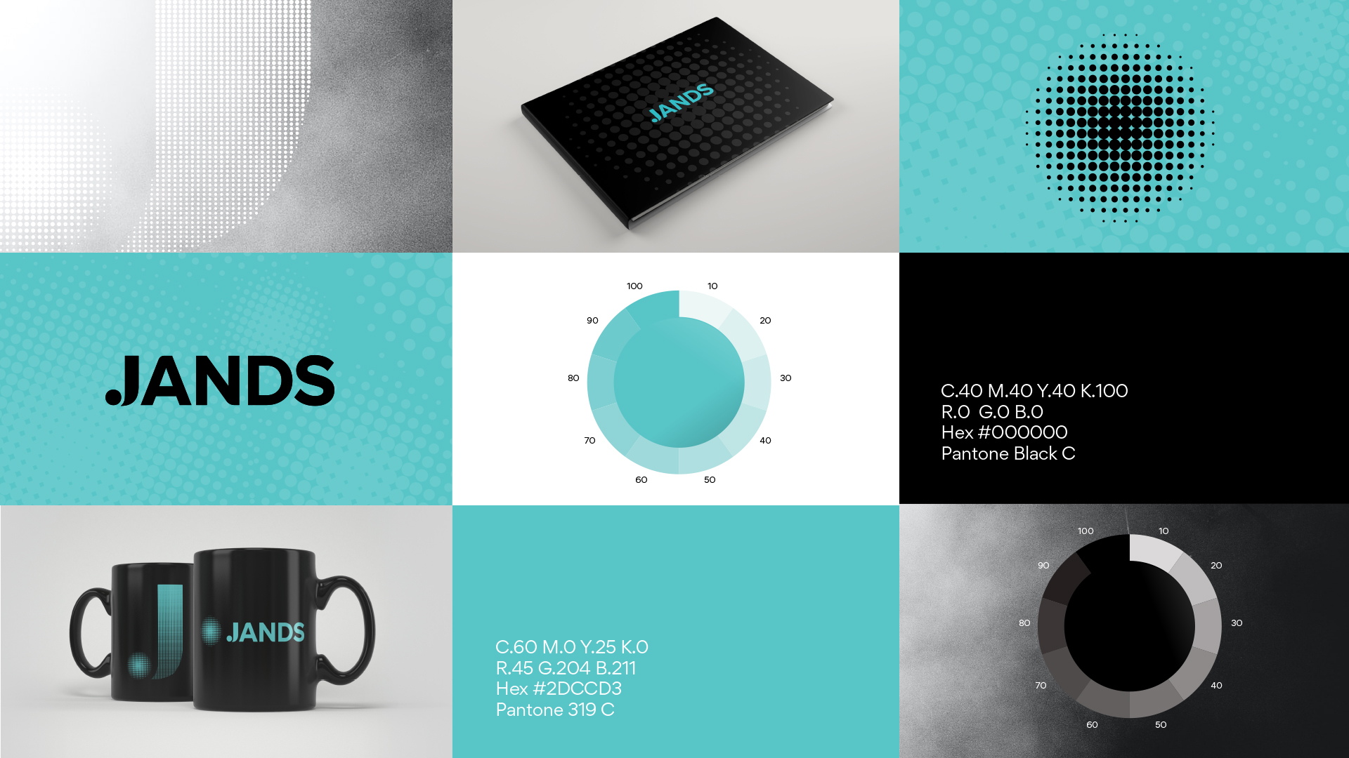
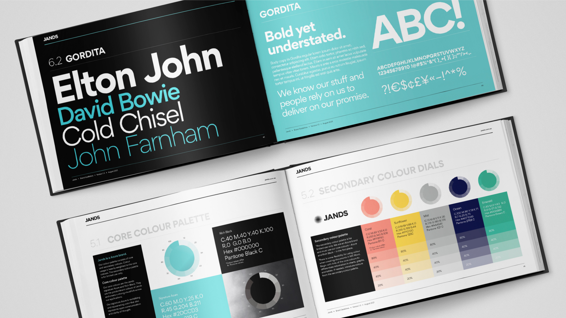
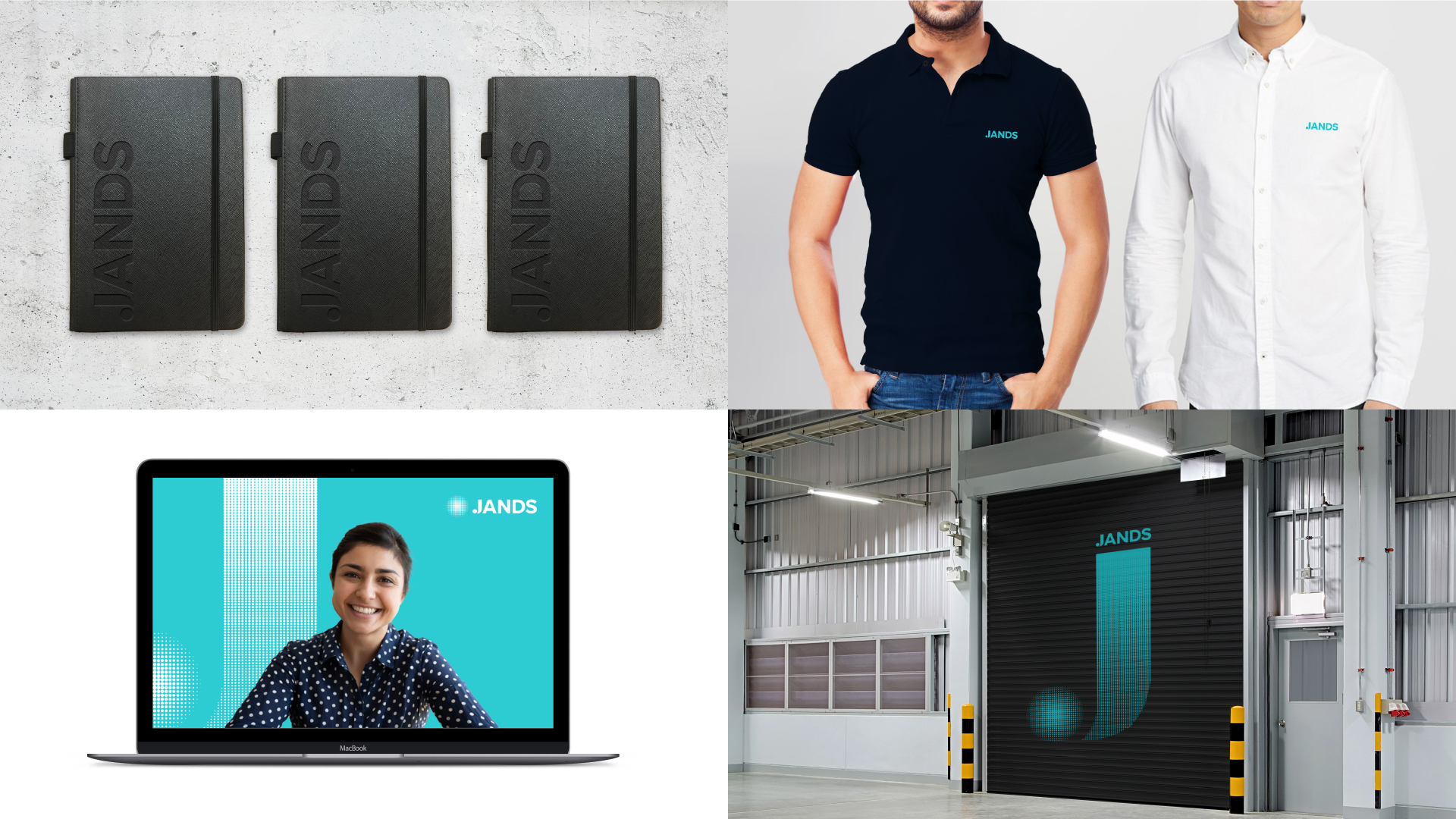
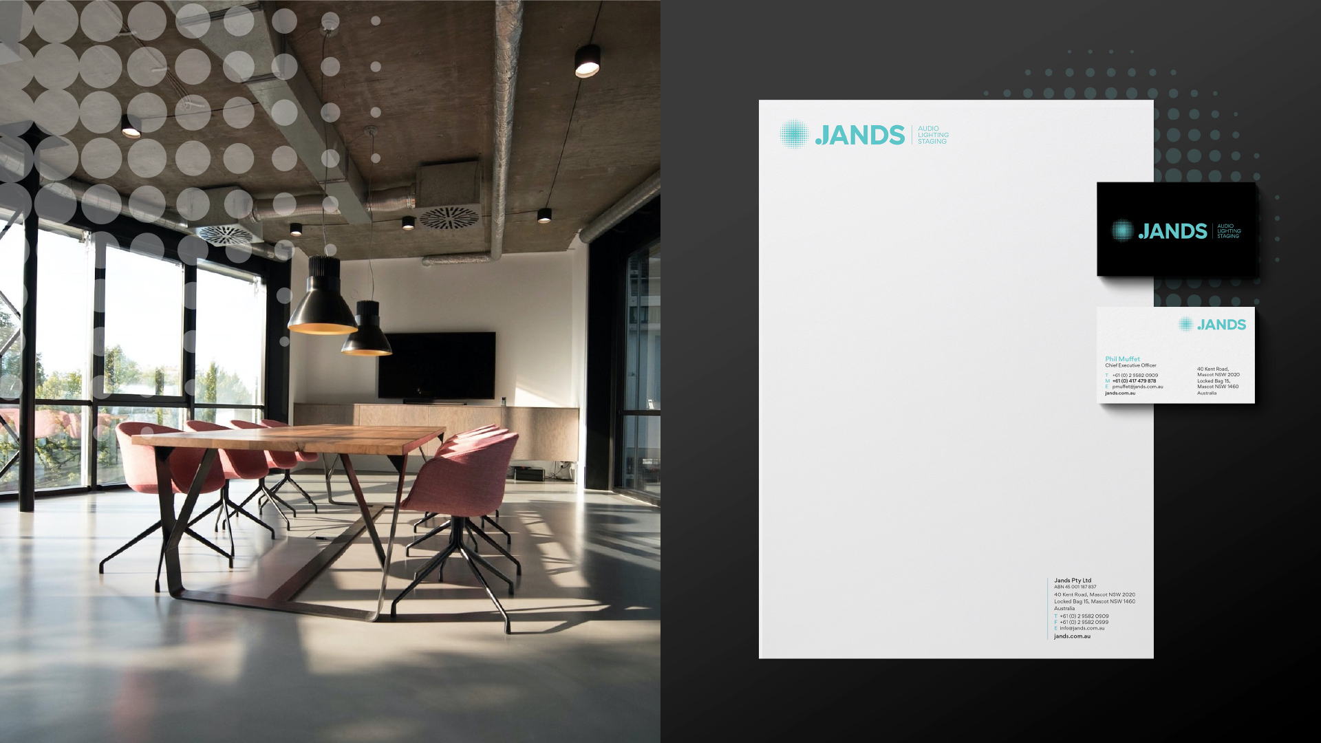
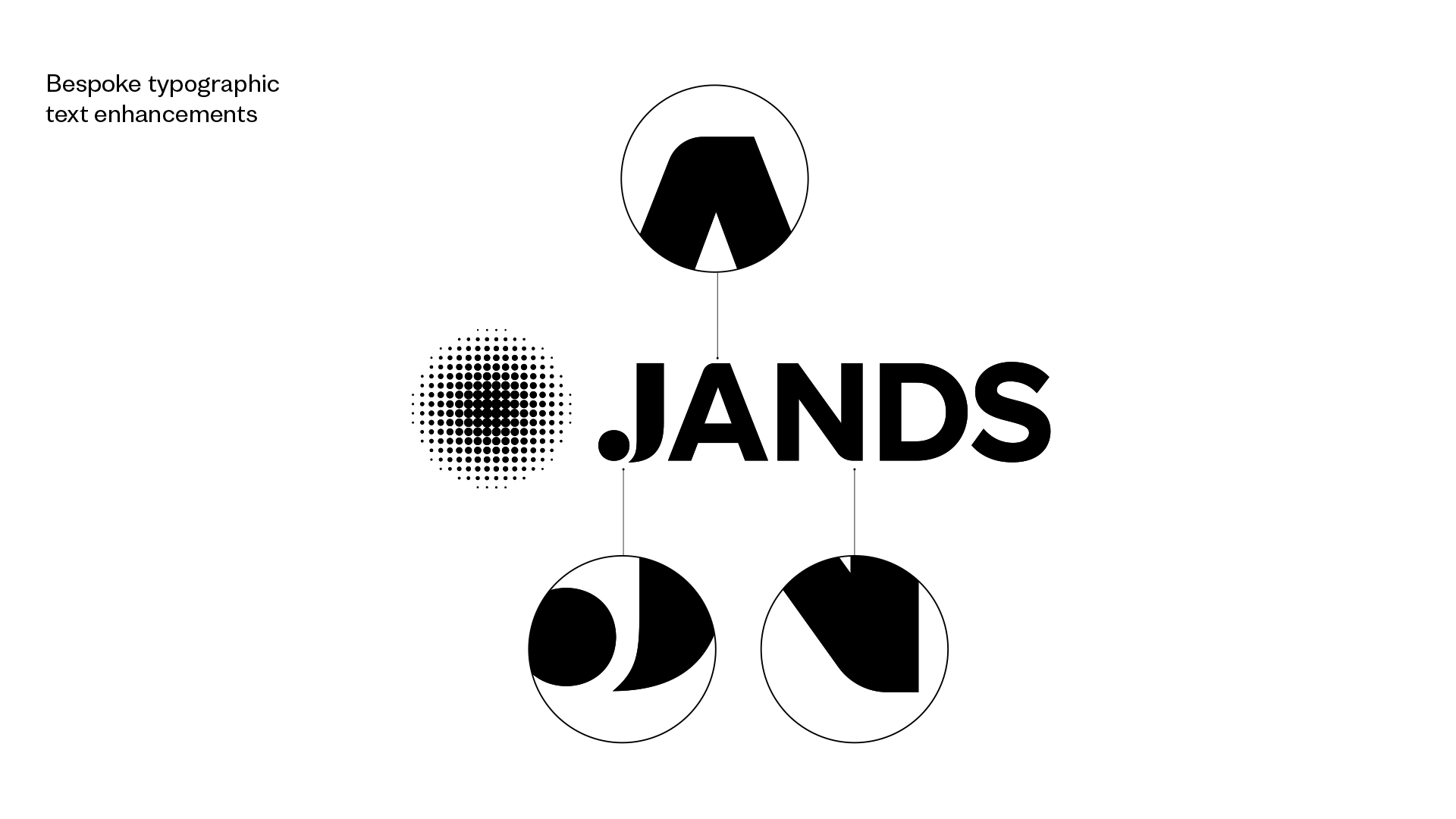
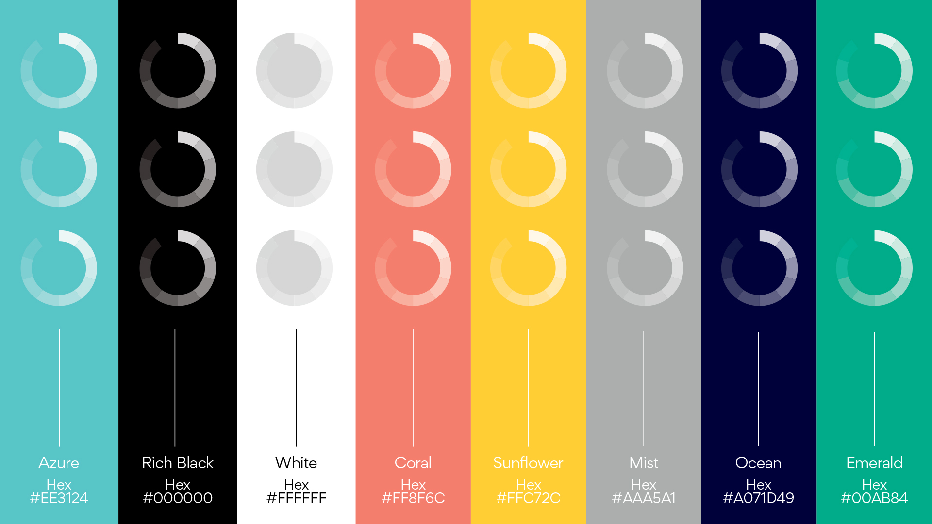
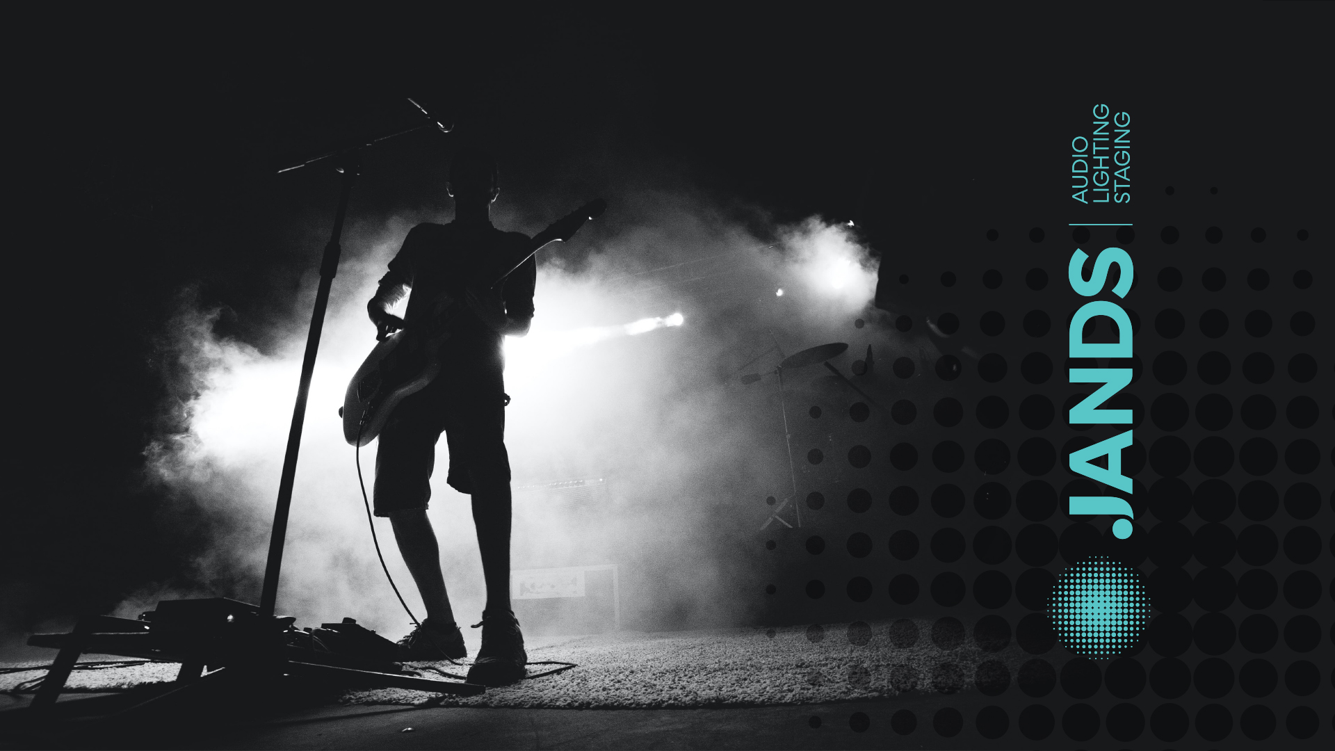
Image Credit :
Project Commissioner
Project Creator
Project Overview
Since 1970, Jands have stamped their mark on the performance industry. To reflect that, we took a bold typographic approach to the rebrand, delivering a hero graphic device that could be scaled up or down to suit their different communication pieces. Jands is behind the audio, lighting and staging solutions for leading music & stage productions, and retail & corporate presentation spaces throughout Australia and New Zealand. They celebrated their 50th anniversary in November 2020 and as part of that milestone sought a refresh of their visual identity. Our goal was to create a mark of distinction, every bit as strong as their brand reputation. We took our cues from the visual vocabulary of the music and performance world: Performance. Sound. Movement. Dramatic light. We delivered a comprehensive design system consisting of a logo device, halftone J letter form and mic device. All major touch points were considered and visualised to show the potential of their brand. The end result is best summed up by the client: “A really enjoyable process and a fantastic result.”
Team
Kylie Gould, Creative Director Dan Clark, Design Director Sofia Merkoureas, Design Manager Tracy Jack, Senior Designer Kasia Froncek, Senior Designer Patricia Lima, Digital Designer Rachel Nicholls, Graphic Designer Catarina Campos, Animation Designer
Project Brief
Jands wanted to refresh their brand identity to reflect the future of their business, but it was critical to retain the equity of the past 50 years. It was our task to make the connection between their heritage and future direction. The design criteria were to reflect the core brand values – value, security and performance – and communicate the brand promise ‘Jands is the quality solution’ through the brand development. Our comprehensive immersion and research revealed opportunities to stand out through the use of colour, movement and light. We wanted to explore ways to interpret ‘performances’ graphically through the brand design; and to leverage the application of multi-dimensional graphics to reflect the variety of user experiences associated with their industry.
Project Innovation/Need
How do you reflect the future without losing the heritage and equity of a brand identity that is 50 years strong? We zoomed in on the J letter form and integrated the shapes and forms of musical notes. We further enhanced the letter form with a halftone circular motif to round off the foot of the monogram. We were inspired to create the halftone motif by the pattern and texture of microphones – what better way to represent ‘live events’ than the ubiquitous microphone! We saw it as an opportunity to create a distinct stamp for the brand, much like the stamp Jands has made on the industry over the years. The halftone microphone stamp – named 'the MIC' – was further developed into a key visual device of the new brand design. We continuously assessed our work against the key criteria. Did it retain some heritage from the existing visual identity? Did the logo stand out amongst its competitors? Did it show trust, security and quality?
Design Challenge
The current logo was over 30 years old and dated considerably. They were hesitant coming into the project as numerous attempts to get a rebrand project off the ground were unsuccessful. They needed a strong creative partner to guide their leadership team and set a new design direction. Our first goal was to make our client feel confident that we could accomplish what they wanted. We worked closely with the business owners to write the brief and set clear design criteria to ensure the core brand values and brand promise was expressed through their visual identity. Jands enjoyed working with a studio who collaborated to produce a fresh, vibrant brand and helped implement it.
Effectiveness
The rebrand was launched internally at the company’s FY22 Strategy Meeting. Based on the feedback from the CEO, the initial response has been great and the launch video we produced was a hit. We continue to work with Jands to help embed the new work internally and have just completed their new brand guideline. “Many thanks to you and the Creatik team Kylie. The initial reaction has been great, and the launch video was truly unexpected. It set the tone of both the brand launch and our FY22 company strategy meeting. A very sincere thank you from me personally. Such a change for any business is a difficult process to navigate. Your patience and understanding of this really made for an enjoyable process and has delivered a fantastic result.” - Phil Muffet, CEO, Jands Pty Ltd.
Graphic Design - Illustration and Type
This award celebrates creativity and innovation in the traditional or digital visual representation of ideas and messages. Consideration given to clarity of communication and the matching information style to audience.
More Details