Key Dates
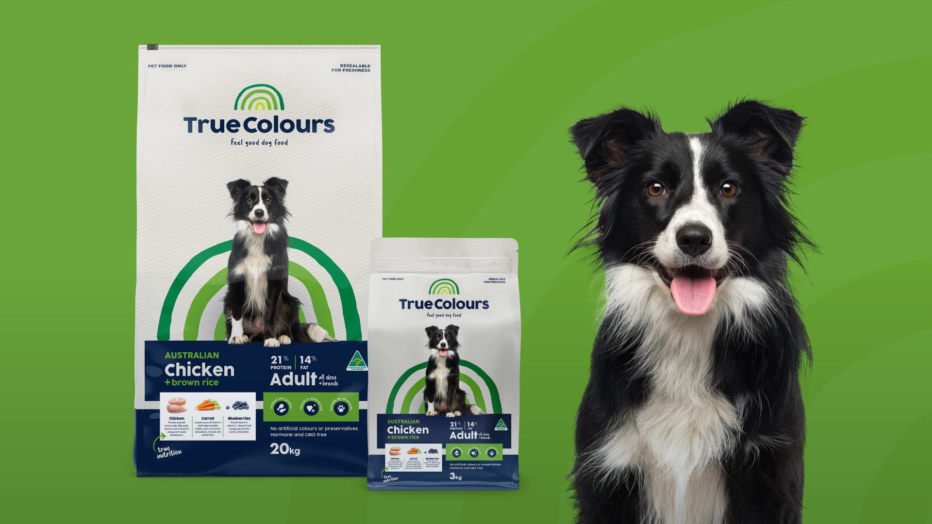
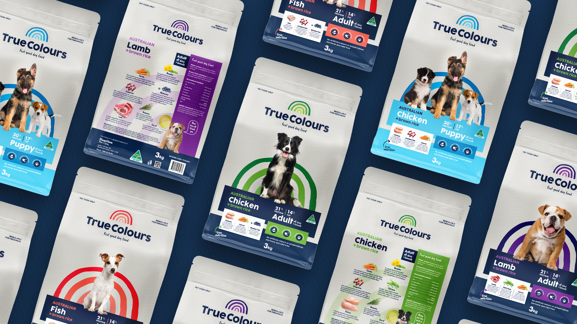
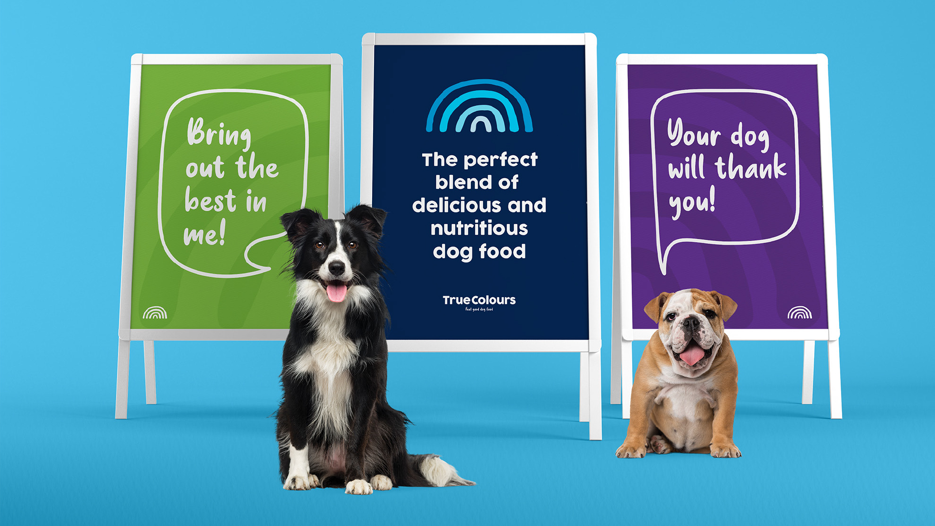
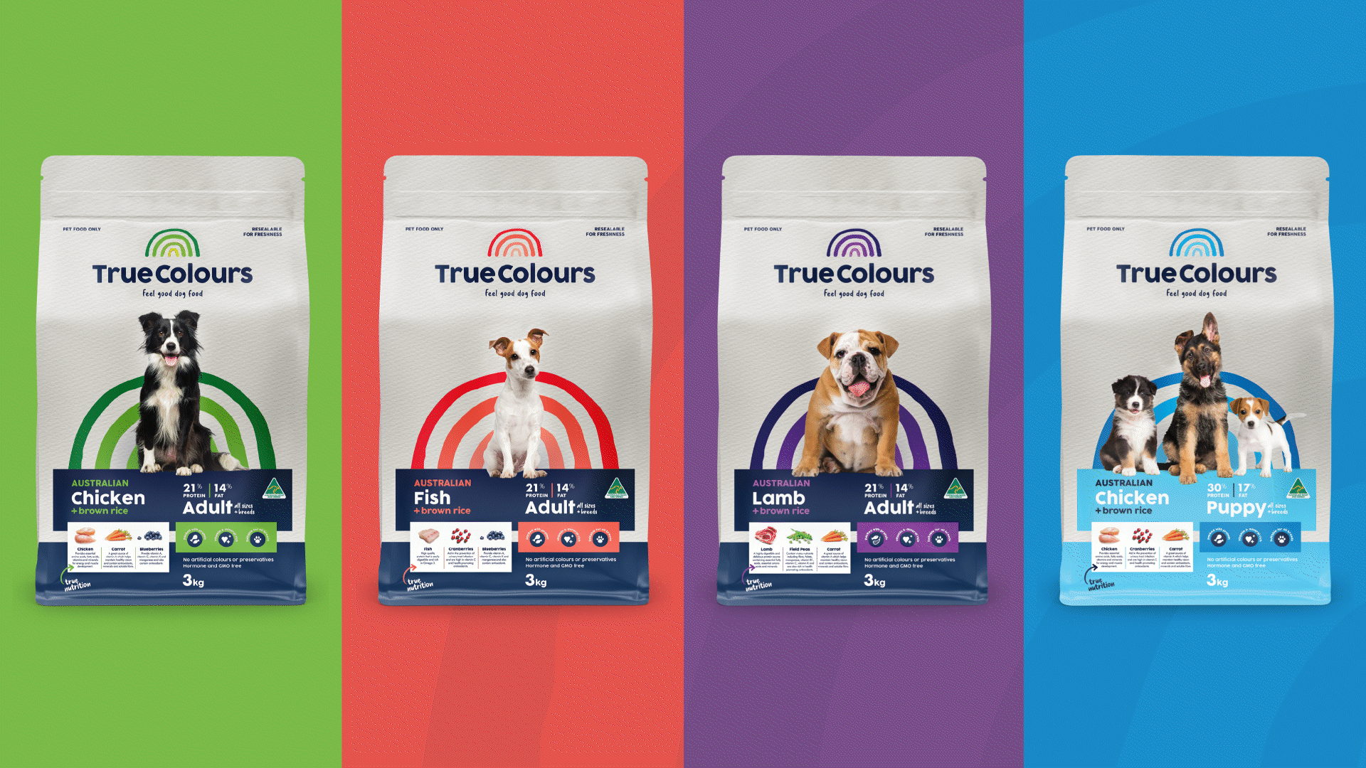
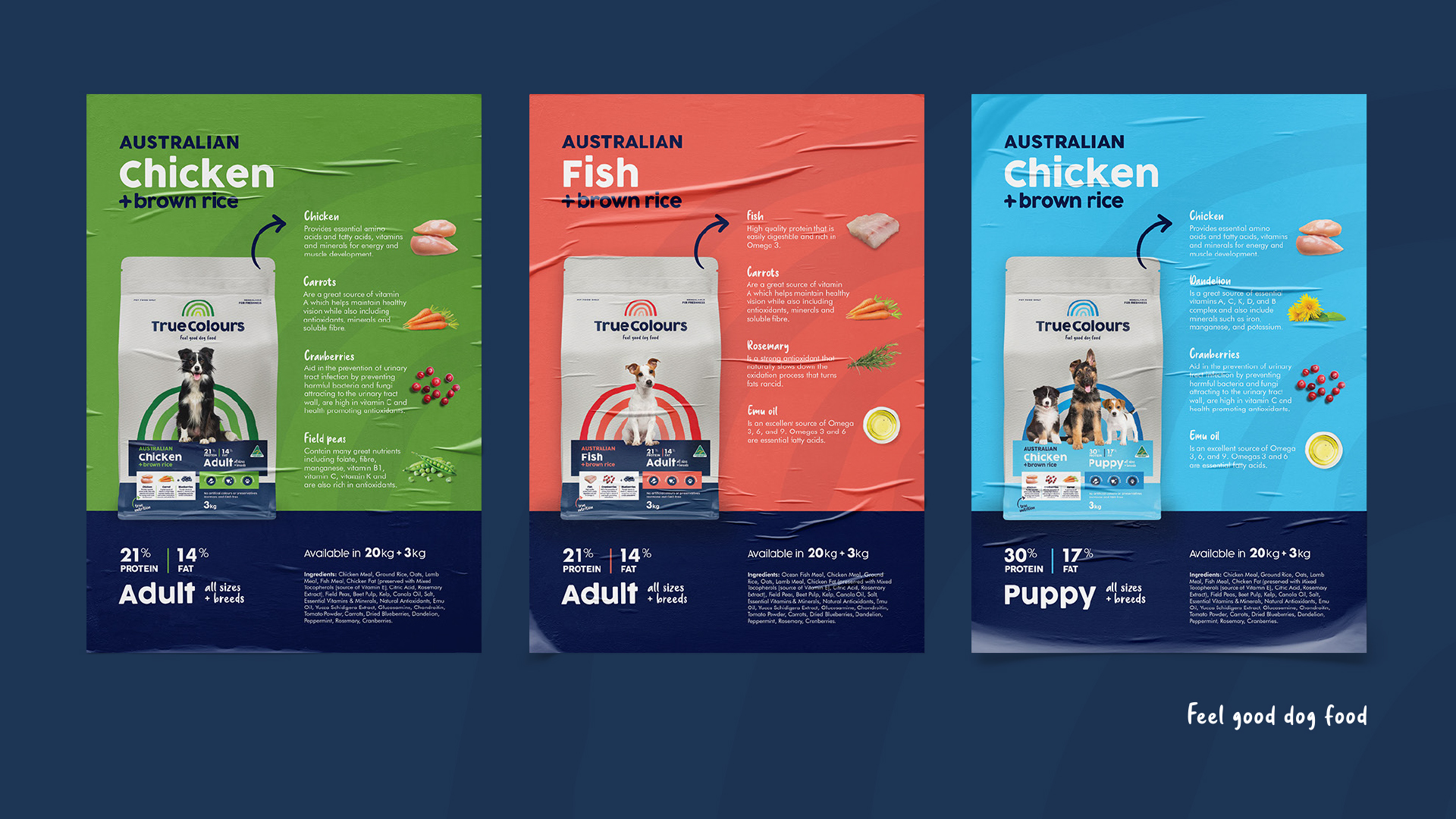
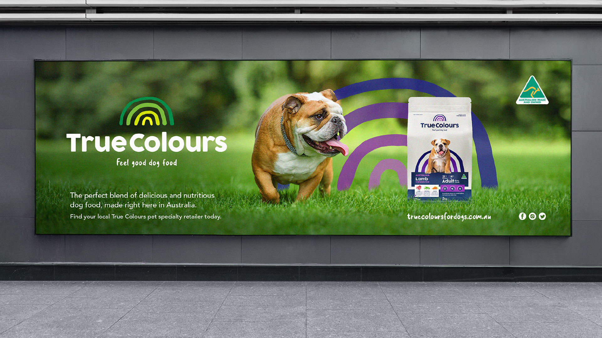
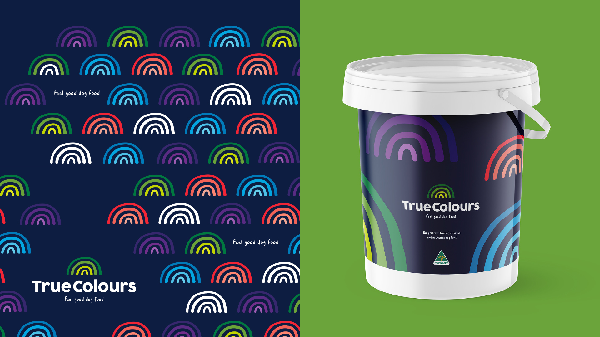
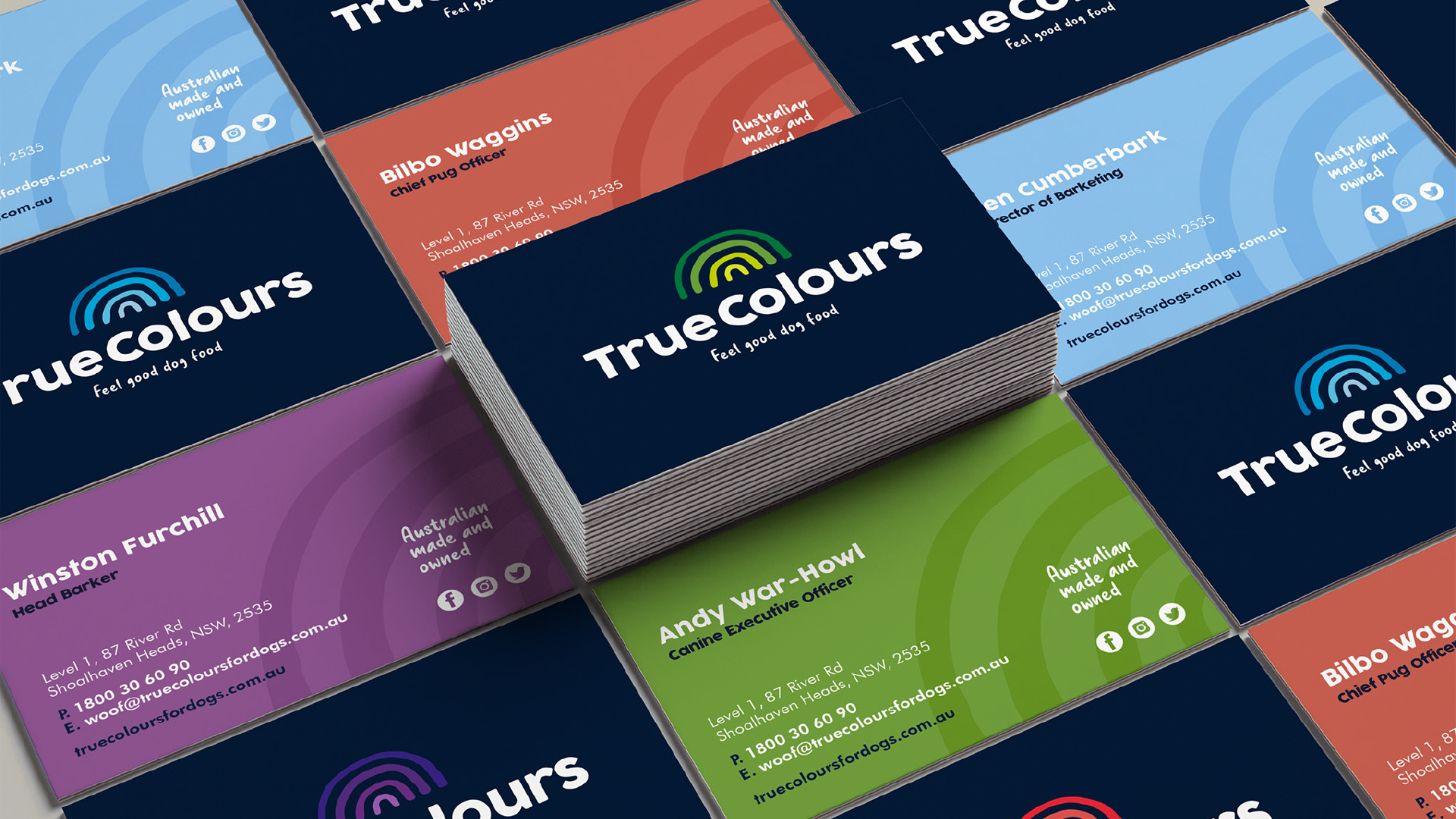
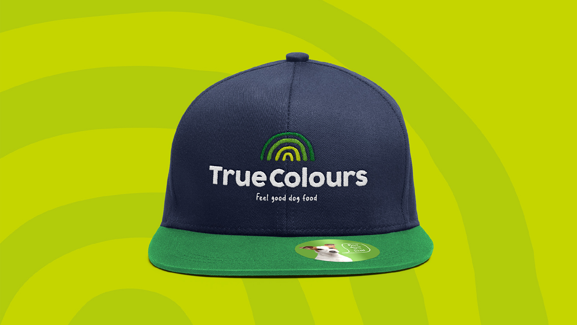
Image Credit :
Project Commissioner

Project Creator
Project Overview
Welcome to True Colours - the home of Feel Good Dog Food. 'You are what you eat' could’ve been coined for True Colours dog food. If you want your best friend to be fit and healthy, you need to feed them good quality, super nutritious food. Knowing this and considering Australia's pet industry is worth an eye-popping $13 billion, the founders of True Colours identified the need for a mid-tier, locally sourced, high-quality dog food. They approached Creatik to design the brand and packaging in 2020. It had to be eye-catching and at a glance convey their commitment to the best locally sourced Australian ingredients, specially formulated to bring out the best in every dog. Creatik considered every element of the packaging, from the branding, to finding the right words for the brand and creating ‘shelf presence’ on pallet displays, colour coding the flavours and sourcing imagery to pair dog’s with personality to each recipe. The result is a consistently branded system that stands out for all the right reasons and brings a smile to mind
Team
Kylie Gould, Creative Director Dan Clark, Design Director Sofia Merkoureas, Design Manager Tracy Jack, Senior Designer Kasia Froncek, Senior Designer Catarina Campos, Graphic Designer Rachel Nicholls, Graphic Designer Louise Thomas, Copywriter
Project Brief
Our brief was simple. “We need our packaging design to stand head and shoulders above the rest.” The client had already established a successful super-premium dog food brand. Their strategy with True Colours was positioned at more of a mid-tier segment, so it was important to make the distinction clear and send the right signals to resonate with what the target audience were seeking. Considering that successful mid-tier foods are all about establishing trust, and that many brands in this space are owned by large multinational corporations, it was important to showcase the ingredients front of pack and emphasize their Australian Made & Owned credentials. A further consideration from the outset was how the packs would present in retail. Product is displayed in a variety of ways including floor stacks, pallet stack and on shelf - so it was vital that all sides of the packaging clearly communicated the brand message and important purchasing cues.
Project Innovation/Need
Our competitor research revealed a trend towards extensive use of black, an emphasis on ingredient photography but a lack of brand personality. With this in mind, our approach was to make an impact and resonate with shoppers by creating a brand full of character and positive, healthy vibes to create a ‘feel good’ brand experience. Our goal was to use the packaging to declare the business and brand values up front and centre. To show the company’s commitment to being transparent and true to its ingredient philosophy and in doing so, building trust with consumers. Every aspect of the packaging design from colour, to font, to tone of voice, is designed to deliver the brand promise. And in doing so, strike a balance between creativity and effectiveness. Our design team were on hand to support the new venture by creating marketing materials to support their business development activities. The packaging design is activated across supporting assets such as pallet wraps, shelf headers & tickets, website, social media assets, vehicle livery and brochures. Compared to other products on the market, the final design is bold, engaging, and clearly differentiated.
Design Challenge
To communicate the essence of the brand, we came up with the tagline 'Feel Good Dog Food' and extended the feel-good tone of voice through a series of speech bubbles. For example, ‘Bring out the best in me’, ‘Paws down the best!’, ‘Your dog will thank you’, and ‘Did someone say food?’ Taking our cue from the name, we explored nature's true colours and rainbows came to mind. We added a modern twist by using tonal colors to streamline the effect and give products a distinct look. Adding a subtle texture to the pack emulates the appearance of watercolour paper - also inspired by the association of the name with colours and paint.
Effectiveness
“When presenting True Colours to our retail partners for the first time, all feedback has been excellent. Consumers have also loved the brand with such a great balance of quality and fun. The True Colours brand the team at Creatik have developed for us is fresh, vibrant and strongly communicates our key call outs of being a high quality, Australian Made & Owned brand for dogs. From the original brief, Kylie and her team have far exceeded our expectations every step of the way to deliver what we believe is by far the best-looking mid-tier dog food brand available in Australia.” - Rodger Muller, True Colours founder.
Graphic Design - Three Dimensional
This award celebrates creative and innovative design in traditional or digital visual representation of ideas and messages used in packaging. Consideration given to: clarity of communication and the matching information style to audience; the approach, including marketing and branding concerns, the dynamics of the retail environment, environmental considerations, and legal requirements; the component parts of packaging graphics such as colour rationalisation, information layout, feel and tone of illustration and photography, and finishes, and how they are used in isolation and in relation to each other; and the relationship to the anatomy of the structural design.
More Details