


Project Overview
TransGrid operates the electricity transmission system, powering communities across the Eastern Seaboard. To accelerate Australia’s energy transition to a clean energy future, TransGrid wished to build the profile of its infrastructure services division, which enables more renewable generators and projects to connect to the grid. Capturing the innovative spirit and commercial acumen of the ‘business growth’ team, we transformed an internal business unit into a progressive market-facing brand, which has the confidence to lead the energy transition and be a compelling choice for customers.
Project Commissioner
Project Creator
Team
Renee Stekel, Senior Account Director
Moensie Rossier, Strategy Director
Simon Wright, Executive Creative Director
Hamish Cargill, Director, Brand Voice
Alex Menyhart, Writer
Agus Wijuya, Designer
Darren Swain, Creative Director
David Cunningham, Head of Production
Ben Williams, Artworker
Project Brief
Amidst stiff competition, the new brand needed to stand out and put a firm stake in the ground around its commitment to creating a smarter energy future. We set the foundations for a brand that would create opportunities and make extraordinary things happen for customers, no matter how ambitious or complex their needs. A new positioning, identity, and name were required to establish the brand with the necessary modernity, technological capability and renewable energy credentials to appeal to customers at the vanguard of rapid changes in the energy industry.
Project Innovation/Need
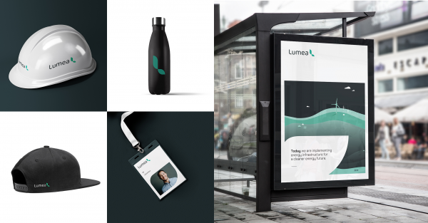
Principals developed a brand strategy for an enterprising, forward-thinking and customer-focused organisation, defining brand drivers and a customer value proposition around the organising brand idea, ‘making tomorrow’s solutions, today’s business.’ Principals’ brand voice agency XXVI developed a new narrative and name, LUMEA. Well-rounded and not overtly masculine, the new brand stands out in the energy space, which is traditionally process-driven and descriptive. We focussed on the outcomes for customers and planet, not just the infrastructure. Altogether, these brand elements place LUMEA at the forefront of a transition to a clean energy future.
Design Challenge
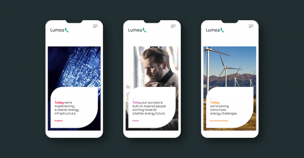
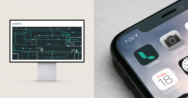
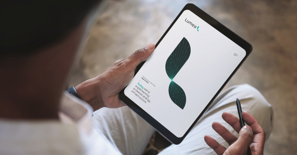
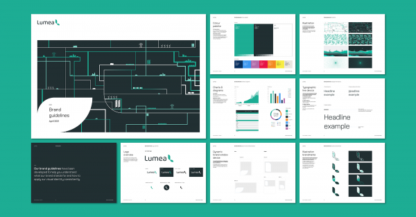
Built on an understanding of the committed innovators delivering this brand and the needs of their progressive ‘green’ customers, our design direction reflects an organisation of pioneers, who make great ideas a viable reality. Challenged to reflect innovation without resorting to typical tech or digital cues, our environmental awareness influenced the look and feel. The colour palette and leaf design evoke the natural green power of renewable energy. The brand mark can incorporate illustration to add variety and works well as a repeating pattern for a great backdrop, or for use in brochures. It also inspires a unique, dynamic window device that’s flexible across a number of layouts and formats. LUMEA’s use of teal and slate is distinct from the TransGrid green, ensuring the separation of the new commercial brand, while nodding to the family heritage. All in all, the bold new LUMEA brand provides aspirational stretch to help an ambitious internal business unit evolve into a competitive and commercial powerhouse, playing a pivotal role in the energy transition.
Effectiveness
The new brand has energised the launch of an internal business unit to the market, at the same time as building cultural momentum and pride among LUMEA staff, who now have their own identity, story and tools to market their innovative services more effectively to receptive customers.
LUMEA CEO Richard Lowe said: “The LUMEA brand positions us strongly to continue to expand our business, provide breakthrough infrastructure solutions to customers and commercialise new technology initiatives. We’re very proud of our new market-facing identity.”
Graphic Design - Identity and Branding
This award celebrates creative and innovative design in the traditional or digital visual representation of ideas and messages. Consideration given to clarity of communication and the matching information style to audience.
More Details