


Project Overview
‘We’ve been around for 180 years’ isn’t in itself a compelling proposition. Making heritage meaningful for clients – in terms of trust through experience, expertise and safety – whilst demonstrating the visionary and future-focus of the organisation and the insightfulness of advisers in the present, often feels like the holy grail for well established brands looking to evolve their brand identity and voice.
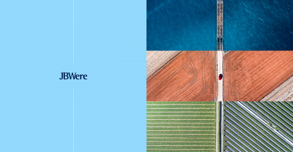
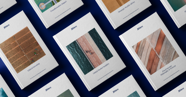
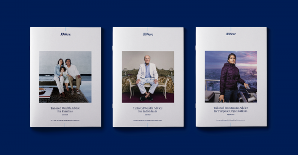
For JBWere, we reinvigorated a tried and tested strategy of ‘putting wealth to work for generations’ by injecting storytelling into aerial photography (used to demonstrate the omniscient perspective), supporting that with warm, authentic portraits (that reflect clients and advisers), and a graphic device to support the logo, another navigational element outlining a clear path to help clients to put their wealth to work for generations.
Project Commissioner
Project Creator
Team
Simon Wright, Executive Creative Director
Wayde Bull, Planning Director
Hamish Cargill, Director, Brand Voice
Aimee Coleman, Business Director
Ashley Ng, Account Director
James Welch, Design Director
Dan Bradley, Director, AlphaLab
Mark Li, Digital Designer
Yolanda Koning, Design Director
Jordan Demetriou, Designer
David Cunningham, Head of Production
Ben Williams, Artworker
Lisa Wilson, Senior Writer
Amy Cameron, Writer
Dane Collins, Creative Artworker
Project Brief
The creative challenge was to refresh the brand identity and voice to celebrate the unique homegrown heritage and values of the JBWere brand whilst demonstrating a confident move into the future.
The brief was to evolve the brand identity in a way that is modern and stands the test of time, is digitally focused and accessible, and:
• appeals to a younger generation of wealth, as well as clients transferring wealth to future generations
• communicates heritage with relevancy for clients
• appropriately reflects valued partnerships with clients
Project Innovation/Need
Breathing vibrancy and visual storytelling into the JBWere brand which over time had lost its distinctiveness in a market where traditional premium brand codes and expected portrayals of what traditional wealth looks like (grey haired males sailing yachts into the horizon) prevail. Bringing clients into the identity exploration process – to test and learn about the new expectations of high and ultra-high net worth clients – and then delivering brand tools to help support the experiences they know to be true.
Design Challenge
Clients invited into the strategy, identity and narrative validation process gave the brand permission to be bolder in visually articulating the often decades-long relationships between advisers and clients. There was an agreement from them too, that demonstrating the valued wealth strategy expertise (built on a 180-year heritage and a firm focus on the future) was important to connecting the brand with its audience. The use of aerial photography within the brand toolkit plays a key role in the visual storytelling - through clear pathways from point A to point B at a macro level, and close up portrait photography style at a micro level focusing on clients and advisers - and the consistent use of a graphic device supporting the logo. The overarching impact of these key distinctive elements seeks to reaffirm the heritage and navigation expressed in the view-from-above style of photography, and culminates in helping to make meaningful – through stability, trust and constancy – the brand’s unique heritage.
Effectiveness
The refreshed brand identity along with digital-first internal tools and templates have helped staff, clients and prospective clients understand how JBWere’s heritage impacts their ability to provide local expertise with global reach, stability having weathered many economic storms, and has translated that established foundation into trusted relationships measured beyond years into decades.
Approaching the website with a simpler, more client focused information architecture (service-led rather than business unit-led), has streamlined the content and made it more digestible and easier to find.
Graphic Design - Identity and Branding - Finance
This award celebrates creative and innovative design in the traditional or digital visual representation of ideas and messages. Consideration given to clarity of communication and the matching information style to audience.
More Details