


Project Overview
ARKLIFE develops, owns and manages residential communities, designed and operated specifically for the rental market. They believe their communities will enable people to enhance the way they live, provide all the conveniences, security and comforts of home and the opportunity to network, socialise and have fun together. Metropolis was appointed to develop the brand and communication tools to launch the business.
Project Commissioner
Project Creator
Team
Brand Strategy - Mei-ling Billing
Head of Design - Matt Cullen
Senior Account Manager - Barclay Rabbidge
Production Manager - Leesa Morgan
Project Brief
Develop a strategic brand to launch ARKLIFE as an experienced team committed to a vision of creating positive, inclusive and vibrant communities with the resident at the centre of all they do.
It was imperative to clearly define a plan for how we would establish a master brand that was connected to and supported by a geographically diverse portfolio of assets targeted at an equally diverse range of people.
Project Innovation/Need
Operating in a relatively new category in Australia (Build-to-rent) ARKLIFE customers don’t know what they are missing. They don’t know how living in an ARKLIFE building will impact their lives for the better.
Once the category matures in Australia, we could see there will be little differentiation between operators as there is currently in the UK and US. So our challenge was to set the benchmark for this category in Australia. To create a brand that communicates more than just what amenities, or what services are on offer. A brand that connects with our customers (residents) and who they aspire to be and how they want to live.
Design Challenge
Our challenge was to create a master corporate brand that reflects to a business audience, a clear vision and plan for each destination. The branding needed to portray a reliable, honest and trustworthy partner/operator that will deliver quality product and experiences for future tenants. While also having the flexibility to connect to the aspirations of potential tenants across a wide range of national locations and demographics - all with a cohesive consistency that binds all of our communication and assets together.
To achieve this outcome, we began by researching other categories/businesses that face similar challenges such as large hotel groups.
Effectiveness
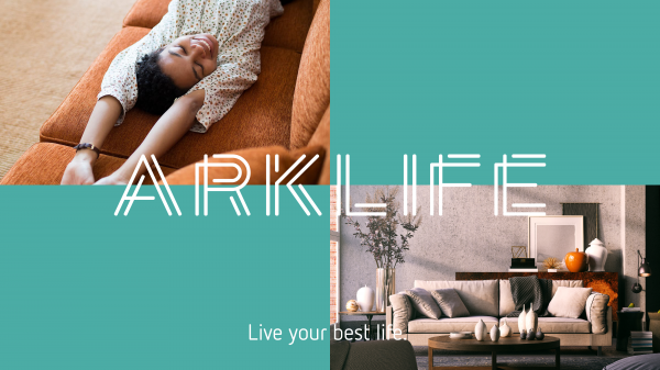
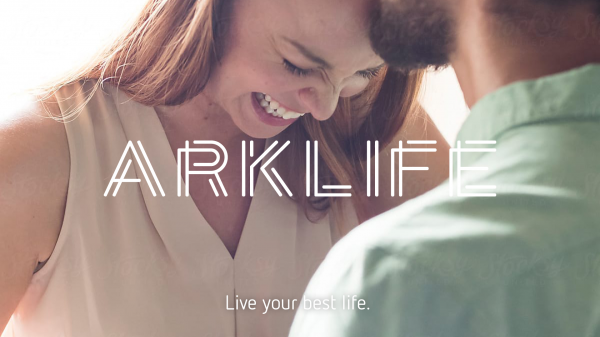
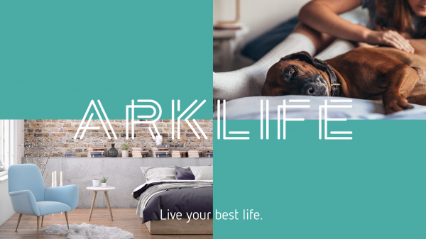
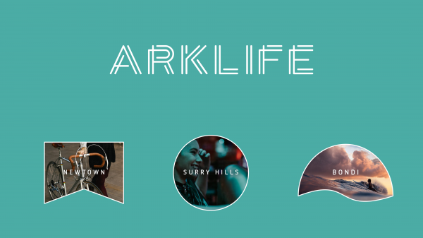
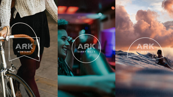
The brand developed for ARKLIFE has a fresh contemporary feel. The animation of the logo reflects the concept of people from all backgrounds and stages on their own life paths finding their community and perfect home in an ARKLIFE destination. We created brand visual cues through distinctive shapes or 'key holes' and hero images for each destination that all connect to the master corporate brand. This allows us the flexibility to build branded destinations that reflect a specific location and target demographic, while still building on the master brand recognition.
Graphic Design - Identity and Branding - Community
This award celebrates creative and innovative design in the traditional or digital visual representation of ideas and messages. Consideration given to clarity of communication and the matching information style to audience.
More Details