


Project Overview
For the wider Network 10 rebrand to have a full impact, we needed to apply it across all of the brand's key elements.
We were given the opportunity to work with the 10 News team on a full rebrand of their national news offer - instilling a renewed sense of confidence and modernity, capturing the fresh take 10 have on News.
Project Commissioner
Project Creator
Team
Simon Wright - Executive Creative Director
Wayde Bull - Planning Director
Renée Stekel - Senior Account Director
Hamish Cargill - Brand Voice Director
Lisa Wilson - Writer
Carolina Relander - Designer
Agus Wijaya - Designer
Hayden Mathys - Motion Graphics
Dean Varndell - Motion Graphics
Ross Dagan - Network 10
David Bernstein - Network 10
Mohammad Hassan Taskhiri - Network 10
Karen Song - Network 10
Project Brief
Ten Eyewitness News: First At Five needed to be reset and future proofed for national leadership and to align with the exciting changes that were taking place as part of the Network's rebrand.
Our brief was to explore the way 10 could deliver News with a new found sense of confidence and boldness.
Firstly, the name Ten Eyewitness News: First At Five was identified as ageing and 'of the 1980s'. Our brief was to develop a name that captured some of the strong legacy, but felt fresh and trusted.
The Eyewitness News identity had many of the same issues as the name. Our brief was to refresh the visual identity across its entire graphics package and set design.
Project Innovation/Need
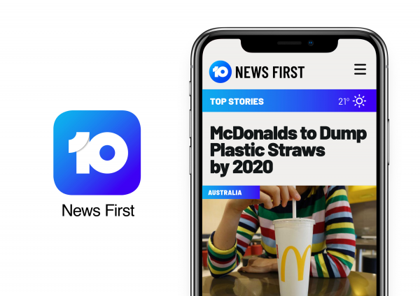
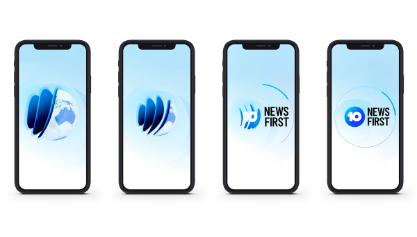
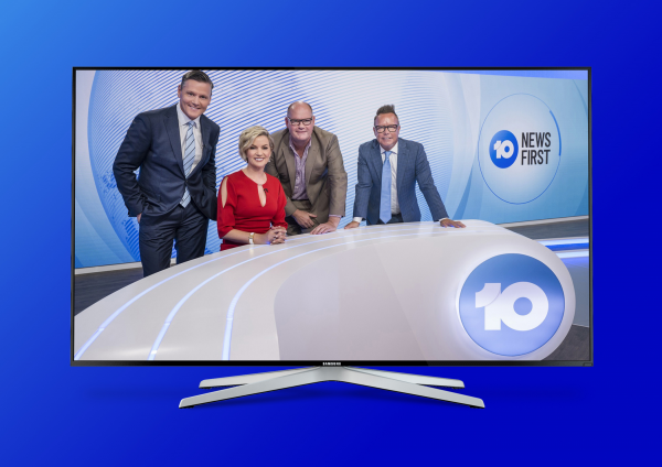
We created a bold, brave new name -10 News First. The name underpins the ethos and passion of the 10 News team. It also carries forward the leadership (First) idea that was part of the existing name.
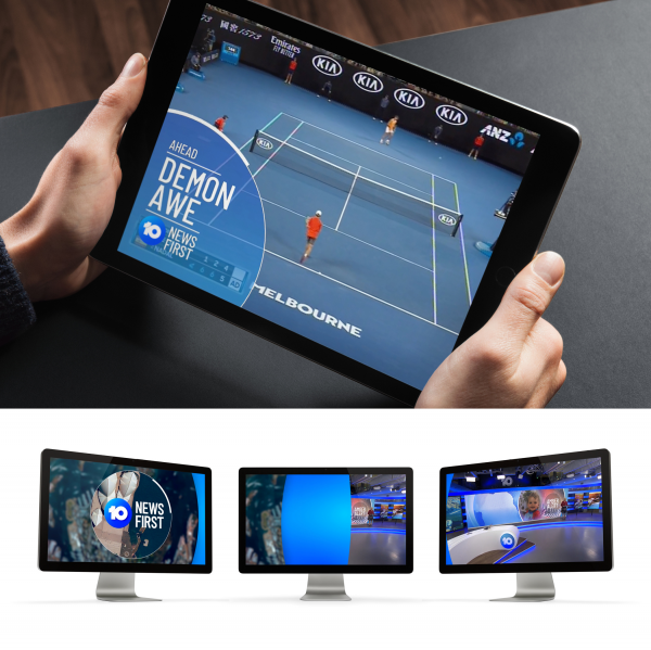
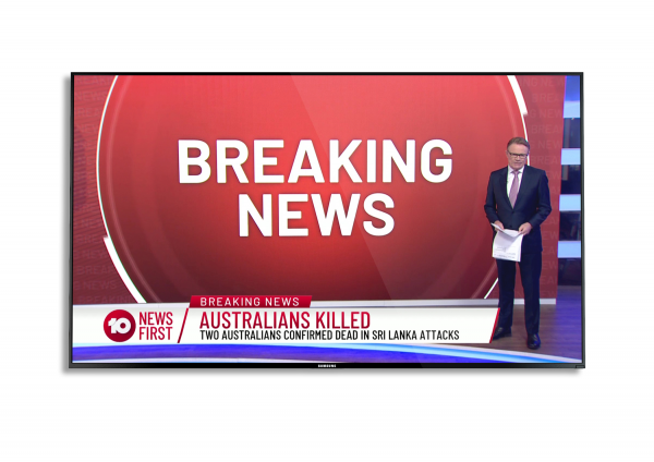
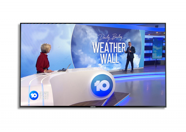
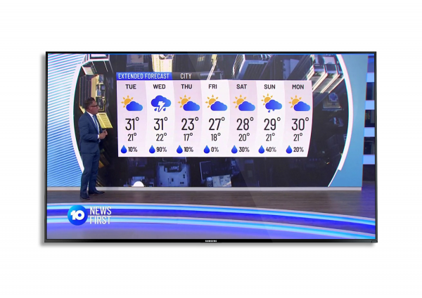
The visual identity created for the graphics package was white and blue, fresh and modern, positioning the program away from its competitors in the other free to air networks.
The approach to aerial imagery, the graphic language of the circular device of the 10 logo and the contemporary set design all worked together to increase the professionalism of the program.
Design Challenge
Ten Eyewitness News has been a legacy name for quite some time at 10. It's respected, stands for something in the market, and holds a lot of equity for the brand.
Our new name had to retain all the positive elements, while capturing the bold and brave elements of the network rebrand.
The rebrand of the News programming was developed in alignment with the bigger project.
There were certain design restrictions based on the tech platform required for live feeds during News programming. Breaking away from typical News conventions and graphic treatments took courage and confidence from our client at 10.
Effectiveness
The set design and refreshed identity has been hugely impressive internally at 10. Since the rebrand in October 10 News First audience share is up.
Graphic Design - Identity and Branding - Media
This award celebrates creative and innovative design in the traditional or digital visual representation of ideas and messages. Consideration given to clarity of communication and the matching information style to audience.
More Details

