


Project Overview
Network Ten. Known for being positively different, they'd lost their mojo and become an unhappy copy of the other commercial networks.
Our job was to help them recapture the fun and cheeky personality that drove the network’s greatest successes - uniting their growing array of channels and platforms through a strong masterbrand approach.
Project Commissioner
Project Creator
Team
Wayde Bull - Planning Director
Renée Stekel - Senior Account Director
Simon Wright - Executive Creative Director
Martin Hopkins - Creative Director
Hamish Cargill - Brand Voice Director
Lisa Wilson - Writer
Darren Swain - Creative Director
Hayden Mathys - Motion Graphics
Dean Varndell - Motion Graphics
David Cunningham - Production
Claudio Amati - Network 10 Head of Network Creative
Karen Song - Network 10 Art Director
Ed Holmes - Network 10 Head of Promotions
Project Brief
From its founding in the 1960s, 10 has always prospered when it has broken with the pack and offered Australians a refreshingly different viewing choice.
Under the confident ownership of CBS, 10 knew they were ready to trailblaze once more. This meant investing in a raft of fresh counter-programming concepts, strengthening their streaming services and reigniting their once famous larrikin personality.
We were asked to bring this strategy to life across their total platform, both visually and through their tone of voice.
From a voice perspective, 10 had become gradually more inconsistent. Their corporate communications were tired and dull, and their on-air voice was driven by programming rather than the brand. We took on the challenge of overhauling every aspect of their comms - from HR and PR, through to promos and digital. No one will ever call 10 boring again.
Project Innovation/Need
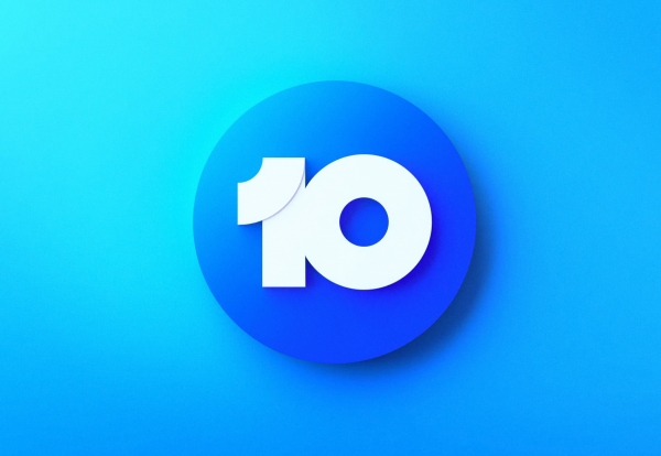
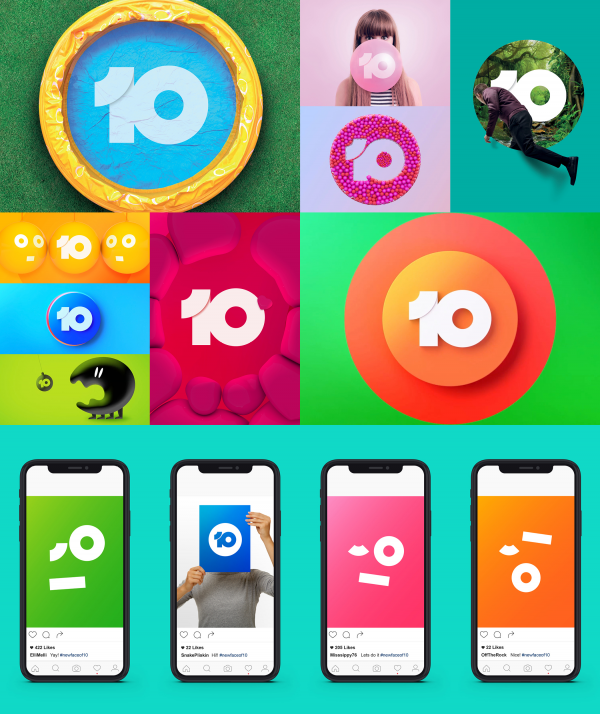
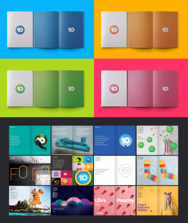
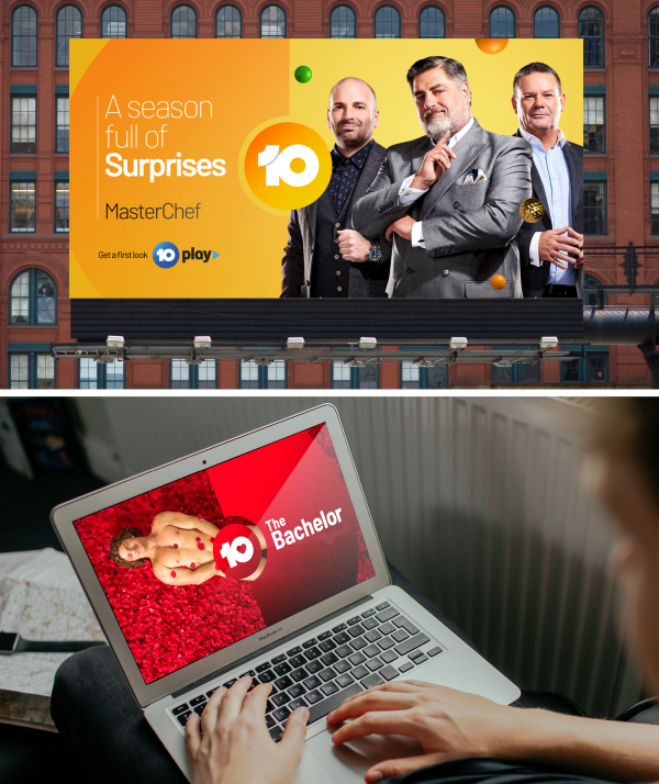
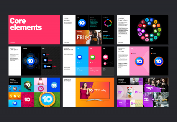
We developed a new take on the famous 10 button, creating something that feels fresh yet familiar.
We placed this button at the heart of the new identity system, across shared by all of the group’s channels and streaming platforms.
And we gave 10 a cheeky, slightly twisted voice that's unlike anything else in the Australian market.
Design Challenge
Viewers increasingly consume 10 content on catchup platforms [like 10 Play, 10 Daily and 10 All Access], as well as watch their multichannels like 10 Bold and 10 Peach.
This meant it was critical for all 10 channels and content to have an unmistakeable, vibrant family feel. Whatever you were watching, you had to know you were in the world of 10.
Effectiveness
The new brand was launched at the Network's upfront events at the end of October, helping 10 build fresh momentum with the marketing community.
The response from staff, viewers and advertisers has been overwhelmingly positive, and it's clearly given them the shot of energy they wanted.
Since launch the engagement and rollout across the business has been phenomenal. Across all external and internal comms, the various divisions of 10 are embracing the new identity and the distinctive strategy. It's highly visible on air and through catch up platforms, and is tightly connected to their new programming and sales efforts.
Graphic Design - Identity and Branding - Media
This award celebrates creative and innovative design in the traditional or digital visual representation of ideas and messages. Consideration given to clarity of communication and the matching information style to audience.
More Details