
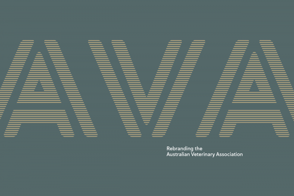


Project Overview
The Australian Veterinary Association is Australia’s only voice for vets association, and for over 100 years they have been advocating, lobbying, supporting and educating vets in every corner of Australia.
In the lead up to their 2021 vision strategy and repositioning they were looking to undertake a brand refresh to help them better connect with a younger audience of predominantly female vets rising up through vocational education and sciences.
Member survey feedback indicated that the AVA was becoming out-of-touch, tired and reactive to its members needs. The need was there for them to rethink its existence, and re-position itself as the leader within its industry.
Project Commissioner
Australian Veterinary Association
Project Creator
Team
Paul Taboure - Executive Creative Director
Gordon Eckel - Commercial Director
Tania Sacco - Senior Project Manager
Jon Zhu - Senior Designer
Trish Zielke - Designer
Project Brief
The challenge was to delve into market research to better understanding key member drivers and motivations around the brand and what it stands for.
AVA is Australia’s largest and oldest connected community for veterinarians so it was important for us to capture a strong sense of unity along with their rich heritage that echoed throughout our new collateral.
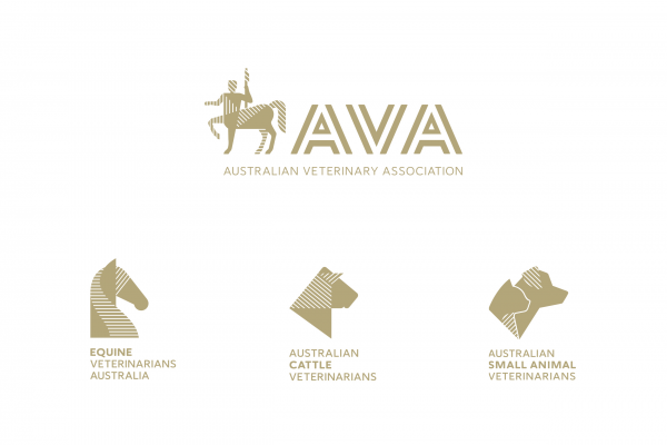
With multiple member stakeholder groups, we needed to undertake four brand workshops to educate, align and galvanise a group consensus. Whilst much of its existing brand was open to change, there was one element that needed to remain – the Chiron symbol (or better known as a centaur).
The Chiron is symbolised by the “wounded healer”, it represents our deepest wound and our efforts to heal it. Chiron was named after the centaur in Greek mythology who was a healer and teacher.
Project Innovation/Need
We developed an AVA tangram-inspired graphic language that could morph and re-configure and flex according to needs. We then created playful animal silhouettes to create customised picograms that could be used across new collateral.
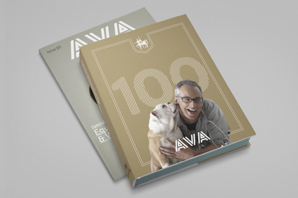
Deliverables included a new identity applied to stationery pack and new brand guidelines. branded pens & badges, USB’s, banners and an eDM template.
Design Challenge
The design challenge was to assess, and redefine the AVA’s brand architecture and its three major special interest groups; Equine, Cattle, and Small Animals.
Another sensitive challenge was managing stakeholders (scientists and animal doctors) wants and needs throughout the brand evolution journey.
The re-brand approach was to engage the client stakeholders by firstly understanding their challenges within the vet ecosystem, their audiences, and key brand messaging.
THERE performed a design audit and brand analysis to determine what could be retained and what needed re-vitalising. As for the Chiron, we revamped the logo to bring the centaur into a modern and contemporary era.
Effectiveness
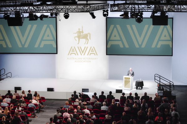
The new brand was unveiled at the annual Vet Summit in Adelaide to positive response. The overwhelmingly positive outcome has led the AVA commission THERE to handle their branding of other corporate branches of the organisation.
Graphic Design - Identity and Branding
This award celebrates creative and innovative design in the traditional or digital visual representation of ideas and messages. Consideration given to clarity of communication and the matching information style to audience.
More Details