


Image Credit : Earl Carter Photography

Project Overview
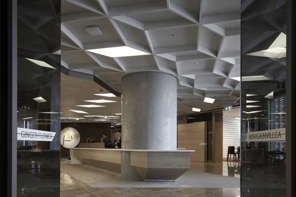
One of the latest buildings defining Sydney’s skyline, ANZ’s NSW head office (known as ANZ Tower, Sydney) occupies twenty floors of the forty-two-storey tower. Home to more than 2000 staff, the space represented a significant opportunity to consolidate ANZ’s various business units into the one building and promote a kinetic workplace, where staff are free to move about the building. Interior designers Hassell, strived to strengthen connection and flexibility through the use of multiple three-storey pocket atriums within the central core of the building, creating visibility across multiple floors and promoting staff connection with one another.
ANZ Tower represents an innovative shift in the financial services industry, allowing staff to work flexibly through offering worksetting options and intertwining communal zones within meeting spaces. Social neighborhoods are formed at level change locations and a central stair forms a heart flowing through the core of the building, prompting interaction and allowing for multiple spaces where the right worksetting can be chosen for the right task.
The interior spaces aim to reflect the values and identity of ANZ, creating a cohesive work environment that communicates the idea of a unified ANZ team.
Project Commissioner
Project Creator
Team
Project Commissioner
ANZ
Project Creator
Vince Frost ?CEO/ECD? Frost*collective
Project Team
Agency: Urbanite? (part of the Frost*collective)
Client: ANZ
Interior Design: Hassell
Project Management: Paragon
Creative Director: Vince Frost
Design Director: Bridget Atkinson
Design Manager: Adam Longo
Senior Designer: Natasha Bartoshefski
Midweight Designer: Katie Bevin
Wayfinding Strategy: Joanna Mackenzie?
Signage Production: A+W Signs
Graphics Production: Wizardry Imaging & Signs
Placemaking Feature: HDallas
Project Brief
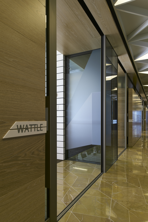
Our brief was to create a signage, wayfinding and graphics system that responded to both the interior design intent of connection and flexibility whilst also further strengthening the ANZ brand discretely within the space. The unique hub focus of the interiors surrounding the internal stair and voids resulted in great importance being placed on signage, wayfinding and graphics to provide both identification and to add character to each of these spaces, whilst also acting as key wayfinding beacons within the floor plates for users. It was intended that the hub spaces would act as wayfinding elements and required a solution which would assist staff and users identify particular zones, even though they were very similar in appearance and layout.
Project Innovation/Need
With a light and minimal material palette, the interior design relied on signage and graphics to announce and identify user hubs and community spaces. The signage and graphics solution needed to both support this minimal palette, but also provide enough character and diversity amongst community spaces that users could easily identify them as their particular homezone. With a desire for no large typography, naming identification and minimal wayfinding signage, a system needed to be implemented that would position these hub spaces as wayfinding and placemaking tools, acting as major directional insertions that would guide and position users on a large scale and provide a more integrated solution than a directional sign.
Design Challenge
The key to our design solution was building upon the concept of ‘convergence’, reflecting the intent of bringing a number of different ANZ branches and workers together into a refined workplace and focus.
A colour overlay was developed that vertically united the tenancy through the use of interlocking graphic and colour elements.
Drawing upon the natural features of the harbor landscape and subtle nods to the ANZ brand, the scheme progresses from midnight blue of the water at the base to honey-gold tones of sandstone at the top. These graphics feature around the core of the building, creating a solid colour base which is used for both floor identification and as a placemaking element to assist in orientation and wayfinding of both visitors and staff. With multiple levels of graphics located at community hubs visible from the internal void, the colour scheme helps to give identity to levels and community spaces and assists in providing a sense of ownership to users working in particular areas.
The vertical convergence approach is culminated within the internal stairway, with the installation of a 4-storey placemaking joinery wall abstractly reflecting a typical ANZ trading-day graphic representation turned on it side.
Sustainability
With a 6-star Greenstar rating, ANZ Tower is heavily focused on providing a best-practice sustainable workplace for it’s staff. With this desire, the signage, wayfinding and graphics solution needed to support and enhance this requirement. The 4-storey placemaking joinery wall was a particular element which was designed with a focus on sustainable materials and fixings, undergoing a number of refinements which resulted in it supporting the desired 6-star rating for the project. Graphics were also designed to be implemented as individual shapes, rather than large expanses of material, allowing for minimal material wastage and replacement issues. Signforms were designed to work with material sheet sizes, ensuring minimal waste during manufacture and installation.
Wayfinding
This award celebrates creative and innovative design in the ways people orient themselves in physical space, and navigate from place to place. Consideration given to signage and other graphic communication, clues in the building's spatial grammar, logical space planning, audible communication, tactile elements and provision for special-needs users.
More Details