


Project Overview
As one of Australia’s leading not-for-profit organisations, Life Without Barriers offers a range of care services to people in need – from Child Services and Refugee & Asylum Seeker Support, to Aged Care and Disability Services.
But Life Without Barriers does more than just lend a hand. They partner with people to change their lives for the better – by acknowledging the barriers, overcoming the obstacles together, and empowering individuals to live the best life they can.
Since its founding in 1995, Life Without Barriers has grown at a rapid pace. And the not-for-profit landscape is evolving too – with more competition, and new government regulations in place. It was time for Life Without Barriers to break down more barriers. To raise its profile, and truly stand out from the crowd.
Project Commissioner
Project Creator
Team
Sandy Belford - Strategy Director; Ed Elias - Strategy Consultant; Tui Horo - Account Director; Helen Spoor - Account Manager; Executive Creative Director - Simon Wright; Creative Director - Darren Swain; Artworker - Darlene Ward.
XXVI
Director of Brand Language - Hamish Cargill; Writer - Carrie Dennes.
Project Brief
‘Challenged’. ‘Excited’. ‘Surprised’. That was how the board and executive wanted to be left feeling, when they asked Principals to develop a new brand strategy, visual identity and guidelines for 2014.
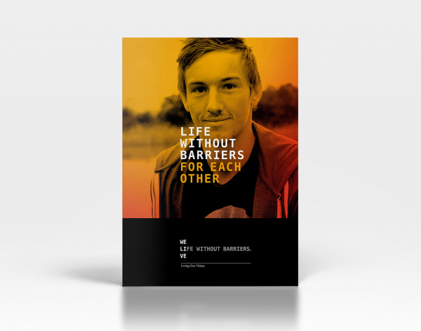
Encompassing print and web design, the brand idea is brought to life through striking photography of individuals in poses communicating courage and strength, living the life they deserve – and a vibrant colour palette that also distinguishes the different services available.
We combined the name Life Without Barriers with the statement 'WE LIVE' - executed as a unique typographic logo – the message ‘WE LIVE’ communicates the aim of enabling people to live the best life they can by having access to the right services and support.
Project Innovation/Need
We moved away from the clichéd images regularly used in the sector and focused on the great lives people can live.
When teamed with the message of ‘WE LIVE’, a real sense of unity and courage is created. It shows that Life Without Barriers and the people it works with are in this together – a refreshing change of perspective in the sector. It challenges people to see things differently.
Design Challenge
The challenge Principals faced was communicating the purpose of Life Without Barriers in a way that stood out in a crowded sector, and appealed to a range of audiences – from young people using the services, to government providing contracts and funding.
That meant creating a vibrant visual identity without losing sophistication. Colour was key in distinguishing the various services Life Without Barriers offered.
Ultimately, the end result was reached through a collaborative process with Life Without Barriers – one that included focus groups with young people, and board input. It was the sum of many parts – with the same common goal in mind.
Effectiveness
Since launching to all staff in March, the brand has received a fantastic response. People think the identity is bold and sophisticated – and perhaps most importantly, capable of telling the organisation’s story, and reaching out to the people who need Life Without Barriers.
It’s still early days – so we’ll be watching to see how it grows in presence and visibility.
Graphic Design - Identity and Branding
This award celebrates creative and innovative design in the traditional or digital visual representation of ideas and messages. Consideration given to clarity of communication and the matching information style to audience.
More Details