


Image Credit : The Morris Project

Project Overview
With the launch of Isabela, Michelin star chef Jose Ramirez is bringing a European style bar a vin to Miami. Introducing world class cuisine & wine in a laid back setting.
The Menu takes notes from Jose's Puerto Rican childhood, through a very different lens. Influenced by years of exploration in revered kitchens across the globe and an eclectic pantry. Fresh native ingredients ground the dishes, bringing new awareness to the layers of the subtropical flavors available in this rich, seaside land.
Jose delivers an inspired, considered expression of his most cherished dining memories. Guests will gather for fresh flavors and spirited conversation
Project Commissioner
Project Creator
Team
Amy Morris, Creative Director
Hallie Weiss, Graphic Designer
James Jackman, Photographer
Jose Ramirez, Client
Project Brief
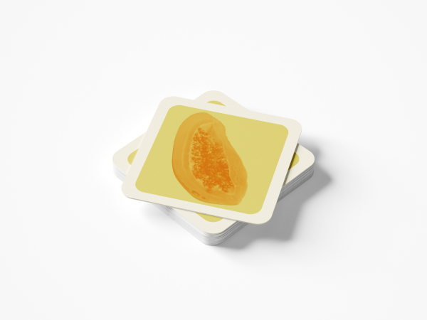
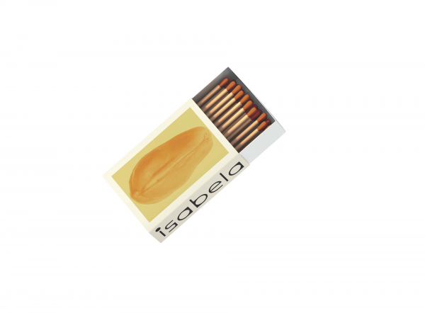
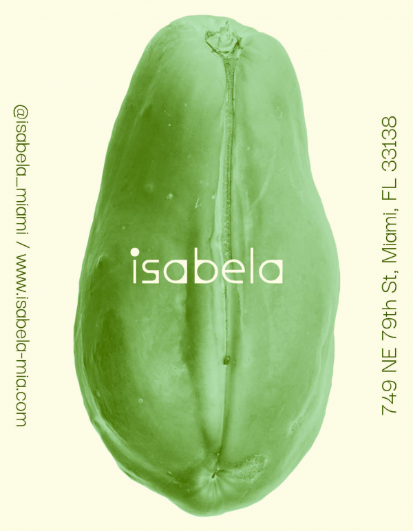
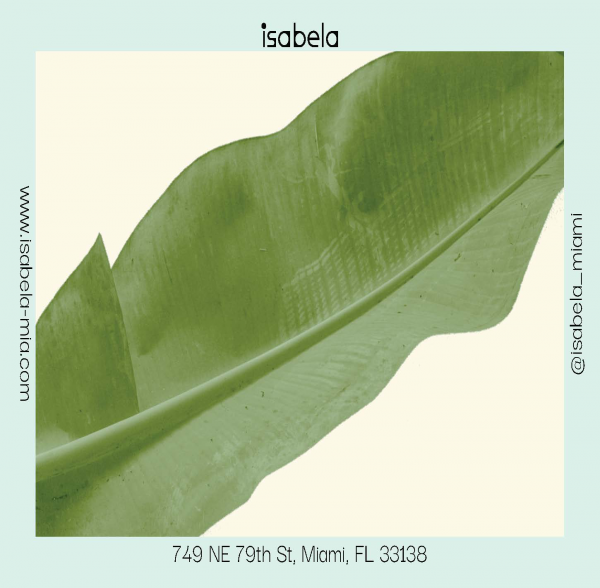
At Isabela, the ingredients take center stage. Our team was inspired to find graphically engaging ways to highlight the subtropical plants that are key to Isabela's menu. Through photography we find new ways to bring a focus to the plants textures and organic shapes. To further highlight the emphasis on seasonality we have created two palettes, winter & summer. Reminding guests that the menu is changing with the seasons.
We aim to provide the viewer with a new perspective of what they're eating and an appreciation for the local ingredients.
Project Innovation/Need
Chef Jose Ramirez is a leader in reducing hospitality waste. He employs Top to Tail philosophy, every piece of the meat or vegetable is used. For example, when he peels and deseeds a squash the peel and seeds are hydrated and made into a powder that is then sprinkled over the cooked squash. The New York Times calls him a vegetable manipulator.
It was important we showcased these sub-tropical vegetables and fruits that are at the heart of the menu and flavors. Rarely do you see a restaurant use photography in an artistic way because of the expense. We employed one of Jose's talented friends to work with us. We took advantage of some close relationships built during the pandemic.
Design Challenge
In order for the photography to stand out it needs a unique point of view. The Morris Project was lucky to work with a chef with a deep passion for his ingredients and a true excitement for our creative direction.
We spent a lot of time outlining how everything was photographed, our shot list was both articulated verbally and visually. We also considered what was photographed and how much color saturation we applied. The client loved our references and was determined to make the vegetables eye catching stars that felt design forward, not instagram food photography friendly.
The collateral created from these images feels warm and timeless, and engaging enough that full size posters can be used for promotions. The campaign elevated his ingredients in a way Jose does every night.
Effectiveness
The client was surprised at how well we understood his desire to make the ingredients the focus. He loved that it stood out from any original thoughts of what a photo driven campaign would look like. The campaign has been such a success he has returned for us to now create packaging for a line of spices.
Also by choosing a bold brutalist style typography it's easily recognizable and can stand alone with the color of the season on the menu.
Graphic Design - Illustration and Type
This award celebrates creativity and innovation in the traditional or digital visual representation of ideas and messages. Consideration given to clarity of communication and the matching information style to audience.
More Details