Key Dates
-
categories
-
Architecture
-
Interior Design
-
Interior Design - International Residential - Executive Suite
-
Space Plus
Space Design
-
Product Design
-
Communication Design
-
Advertising & Marketing
-
Service & System Design
Experience Design
-
Digital Innovation
-
Web & App Design
-
Better Future
Transformative Design
-
- winners
- best of the best
- trophies & annuals
Afterpay Bondi Mint
Afterpay / YummyColours | Graphic Design - Identity and Branding


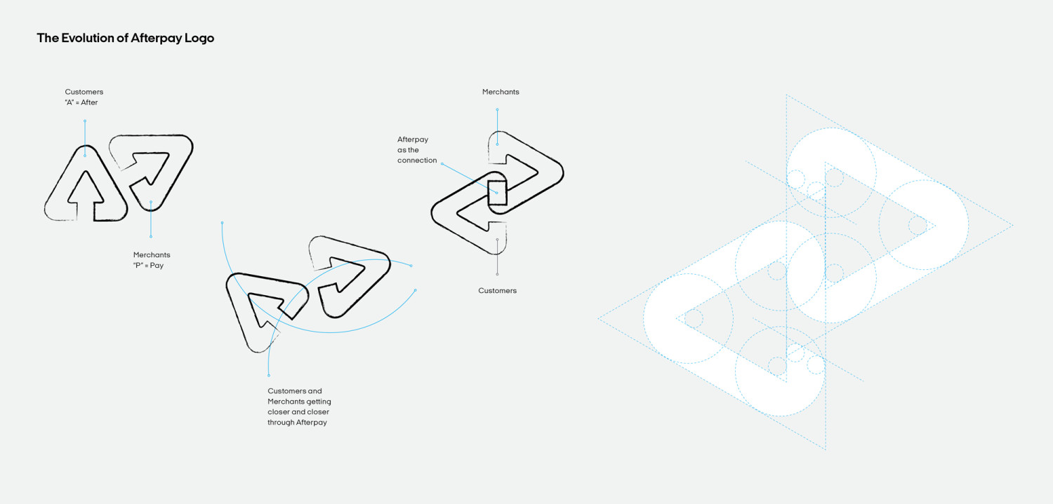
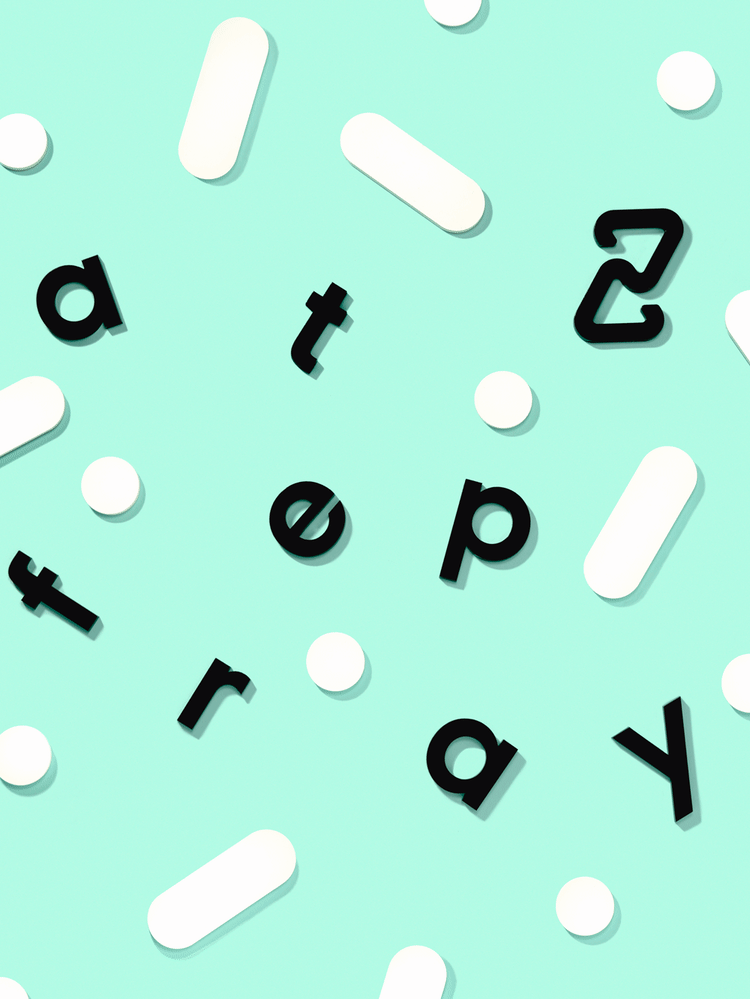

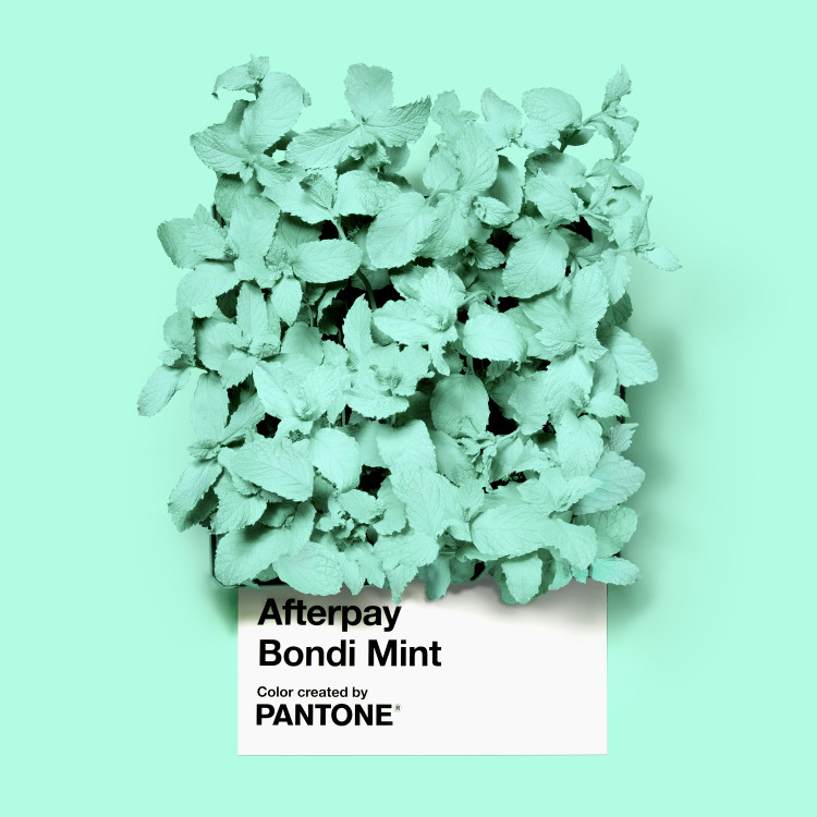


Image Credit : Aaron Bernstein

Project Commissioner
Project Creator
Project Overview
Global retail payments platform Afterpay has launched a new global look, feel and positioning with a fresh brand identity.
Team
Project Brief
Afterpay’s new identity is an evolution of the brand and its services. The new mark embodies the brand’s values and retains the balance
of the previous symbol, combining the existing two triangles into a new, continuous shape. The interconnected brand mark expresses how Afterpay acts as a link between the company, merchants, and customers. This loop represents the way the relationship among all parties is continually strengthened each time they interact with one another.
Project Innovation/Need
“Off the back of Afterpay’s strong global growth, the time has never been better to update our visual identity and more strongly reflect who our customers are and why they choose Afterpay," Afterpay global CMO Geoff Seeley says.
Design Challenge
YummyColours used this unique opportunity to design a custom new signature color for Afterpay in collaboration with Pantone: Afterpay Bondi Mint. “Color is one of the easiest and most effective ways to highlight to a consumer the unique qualities and promise behind the brand,” notes Laurie Pressman, VP at Pantone Color Institute, “because the color a brand chooses to present themselves is the most tangible representation of who they are. Bondi Mint boldly anchors Afterpay’s visual language, distinguishing the brand within the landscape of Buy Now Pay Later companies, and rooting it in youthful, forward-thinking Australian culture with human connection at the core.
Italian Plate No2 Expanded is Afterpay primary typeface. It is bold and modern, classic and friendly. Its geometry is balanced and its soft angles express friendliness. It has character but is not flashy or trendy.
It makes an unmistakable statement, and works as functional typography across digital platforms and print materials.
Effectiveness
The new brand is a powerful representation of what Afterpay deliver for both consumers and merchants, with sustainable financial wellness at its core.
Tags
Graphic Design - Identity and Branding
This award celebrates creative and innovative design in the traditional or digital visual representation of ideas and messages. Consideration given to clarity of communication and the matching information style to audience.
More Details