


Project Overview
The Morris Project recently created the brand identity for a new restaurant - AMA, at the base of a co-living development in Queens.
The restaurant comes under the umbrella of the The Collective, a co-living group whose ethos is to blur the lines between the home kitchen and dining out experience. To present AMA as a real home away from home.
Residents at The Collective are entrepreneurs, freelancers and creatives who often travel for work. Ama is their place to return to, a nurturing environment ripe for shared experiences.
Project Commissioner
Project Creator
Team
Amy Morris: Creative Director
Cristina Rodriguez: Art Director
Hallie Weiss: Graphic Designer
Project Brief
“What it would be like to have a job that requires you to travel constantly?"
As a team we pondered this question and thought about the references, the inspirations and mementos collected before returning “home.”
We developed “Lost & Found,” a creative direction referencing all that’s brought back then shared with loved ones on return. Happy baggage we like to call it, enriching our lives and those around us. Together it represents the poetry of travel.
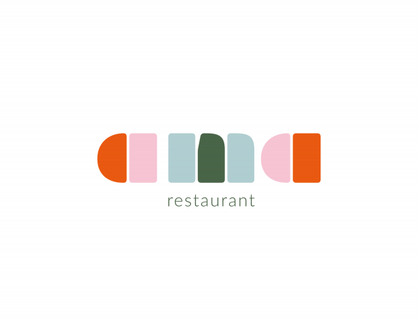
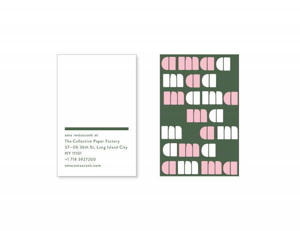
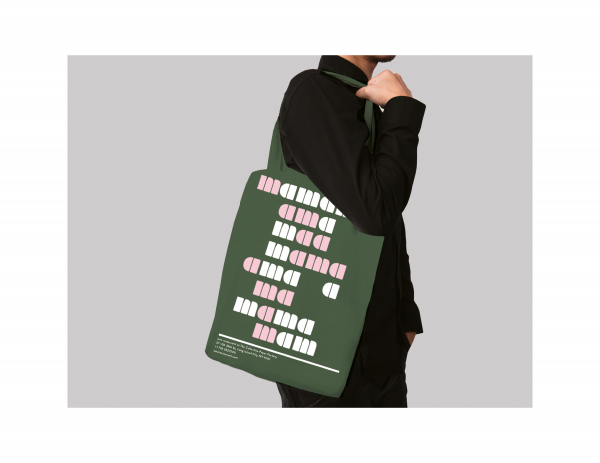
Through concrete poetry, an arrangement of linguistic elements that convey meaning, we played with pieces of the name, deconstructing and reconstructing AMA to MAMA, MA and AMA. AMA has many meanings across many languages, two being love and mother.
Here, the pattern illustrates the movement of travel and the many meanings behind AMA.
Project Innovation/Need
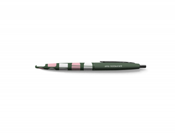
In hospitality, a logo is traditionally placed at the top of a menu, rarely is it part of a larger system of meaning. Here, The Morris Project aimed to bring the restaurant’s personality to front and center, generate more conversation, more poetry, more connections. The logo is extend to a system of patterns, concrete poetry, that connect back to the name’s meaning.
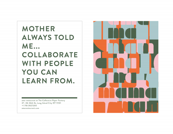
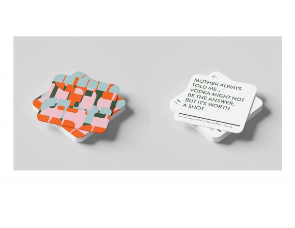
In researching time periods when mother’s had cultural relevance in branding, we found ads from the 70’s that espoused wisdom from mothers. We took some old favorites and updates on kitch sayings and used these on the check presenters and coasters, to again remind people AMA should feel like coming home...
Check Presenters [representing community]
* My mother always told me … collaborate with people you can learn from
* My mother always told me … the only way to have friends is to be one
* My mother always told me… one seventh of your life is spent on Mondays
Coasters [focus on beverages]
* My mother always told me… you can’t buy happiness but you can buy wine
* My mother always told me … drink responsibly, never spill a drop
* My mother always told me… always do sober what you said you’d do drunk
Design Challenge
Traditionally restaurant collateral is pretty straight forward - it presents the logo boldly as the sole representative of the brand. For this co-living space we wanted to bring more meaning to each piece of collateral the community touched.
It's important to communicate that AMA is not just a restaurant but a home kitchen; you should feel the same warmth there you feel when coming home to your family. Through concrete poetry we draw people in, encouraging them to not only ask questions but to also smile and laugh, much like one does when relaxing at home.
Effectiveness
The client was thrilled we managed to communicate, through both concrete poetry and relevant, humorous tag lines, the meaning behind AMA so effectively. The Collective is a brand for sophisticated travelers, and with an elevated artistic approach that is also approachable, this brand personality comes through.
Graphic Design - Identity and Branding
This award celebrates creative and innovative design in the traditional or digital visual representation of ideas and messages. Consideration given to clarity of communication and the matching information style to audience.
More Details