


Project Overview
When we came on board, Westwood was already a very successful land estate in Melbourne's booming north west.
However, the developer had recently purchased another parcel of land just down the road from the previous estate and wanted to capitalise on the success of Westwood by incorporating this new land under its umbrella.
Project Commissioner
Project Creator
Team
Lars Weisenberger - Creative Director/Copywriter
Kelly Barber - Senior Designer
Elisabeth Germanos - Graphic Designer
Ant Bray - Account Director
Amelia Harrison - Account Manager
Project Brief
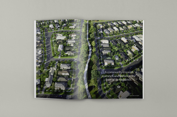
Our challenge was to refresh the existing Westwood brand and find a way to unite two pieces of land that were separated by a proposed school and sporting facilities, into a cohesive whole.
The client wanted to capitalise on the existing brand equity, but still modernise the brand, as it had been in market for some time.
We settled on a strategy where we would treat each parcel of land as a separate precinct of Westwood and without overtly saying it, act as though the amenity between them was part of the estate. Technically it wasn't, but there was no arguing with the benefits the proposed school and sporting facilities posed for residents of either precinct.
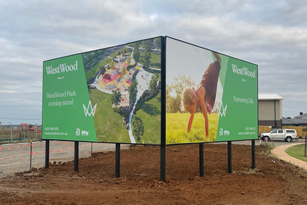
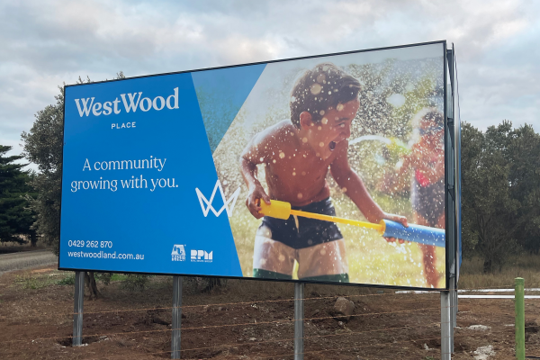
In order to maintain the good will in the Westwood brand, we used Westwood in each precinct name; Westwood Walk and Westwood Place.
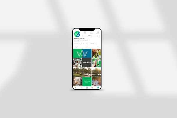
We also devised a colour palette that used three primary colours, one associated with each precinct and then a colour representative of the master brand. This gave us a very visual platform in which to tailor communications that were specific to either precinct or the master brand, but in a manner that was always cohesive and linked.
Project Innovation/Need
It is not everyday that an already established land estate suddenly doubles in size, but that's exactly what happened at Westwood.
Possibly the easiest way to deal with the new parcel of land would have been to create a new identity for it, especially since it didn't share any borders with the existing Westwood. That approach would have allowed us to tell a story that focused solely on the merits of the new land, without also having to deal with the existing precinct.
That wasn't the best result though. Ultimately it would have created another "competitor" for Westwood, despite the fact that the two were both run by the same developer. Neither site would benefit from this approach so despite the fact that it was a far more difficult course to navigate, uniting the precincts as one was clearly the best choice in the long run.
It was a first for our agency, meaning none of us really knew what to expect from the process, however, in the end our instincts were proven correct and Westwood is now in a stronger position than ever to flourish now and into the future.
Design Challenge
The biggest design challenge we encountered at Westwood was the sheer amount of work that needed to be completed in time for the launch. As much as we were creating something new, there were a myriad of existing items that needed to be updated to the new style, in addition to all the new items required.
Everything from the display suite, to existing signage, websites and stages that were already on sale needed to be converted to the new branding, and since we now had two precincts, it was almost like branding two estates at the same time.
Even though our planning was solid, we ultimately ran low on time and had to mobilise additional resources in order to meet deadline.
User Experience
It may have been a stretch getting to the finish line on time, but once we did, it was more than worth the reward.
Land at Westwood has been selling like hotcakes since our re-launch in early June. As with much of the land market, supply can barely keep pace with demand and we are seeing new stage releases sell out in a manner of days.
In fact, we are seeing lots that were already on market prior to the brand refresh, have renewed interest.
It is only very early days, but I don't think we could have anticipated the positive reaction the brand has received and it does not look to be slowing down anytime soon.
Marketing - Branded Experience
This award celebrates creative and innovative design for branded experiences intended to persuade an audience to purchase or take some action upon products, ideas or services. Consideration given to the technical, conceptual and aesthetic elements, user experience, audience engagement and message delivery.
More Details