


Image Credit : Photography by Alysha Sandow.

Project Overview
If you've been locked down inside your house or apartment for the best part of 18 months, it's pretty likely the one of the things you're longing for is a holiday.
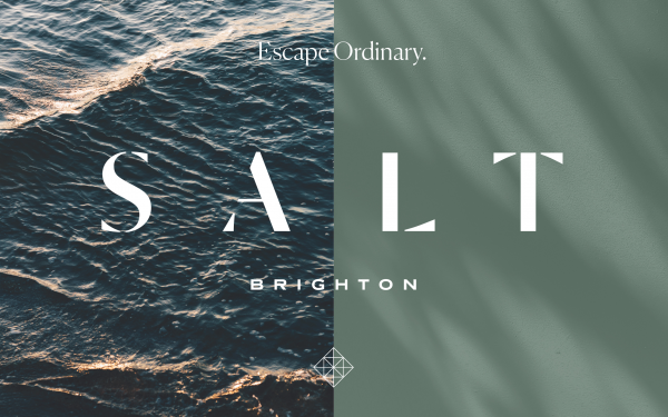
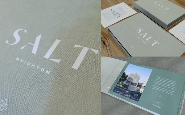
Salt Brighton was a unique property development that understood the changing landscape of the world and was crafted to offer a lifestyle that was like being on holiday every day. A sanctuary that would allow you to live your best life and escape the ordinary.
Project Commissioner
Project Creator
Team
Lars Weisenberger - Creative Director/Copywriter
Alysha Sandow - Design Director
Ant Bray - Account Director
Martha Daggian - Account Manager
Carmen Lo - Account Manager
Project Brief
"I want people to feel like they're on holiday when they come home every day."
Not your standard brief for a boutique collection of luxury townhouses in the premium bayside suburb of Brighton, but that was pretty much it.
Of course there were details around materiality, design and location, but the essence of the brief was firmly located in this one idea.
And it was a great one.
We were given this brief just before the pandemic exploded and sent us all into captivity. It was a great notion then, but it only became more and more relevant as the landscape of the world changed. We were all craving an escape, but more than that, we were all looking at the four walls we called home and reflecting on it with a whole new perspective.
What did we actually want in a home? More importantly, what did we need?These questions only became more important as the pandemic went on with no real end in sight.
As creatives, we recognised this shift in the social psyche and saw how there was a clear synergy with the approach we were adopting to the Salt brand. There was a real opportunity to create a brand story that would resonate with our target markets in a powerful and meaningful manner.
Project Innovation/Need
During lockdown, there was an activity that saw an amazing surge in popularity; walking.
We couldn't go far, but at least walking around your local neighbourhood got you out of the house and granted you a change of scenery.
Taking into account that the target market for Salt was likely affluent locals already living in the bayside area, we figured that many of them would likely be strolling past our site on their daily constitutional.
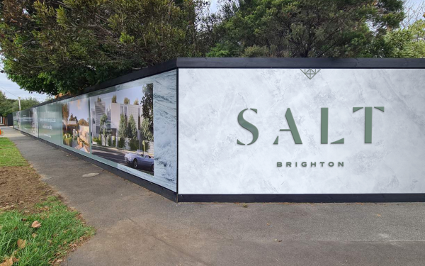
This was an opportunity we really wanted to take advantage of, so in collaboration with the client, we created something of an "unveiling" experience using our site hoarding.
We painted the entire hoarding black, so immediately it stood out. The developer's logo and contact information were placed on the prominent corner panel and then nine days out from launch, we placed a single gold icon on the hoarding.
Every day for nine days, a new icon was added to the hoarding. Each was different, but subtly alluded to an aspect of the development. As people walked by the site each day, they would see this story slowly unfolding and building intrigue around what was happening on site.
After all nine icons were revealed, we installed the full hoarding, using the Salt branding and messaging, announcing to the market that something special was indeed happening.
Design Challenge
Perhaps the biggest challenge in creating the implementing the Salt brand centred on something that would usually be pretty simple; photography.
Our "Escape ordinary" concept was all about creating a feeling of being on holiday all the time. From a photographic standpoint, we wanted to co-ordinate a high end, lifestyle shoot with select talent indulging in the very best the area had to offer.
However, that was not to be.
Our shoot needed to happen during the height of Melbourne's lockdown, meaning we were unable to get people together to make the shoot happen. In fact we were struggling to get a photographer willing to even take on the job.
So we pivoted. COVID forced us to adapt and come up with a new approach that would still position the brand as we originally intended.
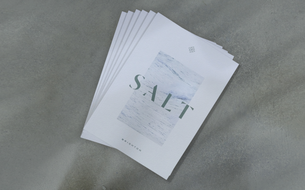
We came up with the idea of hiring a photographer with a more artistic, abstract lens to capture the details and nuances that encapsulated the essence of bayside living at different times of the day and night. There was no talent, so instead light and shadow became the heroes of the imagery, resulting in an outcome that was arguably better, and more original, than our initial approach.
Effectiveness
Salt soft launched to the market earlier this year, in between lockdown periods. It has been a strange time to launch projects in Melbourne, with interest levels and purchaser timeframes varying quite drastically across regions and product types.
We had found that the purchaser timeframe on luxury stock had lengthened to anywhere between 3 and 6 months, and that purchasers were being more analytical than ever before.
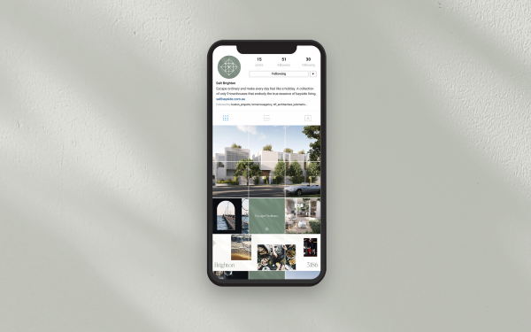
We also knew that the next lockdown could happen at any moment and no one could predict how long they would last. Due to this, a standard property campaign designed to draw prospective purchasers to a display suite would not suffice. Instead we created a more digitally focused user experience, getting enquiries to our website through a mixture of standard advertising placements, search and social campaigns. Once registered on the site, prospective purchasers could choose to talk to an agent on the phone or via video chat. They were also then added to the database and nurtured through their customer journey with regular eDM communications and more specific pieces of information as requested.
Ultimately, this strategy has yielded very strong enquiry to date, with several homes being sold. However, it is still very early in the campaign to draw many conclusions, especially for a luxury product like this, due to the more niche market it appeals to.
Advertising - Print
This award celebrates creative and innovative design for visual communication intended to persuade an audience to purchase or take some action upon products, ideas or services. Consideration given to the technical, conceptual and aesthetic elements, audience engagement and message delivery.
More Details