


Project Overview
On the site of one of Melbourne's most notorious, maximum security prisons, a vibrant new residential and lifestyle precinct is taking shape.
Pentridge in Coburg was an active prison until 1997. Upon it's closure, plans were created to revitalise and reclaim the site, making it an active part of the community once again.
After undergoing various stages of regeneration through a host of property developers, the site was acquired by Shayer Group. They initially brought with them plans for 2 new residential buildings to compliment the shopping centre and cinema complex they had already added to the precinct.
Project Commissioner
Project Creator
Team
Lars Weisenberger - Creative Director/Copywriter
Eliza Minty - Senior Designer
Ian Hickey - Account Director
Carmen Lo - Account Manager
Project Brief
Our initial brief from Shayer Group was more complex than a standard residential building brief. They were keen to launch 2 separate buildings at the same time, each targeting a different market with a different sales strategy.
One building was an apartment tower with smaller, investment grade stock that they were planning on taking offshore and selling into Asia through channel marketing. The other building was more boutique, with larger apartments that were targeting local owner occupiers, likely downsizers.
There was actually a third agenda as well and that was to refresh the narrative around the Pentridge precinct in general, now that the shopping centre and cinema complex were complete.
All items needed to occur at the same time, and while they wanted each apartment building to feel individual, they still needed to feel as though they were part of the same family.
Project Innovation/Need
Flexibility. That was the name of the game when it came to Pentridge.
Working on 3 brands at the same time was tricky enough, but needing to be able to change the way in which they interacted, or didn't interact, was another challenge altogether.
Sometimes we wanted to tell a precinct story and then connect to The Rook product, but other times we needed to segue to the Victoria Tower narrative.
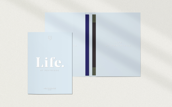
To deal with this, we approached the design of certain collateral in very different ways. For instance, when it came to brochures, we created 3 separate brochures and an outer folder. This allowed the sales agent in the display suite to curate a specific pack for the purchaser tailored to their needs. Due to the fact that it was unlikely that people would get both The Rook and Victoria Tower brochures, we were able to share content between them (lifestyle and location images, amenity renders etc), ensuring we kept costs manageable.
In our display suite, we designed a layout that was compelling, with a clear sales journey, but could also be updated easily to change from one release to another without a lot of time, effort and cost.
Our entire approach was built around maximising the value for money for our client and allowing them to nimbly meet the needs to the market, that can change in an instant.
Design Challenge
Our biggest challenge with the design of the Pentridge work was to ensure that all our brands felt unique, yet still at home in the one precinct.
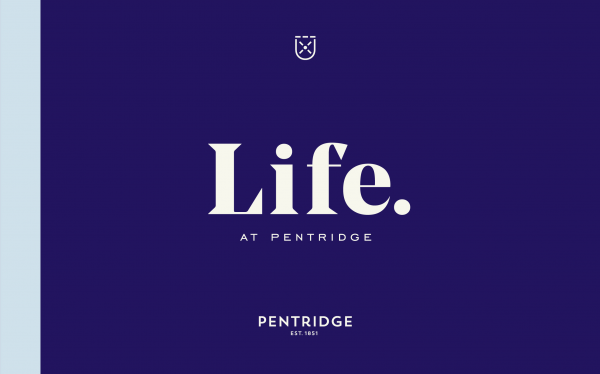
We created a brand called "Life. At Pentridge" which was used in an overarching manner to convey the lifestyle available within the precinct as a whole. It used the original Pentridge look and feel that had been established years earlier, but modernised it to reflect the current state of the precinct.
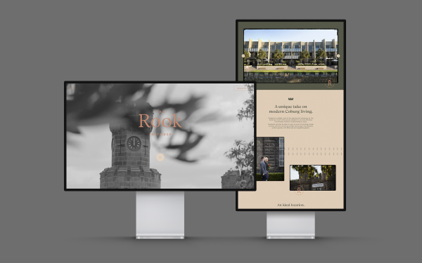
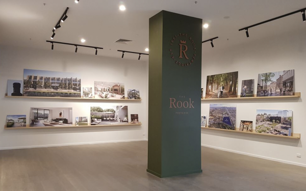
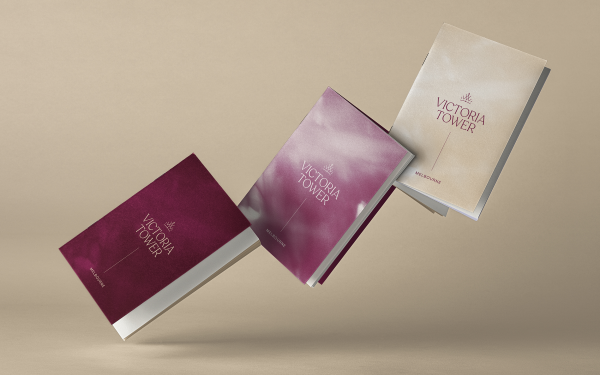
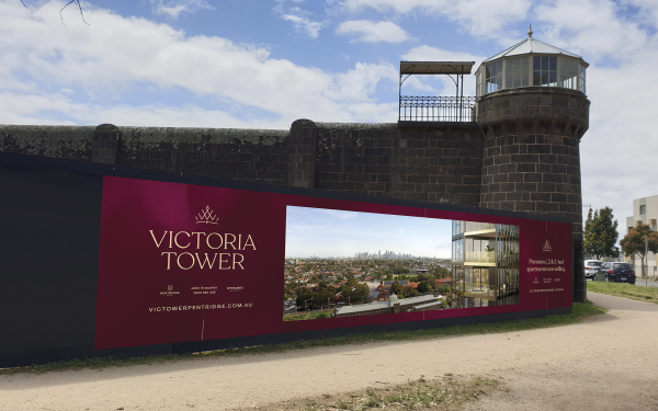
However, the client did not want us to use the same look and feel for their buildings. Instead we investigated completely different looks that still felt complimentary to one another. The Rook became a heritage green with copper, while Victoria Tower was a rich red with blue and gold accents.
Based on colour alone, the brands felt detached from each other, so we sought to link them through more subtle means. The names of the buildings were each inspired by the heritage of the site. Each logo features a variation on a crown motif, again harking back to the history of Her Majesty's prison.
These subtle links allowed us to ensure that each brand felt connected to each other, without appearing the same. It meant we could vary our tone of voice and messaging to target specific demographics without compromising on cohesion.
Designing 3 separate brands concurrently was also a pretty big design challenge in its own right!
User Experience
Based on results to date, it is hard not to see our work on Pentridge as being a great success.
The Rook building is sold out and did so in excellent time. A combination of great product, engaging branding and clear sales funnel meant that we were able to effectively convert leads into sales.
Victoria Tower enjoyed moderate success overseas, however, the pandemic did lessen its initial impact. Due to this, the building was actually given a local launch as well and we have seen solid results to date.
In fact, results have been so strong we are now working on a new building release that will be a split between a residential apartments and a 5 star hotel.
Marketing - Branded Experience
This award celebrates creative and innovative design for branded experiences intended to persuade an audience to purchase or take some action upon products, ideas or services. Consideration given to the technical, conceptual and aesthetic elements, user experience, audience engagement and message delivery.
More Details