


Project Overview
Melbourne’s Del Castillo, a multi-disciplinary, award-winning interior design studio, draws inspiration from eclectic cultures throughout the world while meticulously maintaining the balance between style and function.
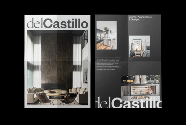
When Penny Del Castillo approached us to refresh the brand for her renowned interior design studio, In Design International, we wanted to play with the idea of balance through design — something that Del Castillo, seemingly effortlessly, masters.
We chose to focus on the delicate pull between timelessness (the old) and modernity (the new). This was achieved, in part, by marrying two very different but equally striking fonts for the Del Castillo logo. The two opposing elements of this identity reside next to each other creating tension but also equilibrium.
For the extended brand language, digital design, and collateral, we played with scale to create a sense of drama. We highlighted the contrast of micro and macro in Del Castillo’s work — representative of their attention to detail while sustaining a firm grasp of the big picture when designing and styling any space.
Project Commissioner
Project Creator
Project Brief
The client, formerly known as In Design International, wanted to elevate their current brand, including a name change.
Before we could start designing, we needed a firm understanding of the whole landscape of the business. We set to work defining the brand strategy, taking a deep dive into their brand identity.
We examined Del Castillo’s values, how they communicate their services, as well as the emotional response they wish to evoke from those who engage with their brand. We wanted to unwrap what set them apart from their competitors and understand the core values of the business.
Within our brief, the theme of balance persevered. Our job was to equally weigh the old business and the strong reputation it had built with what it was becoming. This was needed to create a smooth transition and ensure the brand stayed relevant and adapted to its continued evolution.
Project Innovation/Need
Trying to bring the balance between styles to create a branding suite that communicates to people where the business came from and also where it’s headed. We had to map out Del Castillo’s future trajectory in order to achieve a brand that would last.
Design Challenge
Considering the longevity of the brand was a challenge. We had to look far down the track to ensure relevancy and leverage the brand equity through the reputation of Penny Del Castilo’s name. We needed to ensure there was flexibility for where the business evolved to in the future and consider a future need for brand architecture.
Effectiveness
As a boutique branding studio, the Principal Design team understood the importance of developing and maintaining a strong brand for Del Castillo. Through our processes and workshops, we fully communicated who Del Castillo was as a brand and ensured consistency throughout their business, story, and selling point. It was a much more in-depth process than merely slapping a new name on the business, which also made it far more rewarding to work on!
Graphic Design - Identity and Branding - Property
This award celebrates creative and innovative design in the traditional or digital visual representation of ideas and messages. Consideration given to clarity of communication and the matching information style to audience.
More Details