Key Dates
-
categories
-
Architecture
-
Interior Design
-
Space Plus
Space Design
-
Product Design
-
Communication Design
-
Advertising & Marketing
-
Service & System Design
Experience Design
-
Digital Innovation
-
Web & App Design
-
Better Future
Transformative Design
-
- nominate
- projects showcase
- winners
- home
Brown Brothers Limited Edition ‘BlazeAid’ Shiraz
Brown Family Wine Group / The Edison Agency | Graphic Design - Three Dimensional
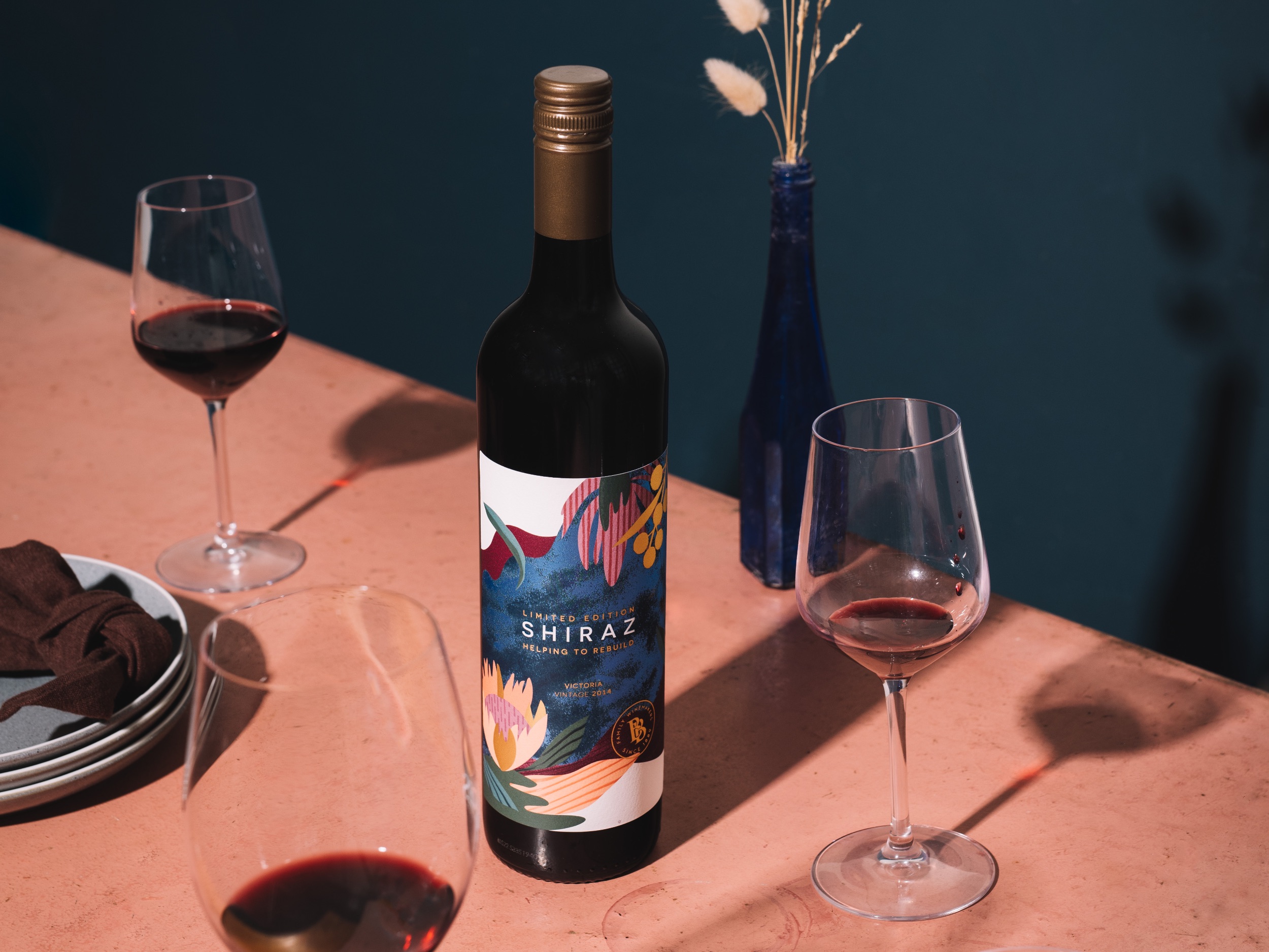
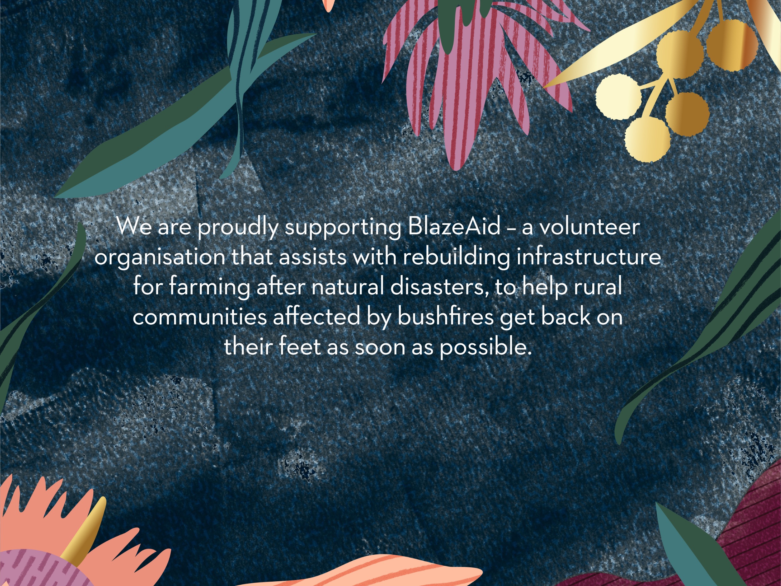
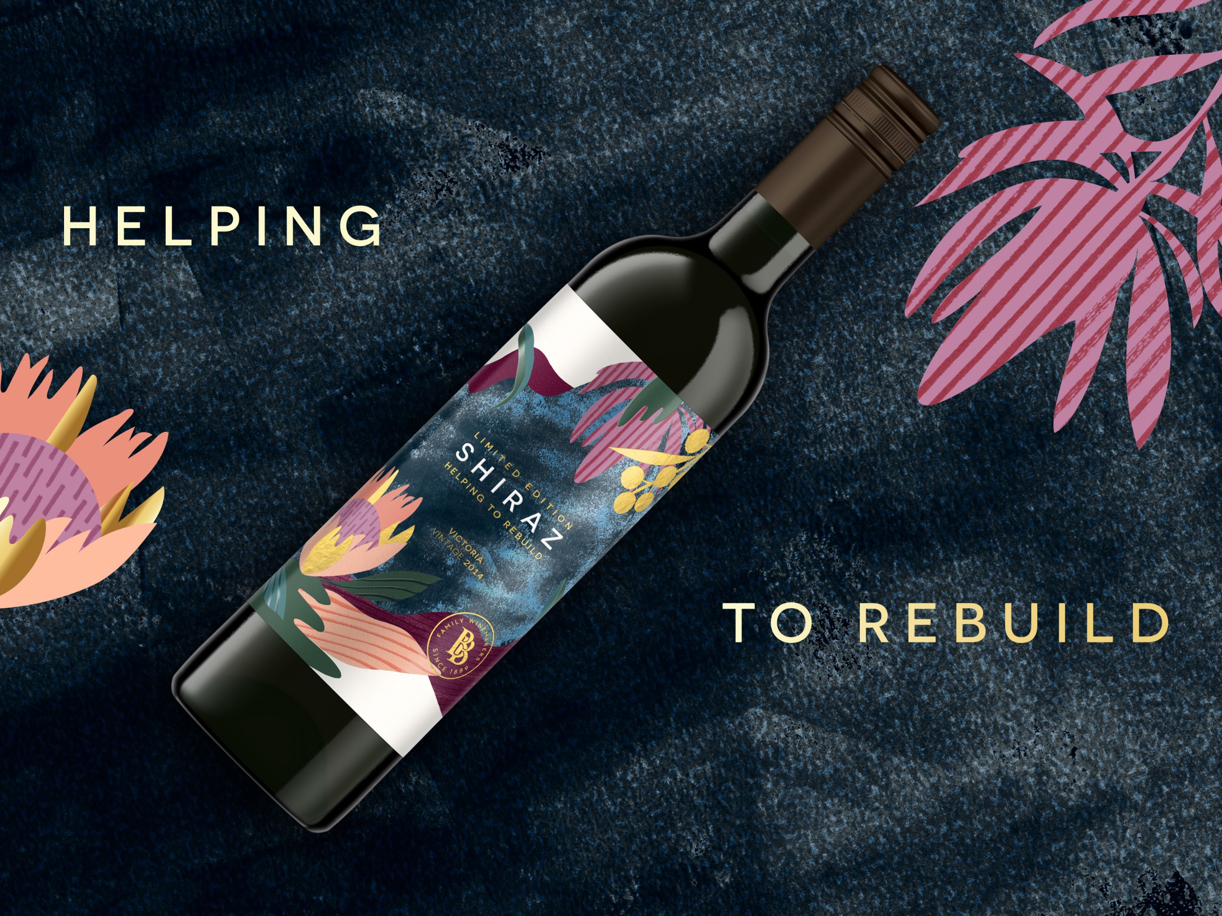
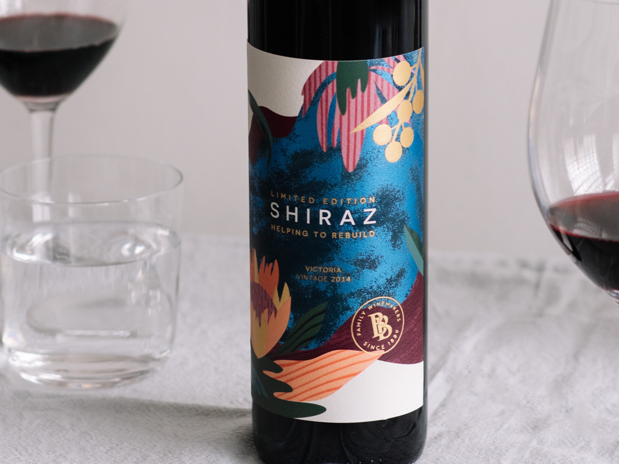
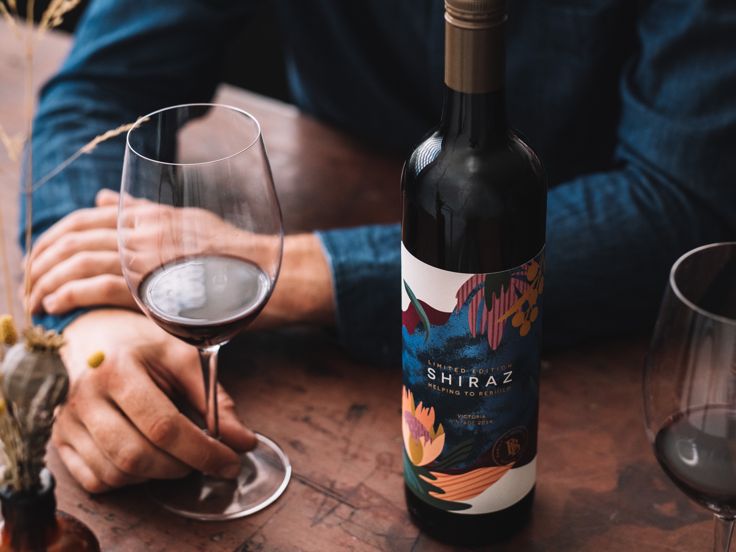
Image Credit :

Project Commissioner
Project Creator
Project Overview
The Edison Agency were engaged by Brown Family Wine Group to help create a limited-edition 2014 Shiraz wine label design to support families and communities impacted by recent floods and bushfires.
Team
Amber Bonney - Head of Strategy + ECD Brian Rodrigo Llagas - Design Director Liz Archer - Senior Account Manager Matt O'Connor - Senior Creative Artworker Animation - Natalie Tuke Tarynn Barrie - Brand Manager John Biggar - Brand Manager Emma Brown - Marketing Manager ‑ Brown Brothers & Tasmania Photographer - Phoebe Powell Photography
Project Brief
As a business located close to some of the bushfire disaster zones, Brown Brothers was acutely aware of the devastation felt in local communities as they prepared for the long process of rebuilding.
With this sentiment top of mind, The Edison Agency had to approach this brief with the utmost sensitivity, considering all content, design and execution to best represented the Brown Brothers emotional response to the regional devastation. 100% of all profits will be donated to Blaze Aid – a National organisation that helps local communities rebuild infrastructure after natural disasters. This was a collaborative pro-bono program with support from Brown Brothers printers, designers, photographers and PR partners - a great signifier of an industry coming together for a positive community cause.
Project Innovation/Need
Our work identified a strategic opportunity to set a precedent for the cause using design to inspire hope and action. Our distinctive and playful illustration style was hand-crafted by one of our resident Edison illustrators - the vibrancy of the botanicals is captured via a Matisse-esq paper-cut aesthetic. In keeping with the attitude and personality of the Brown Brothers brand - this design captures the impenetrable spirit and beauty of the King Valley region, ready to rise again.
Design Challenge
The design challenge was focussed on three core areas:
1. Design a cause related label that was not insensitive to the issue
2. Reflect the premium nature of the wine, without appearing indulgent
3. Outcome was to be shareable and engaging, motivating consumers to purchase and support
Effectiveness
The Brown Brothers Limited-Edition 'BlazeAid' Shiraz has a unisex appeal and is beautifully crafted with subtle, high-quality print finishes to reflect the quality of the wine. The contrast of colourful Australian botanicals juxtaposed against a deep-blue mottled foil background cue a hopeful, flourishing future for our bushland, while referencing the darkness it sprung from. This was quite a step away from Masterbrand range, in hope to acquire a new online/social audience and promote action that led to generous community support.
Graphic Design - Three Dimensional
This award celebrates creative and innovative design in traditional or digital visual representation of ideas and messages used in packaging. Consideration given to: clarity of communication and the matching information style to audience; the approach, including marketing and branding concerns, the dynamics of the retail environment, environmental considerations, and legal requirements; the component parts of packaging graphics such as colour rationalisation, information layout, feel and tone of illustration and photography, and finishes, and how they are used in isolation and in relation to each other; and the relationship to the anatomy of the structural design.
More Details