Key Dates
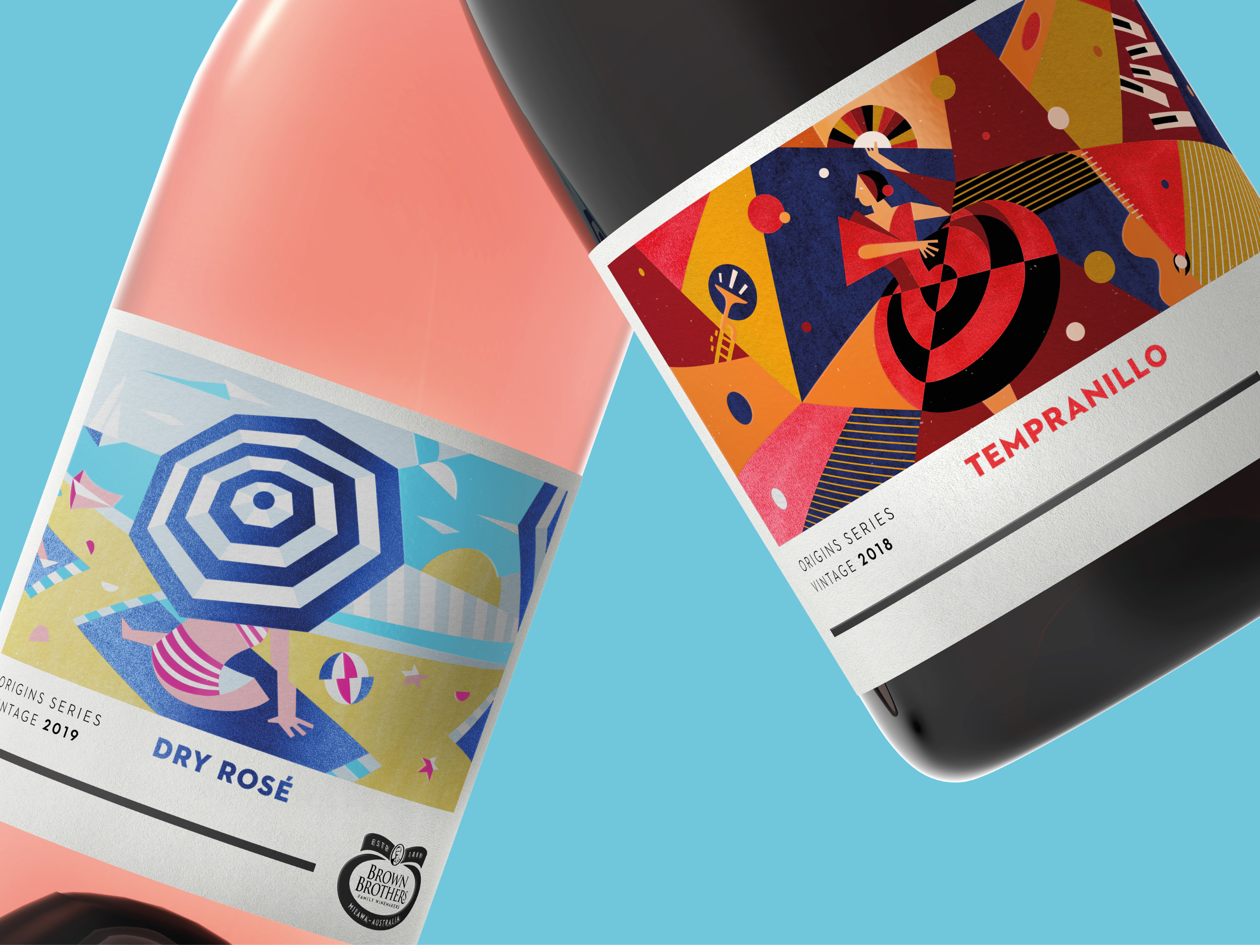
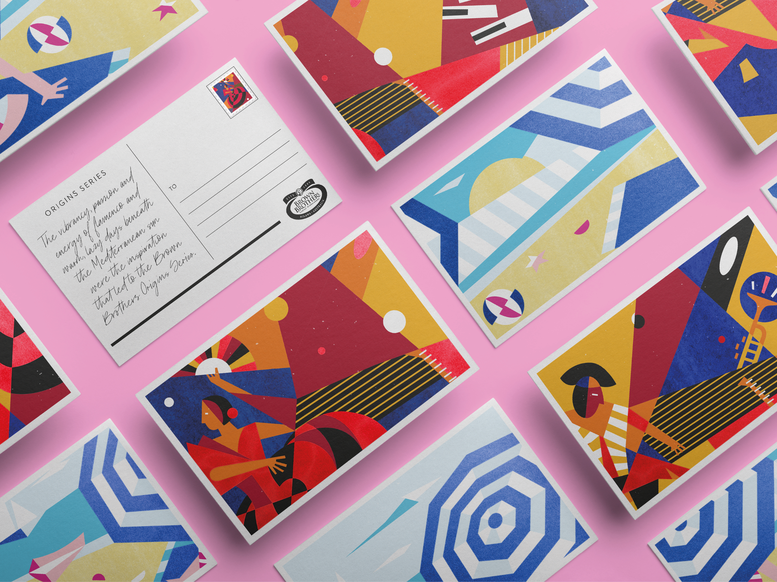
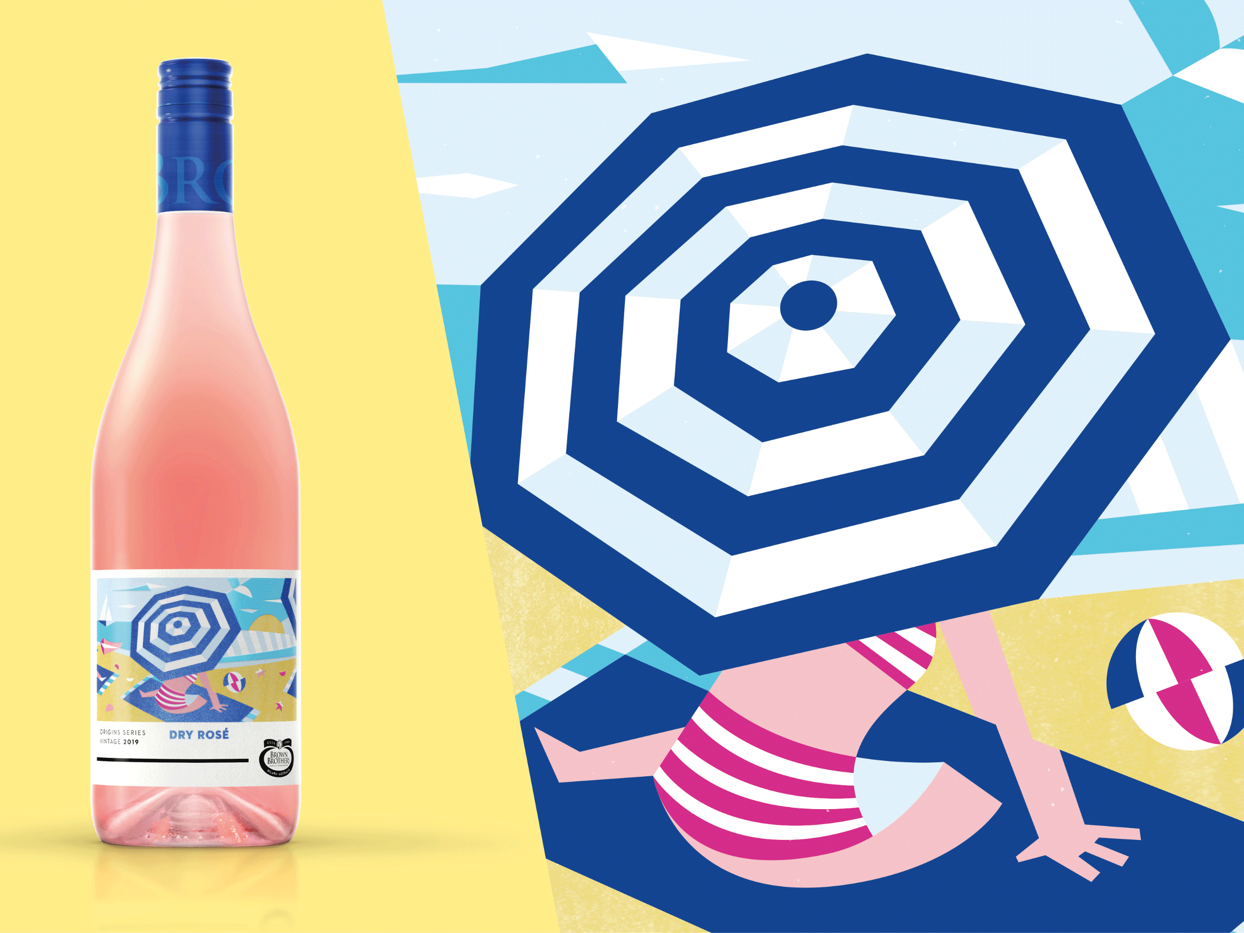
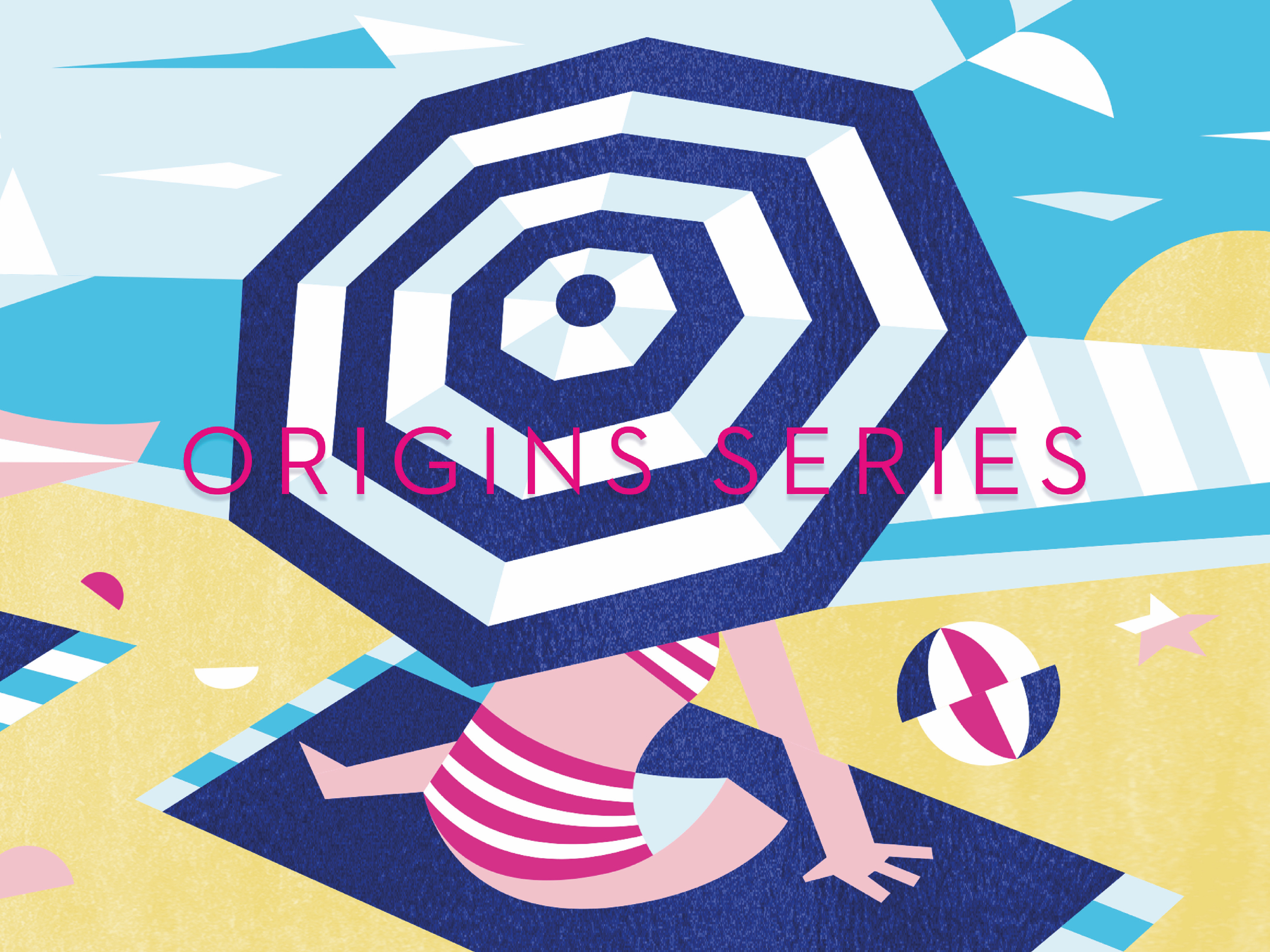
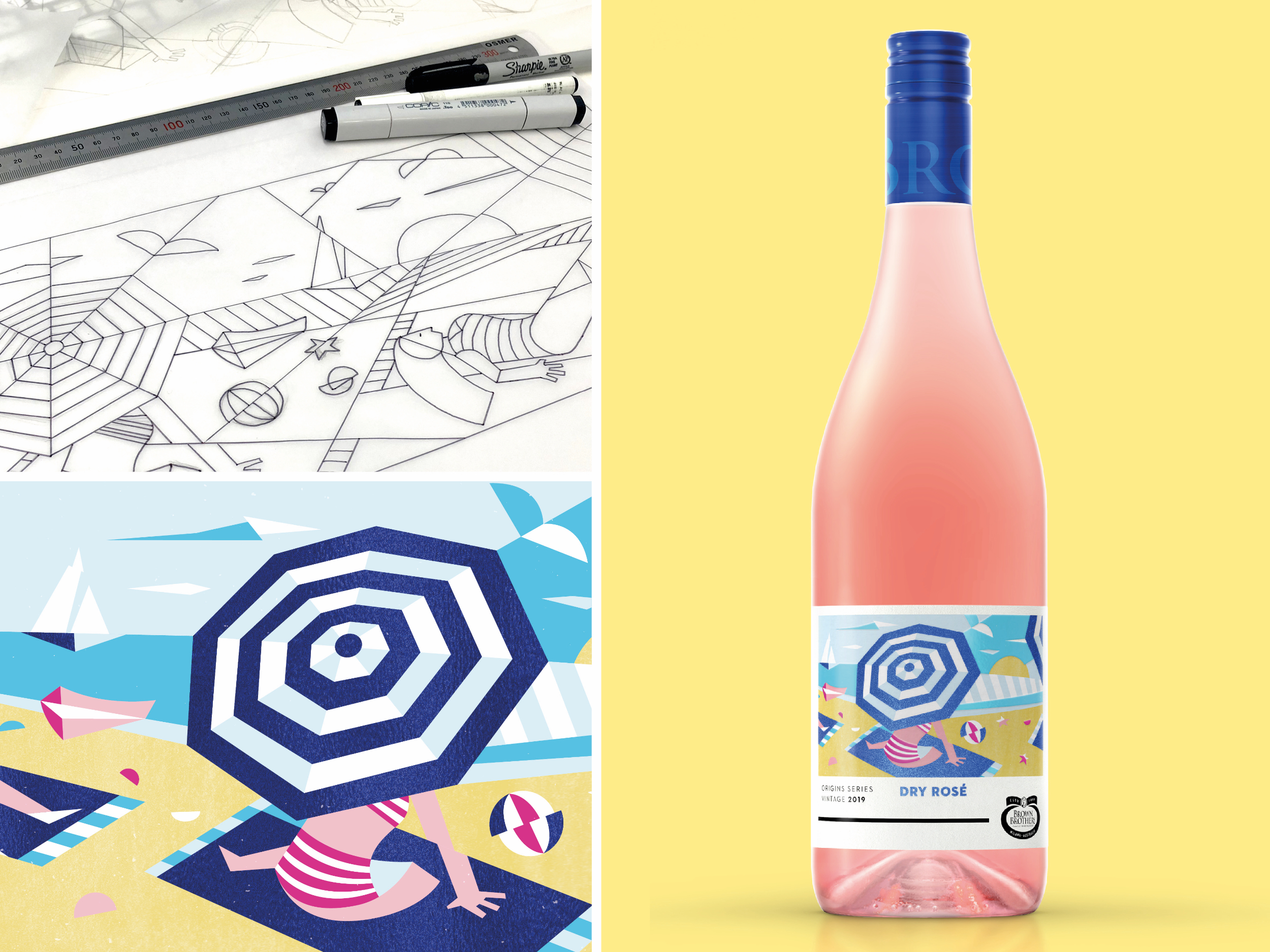
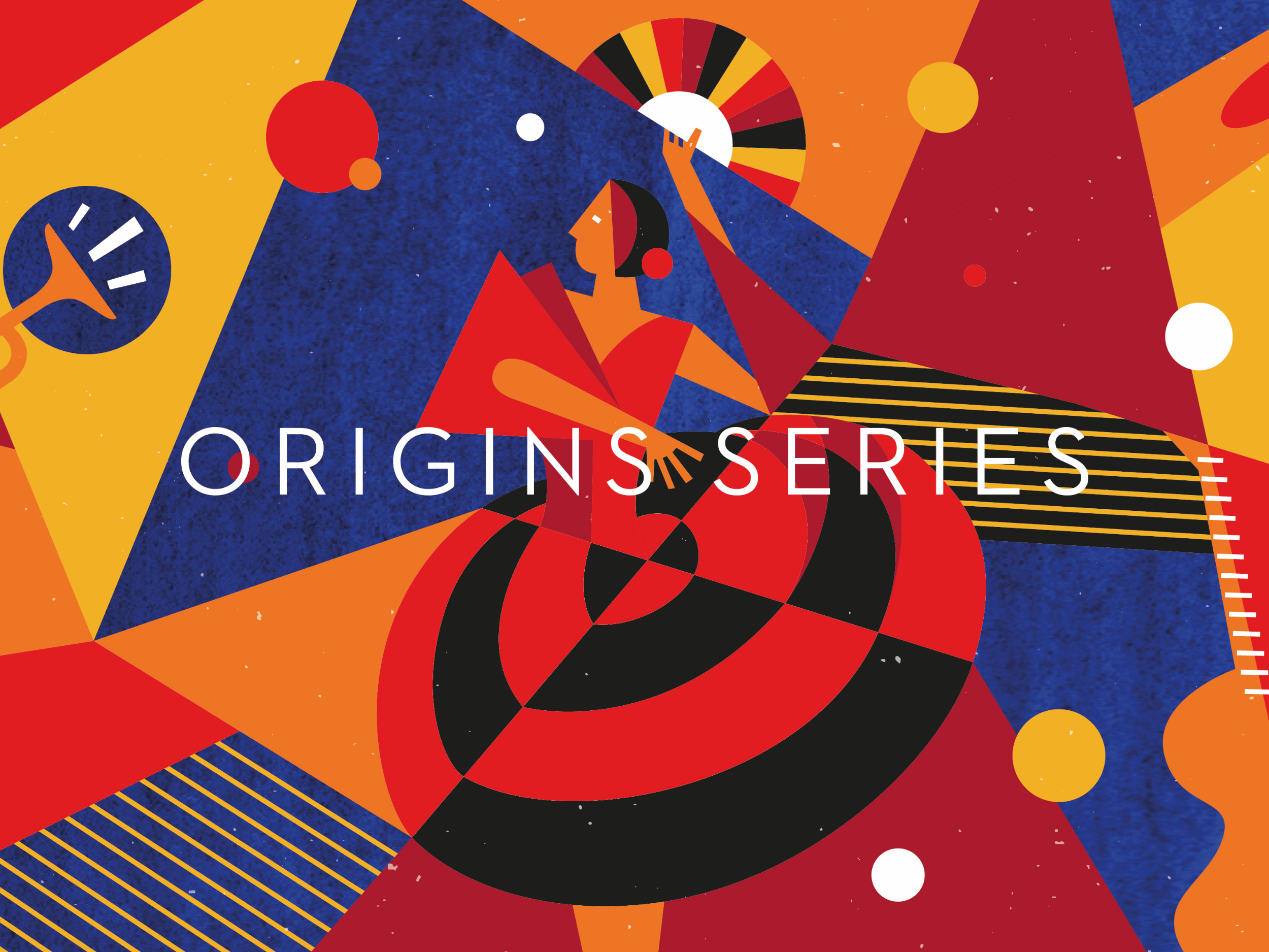
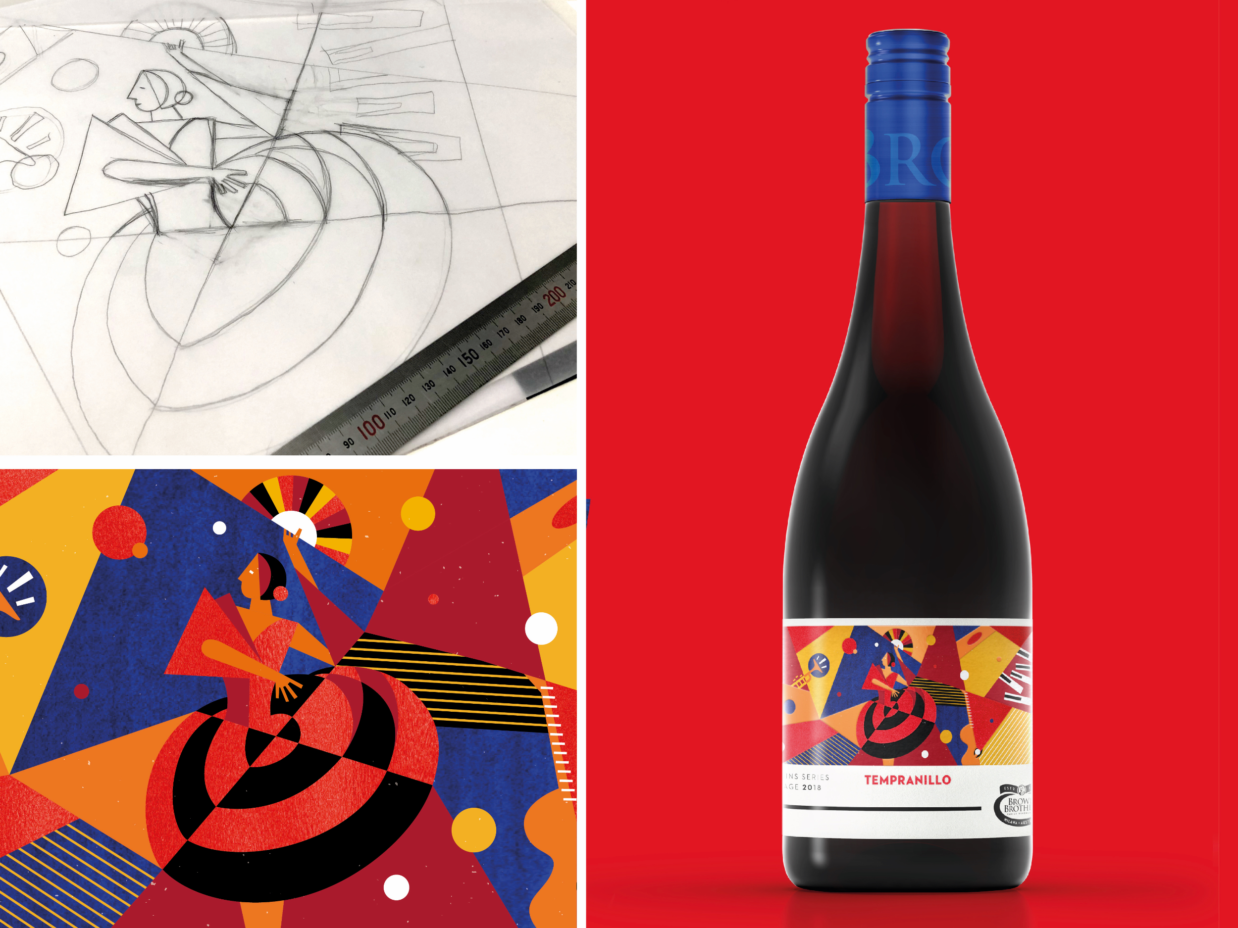
Image Credit :

Project Commissioner
Project Creator
Project Overview
A playfully exotic expression to spice things up in dry wine category.
Team
Amber Bonney - Head of Strategy + ECD Brian Rodrigo Llagas - Design Director Stephen Wren - Group Account Director Matt O'Connor - Senior Creative Artworker Matt Symons - Illustration & Design Ellie Vince - Chief Marketing Executive Emma Brown - Marketing Manager ‑ Brown Brothers & Tasmania
Project Brief
The Edison Agency were engaged by Brown Family Wine Group to help create a disruptive solution to their dry portfolio. Brown Brothers are renowned for their sweet portfolio of Moscato’s and Prosecco’s that tend to overshadow their more exotic grape varietals like Tempranillo, Pinot Grigio and Malbec. Creating ‘new news’ in aisle was key to increasing exposure and consideration of the Brown Brothers dry portfolio with the distinct character of the flavour profiles central to the idea.
Project Innovation/Need
Our work identified a strategic opportunity to own the “Origin” of the varietal through a distinctive, colourful and evocative illustration style. This was a project of love - our distinctive and playful illustration style was hand-crafted by one of our resident Edison illustrators. The vibrancy of the varietals country-of-origin is captured in an approachable and down-to-earth Cubist-Inspired aesthetic. In keeping with the attitude and personality of the Brown Brothers brand - this range captures the spirit of the Mediterranean, French and Spanish icons in a familiar way - rejecting the traditional status codes of stuffy old-world wines.
The vibrancy of the Origin country reflects the flavour profile of the wine and allows for an easy comprehension of these new varieties through known semiotics like the Mediterranean and Spanish Flamenco. The heavily foiled, high build label immediately draws the eye on shelf, with the modern, abstract illustration creating dynamism and energy. Our solution for Brown Brothers Origins has a unisex appeal, whilst re-establishing the range as an exciting, modern and proud range within the master portfolio – worthy of recognition.
Design Challenge
The design challenge was focussed on four core areas:
1. Create disruption at point-of-purchase and engage with new Brand Brothers consumers (currently not considering the brand for dry varietals)
2. Increase awareness and consideration of the dry portfolio through a distinctly bold flavour-led style
3. Capturing the exotic qualities of these unique varietals in a modern ‘flavour first’ system - a bold new approach within the classically designed Brown Brothers family of brands.
4. To create a secondary range architecture system that complimented the Brown Brothers master-brand system (also created by Edison)
Effectiveness
The Origins Series for Brown Brothers has a unisex appeal and is beautifully crafted with the highest quality print embellishments for a rich tactile experience. An exciting, modern and playful design solution inspired by the past but very much a celebration of todays wine drinkers and makers. This was the first time Brown Brothers utilised a new Masterbrand system (using the branding at the base of the label) and has helped evolved the brand with the intent of reaching new audiences.
Graphic Design - Three Dimensional
This award celebrates creative and innovative design in traditional or digital visual representation of ideas and messages used in packaging. Consideration given to: clarity of communication and the matching information style to audience; the approach, including marketing and branding concerns, the dynamics of the retail environment, environmental considerations, and legal requirements; the component parts of packaging graphics such as colour rationalisation, information layout, feel and tone of illustration and photography, and finishes, and how they are used in isolation and in relation to each other; and the relationship to the anatomy of the structural design.
More Details