


Project Overview
Push Collective are a brand consultancy based in Melbourne. They needed a new website to showcase their client work, as well long-form writing and news articles.
Project Commissioner
Project Creator
Team
MASS
Project Brief
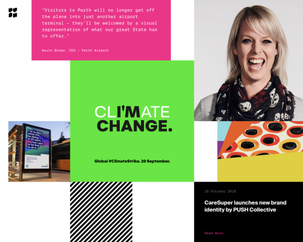
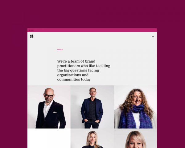
Push Collective combine research, strategy and design to create rich brands for their clients. They needed the website to be able to show the depth of thought that goes into their work, with the capability to include written commentary about the processes that went into the final outcomes. They also needed a space to house their thinking on a range of topics, extending the gamut of branding to Australian culture.
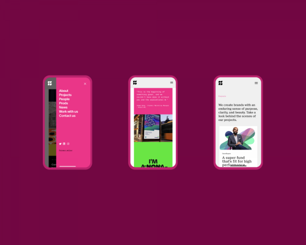
Push were adamant they didn't want their work "floating in space"; there needed to be an obvious underlying structure to the website layout.
Project Innovation/Need
One of the aspects we explored on this project was the idea that nearly all content containers lived on the same z-axis in space, therefore they all pushed up against one another. If something had some element of interactivity (i.e. tiles on homepage, website menu container, page to page transition), this was represented with a vertical swiping/pushing motion.
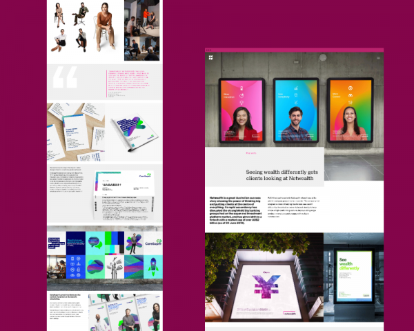
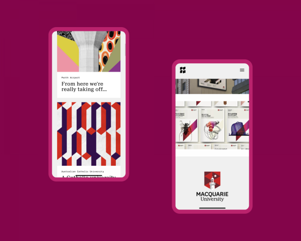
Case studies are completely customisable by way of a vast array of components. This allows content creators to create pages which feel unique, while still feeling unified within the same design system.
We worked closely with the Push team to develop the idea of a branded sound. The homepage features a subtle ambient audio track playing in the background, which became a signature of the site. When interacting with case study tiles on the homepage, the ambient sound was muffled, whereas when the menu appeared a unique sound was layered over the top.
The site features a single page app experience, with no classic page refreshes as a site visitor navigates to different pages.
Design Challenge
Helping to communicate and do justice to the work that goes into a Push branding project was part of the design challenge. We helped achieve this by designing a range of flexible image/video containers which could be ordered in a multitude of arrangements on each case study detail page. We also allowed content creators to make use of a range of text-only content components, where they could build out the brand story of case study.
User Experience
We wanted to allow site visitors to explore and discover on their own. For this reason, we hid the main navigation behind a mobile style menu, only revealed on click. From the homepage, site visitors can scroll from the hero content component into a curated set of tiles, which push them to various parts of the site. Once they've navigated into a detailed section of the site, they can use the main menu to orient themselves and navigate elsewhere.
Digital - Corporate
This award celebrates innovation and creativity in design of a unique user experience in the combination of text, audio, still images, animation, video, and interactivity content for websites. Consideration given to clarity of communication and the matching information style to audience.
More Details