


Project Overview
Several years ago a number of Gippsland TAFE campuses merged to form Federation Training. This merger served its purpose at the time, but there was a sense that TAFE in the region had lost its connection with the community and its purpose as a brand. The organisation needed a new name and brand to show students, community and businesses that this is their local TAFE, and it is bigger, bolder and stronger than ever.
Project Commissioner
Project Creator
Team
Strategy: Kylie Chong & Rachel Miles
Creative Director: Gary Townsend
Design Director: Michelle MacCreadie
Designer: Justin Davies
Designer: Jo Bane
Designer: Emma Baldwin
Artwork: Eleanor Padey
Digital Design: Bel Giles
Illustration: Bryce Pepper
Copywriter: Sanna Lory
Account Director: Alissa Dinham
Senior Account Director: Cera OGrady
Managing Director: Mel Dale
Project Brief
With a clear outline of the problem we needed to solve, we set out to win back the hearts of the people by uniting the diverse Gippsland region and its multiple TAFE campuses. We knew that the name had to change, and the new name must include TAFE. We had to unlock all the positive things about TAFE in Gippsland, and express this in a way that felt authentic and real for Gippsland. And this would be a hard launch, with signage, digital, uniforms and livery switching over at the same time.
Project Innovation/Need
Working closely with the brand and marketing team, we undertook interviews, workshops and research with students, employees, industry, government, schools and the broader community to shape the next chapter together.
Through this collaborative process, we determined that the organisation needed to reaffirm its commitment to Gippsland and win back the hearts of the people.
We articulated a brand purpose that reflected how passionate everyone was about the role of TAFE – To change people’s lives through education. We then built upon this to create the brand idea of ‘transformation’, which resonated with both teachers and students.
Design Challenge
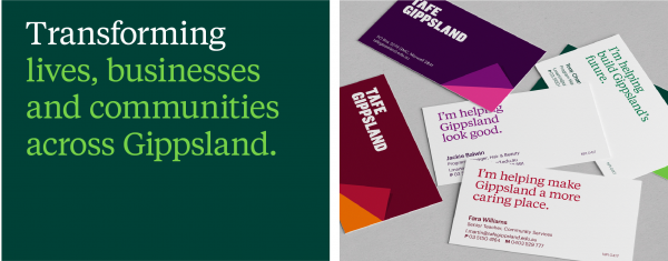
The new identity starts with a new name, TAFE Gippsland, and a new logo. It’s simple and bold, grounded and honest, with reversed As that visually represent transformation. A ‘page turn’ device serves as a recurring master graphic, positioning TAFE as a gateway to a world of exciting possibilities. And the vibrant colour palette, injecting youthful energy into every design, illustrates the diversity of the students, courses and region.
Together, these elements form the foundation of a compelling brand, full of colour, ambition and personality. The photography is real and relatable, and the design is dynamic and contemporary. The type is bold and the is messaging empowering, using language in a way that feels at once aspirational and accessible.
Evolving the user experience across campuses was about more than just aesthetics – it was about creating a functional signage system that would allow students, teachers and visitors to navigate the 12 campuses with ease. So, we partnered with wayfinding experts Isovist, who developed, manufactured and installed a well-considered and effective wayfinding system across TAFE Gippsland’s physical ecosystem.
Effectiveness
The rebrand has just launched to incredibly positive response from students, teachers, the community and Gippsland industry. We look forward to getting hard data to support this anecdotal feedback.
Graphic Design - Identity and Branding - Corporate
This award celebrates creative and innovative design in the traditional or digital visual representation of ideas and messages. Consideration given to clarity of communication and the matching information style to audience.
More Details