Key Dates
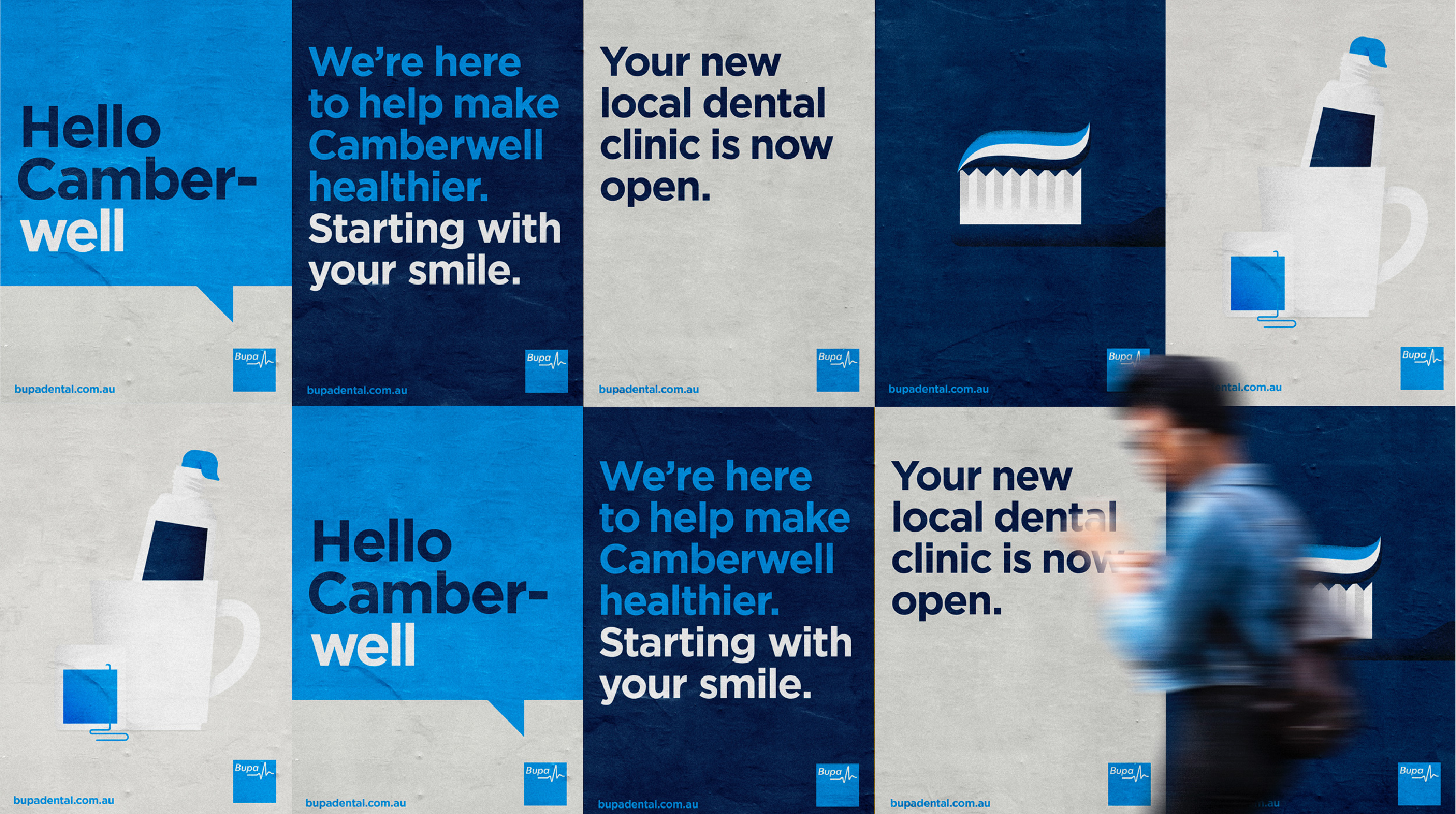


Image Credit :
Project Commissioner
Project Creator
Project Overview
Creating a brand identity for a global health and care business.
Team
Strategy: Rachel Miles Creative Director: Gary Townsend Design Director: Michelle MacCreadie Designer: Justin Davies Designer: Eleanor Padey Digital Design: Bel Giles Illustration: Bryce Pepper Copywriter: Sanny Lory Senior Account Manager: Mark Adams Senior Account Director: Cera O'Grady Managing Director: Mel Dale
Project Brief
Bupa successfully operates in a number of markets around the globe. Due to the widespread nature of the business there were inconsistencies in the way the brand was being brought to life. The result was reduced brand impact. They needed an evolution of their global brand identity and the way the ID system was used. Our brief was to evolve the brand identity to ensure it was high impact, distinctly Bupa, simple, ruthlessly consistent and reflected their premium brand positioning.
Project Innovation/Need
We audited a range of applications and brand touch points from around the world to identify when the brand was at its best. We also identified opportunities to align the brand identity more closely with the organisation purpose to have a bigger, better impact around the world. We refined the design principles in response to market needs, simplifying the brand guidelines to reflect a distinctly Bupa style, and creating a system that would allow for coherence with local flexibility.
Design Challenge
Building on what makes Bupa iconic (a blue square), the new visual identity can be broken down into four simple design principles and an easy-to-use design toolkit. With real photography, impactful illustrations and simplified icons, it’s bold, contemporary and distinctly Bupa. The design system allows the brand to come to life in an impactful way, capturing the quality Bupa delivers in every communication. It enforces consistency (a single-minded use of blue, short and punchy headlines) but is flexible enough to adapt to local markets and audiences, and be creative when the time is right.
Effectiveness
The new Bupa core guidelines and small set of ‘How To’ guides (replacing 22 different brand documents), and a comprehensive asset library, are now used across digital and print, throughout ANZ, UK and Spain, and anywhere else in the world. And Bupa is better positioned than ever to live up to their purpose of helping people live longer, healthier, happier lives. “It makes us feel so much more contemporary” “It feels like Bupa are so much clearer on who they are as a brand” “As an agency, you have to become familiar with multiple brand guidelines. This document tells me exactly who you are and what makes you different.” “It’s really clear and not overwhelming” Bupa is the registered trade mark of The British United Provident Association Limited and is used under licence.
Graphic Design - Identity and Branding - Health
This award celebrates creative and innovative design in the traditional or digital visual representation of ideas and messages. Consideration given to clarity of communication and the matching information style to audience.
More Details