Key Dates
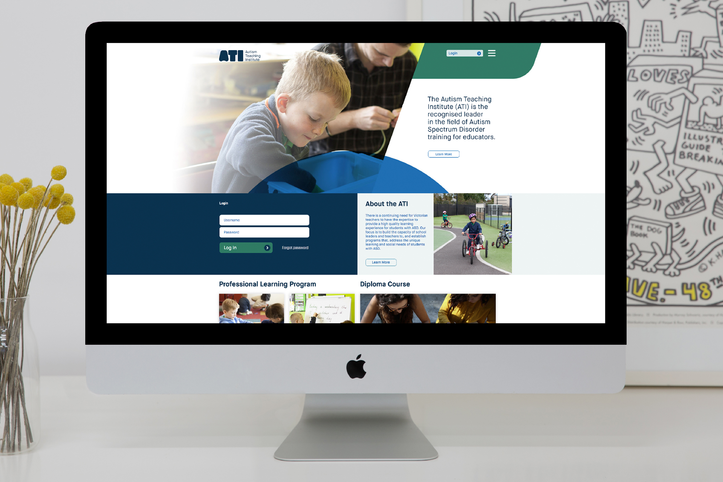
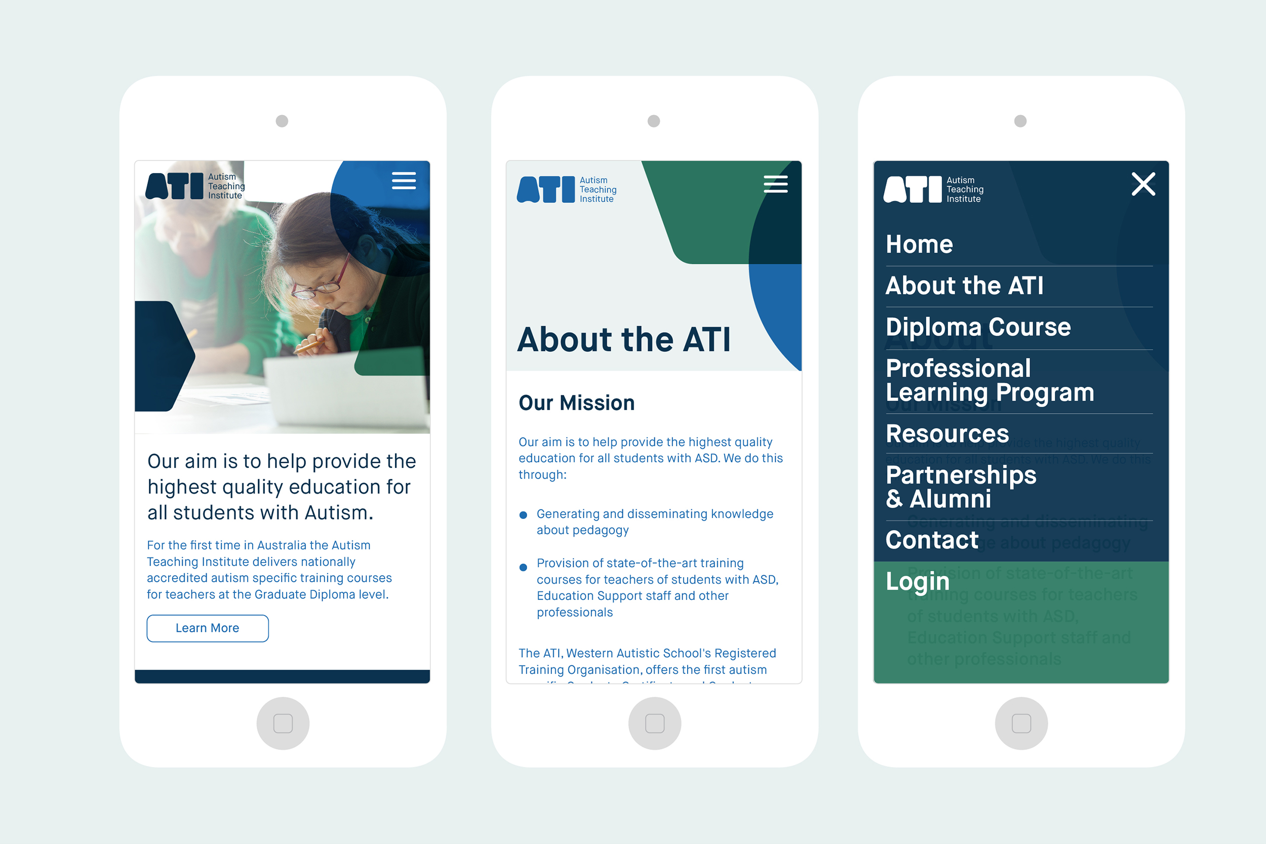

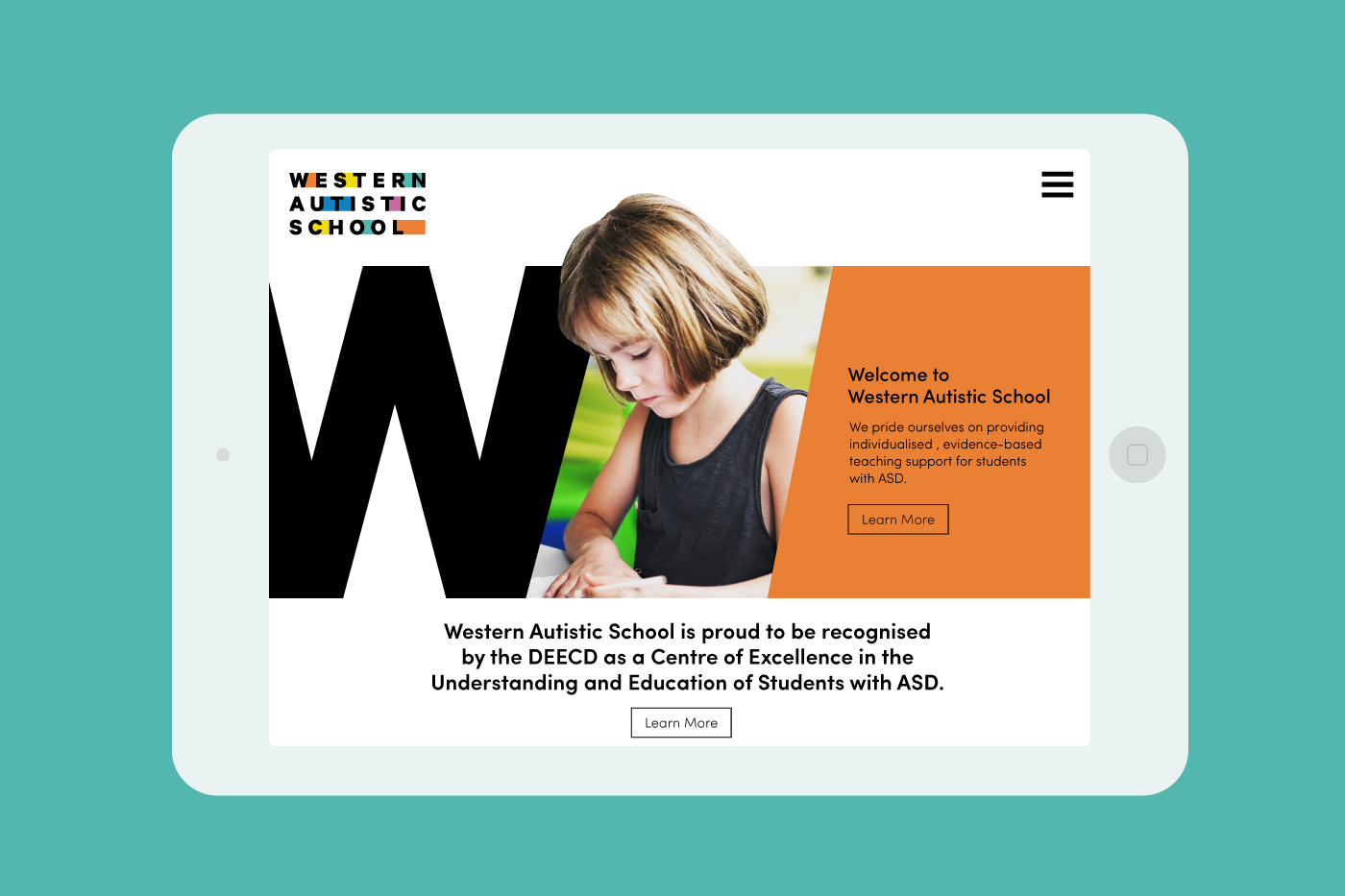

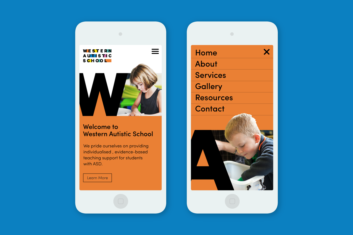
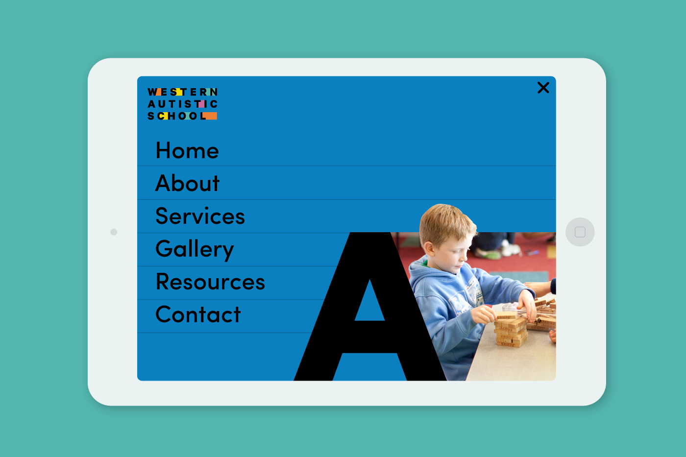
Image Credit :

Project Commissioner
Autism Teaching Institute & Western Autistic School
Project Creator
Project Overview
The Western Autistic School (WAS) provides a range of educational programs for student diagnosed with Autism Spectrum Disorder (ASD). Their highly individualised programs acknowledge that every case of autism is different and therefore manifests different social, emotional and intellectual challenges for students in the school environment. They endeavour to “fill the gap” in the education system and provide specialised support for students with ASD, and their teachers, to enable them to integrate into the mainstream education system.
In our ongoing collaboration with the Western Autistic School we also conducted a rebrand of their teacher training initiative, the Autism Teaching Institute (ATI), an exciting cutting edge initiative that has broken new ground in the fields of School Education, Teacher Training provision and Vocational Training in Australia. Responding to the need of more teachers qualified to handle the special needs of children living with Autism, ATI provides state-of-the-art training courses for teachers, school leaders, and other professionals.
We worked to reposition these two brands as industry leaders with reinvigorated, contemporary brand identities and innovative, informative and intuitive digital platforms.
Team
Creative Director: Sash Fernando Account Director: Anja Doedins Design & Development Team: Sheli Kuperman, Declan Cox, Matthew Campisi, Coire Jones Videography: Angry Chair
Project Brief
WAS approached Principle Design to develop a brand and digital strategy that would reaffirm their presence as a leading educational institution. As an affiliated organisation, ATI reflected a similar need, with nuanced outcomes, in order to stay current alongside their parent organisation brand and evolve their digital pedagogical service provision.
The primary consideration of creating these parallel brands was distinguishing the unique brand identities and custom digital platforms that were tailored to the specific target market, functionality and growth strategy of each organisation. The key outcomes were to increase exposure, grow brand recognition and credibility as well as provide functional and intuitive interfaces for parents and staff as a key communication touch point.
Project Need
With an out dated brand and website design, both organisations felt that their visual identities did not sufficiently inspire parents or teachers of children with ASD to engage in their innovative learning and teaching programs. The rebranding exercise visually expressed the WAS' position in the Victorian education system as "filling the gaps" symbolised by vibrant colour blocking absorbing the space between the letterforms of the bold typography.
Similarly, ATI was seeking to better represent the unique teaching methods required to effectively work with students with special needs. The bold swathes of blue and green geometries of the bespoke typeface represent the unique building blocks of autism teaching in that no two cases of autism are the same. The intersecting shapes are expressed in unique patterns across both digital and print media to demonstrate a consistent quality of care across various bespoke applications.
It’s design that represents innovation with a level of symbolism and attention to detail that captures the sensitivity and tailored approach to education for children with special needs.
User Experience
As the primary touch point for current and prospective teachers of ATI, we developed an interactive portal website that acts as an educational asset for the institution to facilitate communication of key course information, access to learning materials, assignment submissions, and discussion between students.
We charted the user experience journey through simulating the experience of engaging with the program whilst pushing the brief to see if we could enhance the user experience through innovative design solutions. We proposed the inclusion of a forum mechanism that facilitated communication between the faculty and users and elevated the website from a simple digital platform to a vital communication asset.
This rigorous questioning of the the brief and the user experience journey allowed us imagine new possibilities and create an outcome that elevated what was once a simple website into a critical pedagogical tool and a vital feature used in the daily structure of the institution.
Project Marketing
The rebranding exercise has been a community focused exercise that aims to express their commitment to innovate and address the needs of students with special needs across their schooling opportunities at WAS and developing teachers of students with ASD through the ATI. In the special needs education community, the exposure has been significant with a marked increase in parent engagement and improved communication between program facilitators and participants; communication facilitates community which is at the heart of both ATI and WAS.
Project Privacy
N/A
Digital - EdTech
EdTech focuses on how education is changing through technology, changing the way we learn and process knowledge. What will stand out here is those that enhance the learning experience and make a lasting impression.
More Details