


Project Overview
Designed by Christopher Doyle Architects, with interiors by Studio Griffiths, this pair of whole floor premium residences presented a unique offering to one of Melbourne’s most revered suburbs; Armadale. The highly exclusive nature of the project required a design that matched this superior quality and tone. With this in mind, Earl.St released a limited number of high-end publications together with site signage that showcased a unique, reflective surface. Thoughtful consideration into such details resulted in a campaign that was refined, elegant and highly desirable.
Project Commissioner
Project Creator
Project Brief
Earl.St was tasked with creating a campaign that would complement the high-end and exclusive nature of the project. The design was to appeal to an older, more conservative demographic – likely couples looking to downsize from a larger family home in the area without having to compromise on quality and location.
Project Innovation/Need
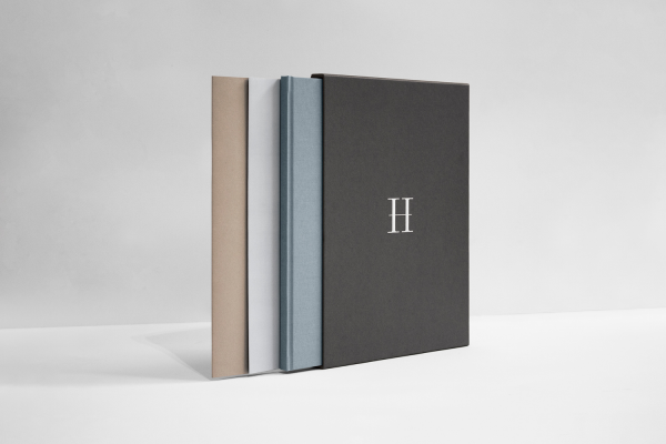
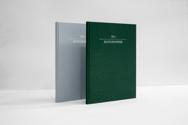
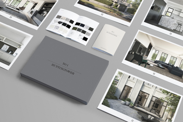
The publication series consisted of complimentary items contained within a custom made slipcase. This was designed to reflect the carefully considered and uncompromising quality of the development.
We included two variations in cover to reflect the two residences on offer, one penthouse and one garden. Oversized floor plans utilised the highest possible printing area available, placing emphasis on the oversized nature of the project compared its competitors on the area. We also featured materials with textures that complimented each publication in the series and reflected the materials used within the project.
Design Challenge
The elaborate and highly exclusive nature of the project meant the tone of the design had to be carefully considered to ensure it would appeal to the right audience. As such, the design was crafted to capture the uncompromising nature of the project, with materials carefully chosen to enhance the tone of voice and effectiveness of the communication.
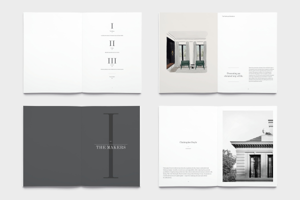
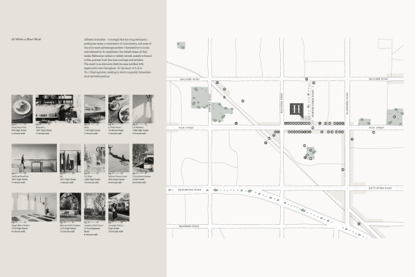
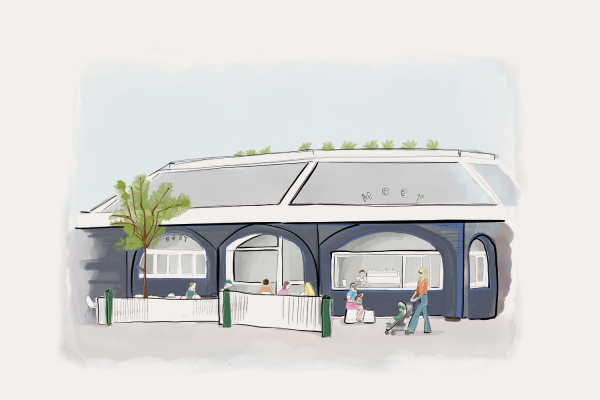
Photography and illustrations were also commissioned to highlight the plentiful and covetable local lifestyle offering. This was further emphasised by a location map designed to complement the photographic series by showcasing the vast offerings that exist within a 10-minute stroll of the project.
Effectiveness
Many considerations were made to ensure an effective and engaging experience for the project’s audience. An oversized scale brochure ensured a grand and illustrious impression, which further complimented the architectural visualisations. Similarly, the typography was carefully considered to adhere to the tastes of a conservative, older audience.
The publication itself was then complimented by a series of pieces that worked in tandem to provide further detail and insight into the brochure’s content. This allowed notable details to be viewed in conjunction with the overview – such as the material finishes against the large architectural visualisations.
Graphic Design - Publication
This award celebrates creative and innovative design in the traditional or digital visual representation of ideas and messages. Consideration given to clarity of communication and the matching of information style to audience.
More Details