


Project Overview
One of the frustrations of the branding business is that companies see branding as something elective and occasional, when it really needs to be always on. As we’ve seen in many instances, from BP to United Airlines, when companies lose sight of their values and brand identity, they put their organisations at risk. Darren and Mark agreed that while there were branding books on the market that explained branding techniques and related case studies, there wasn’t a book that explained how and why branding, historically used mainly in retail industries, had become a necessity for everyone, even for individuals. Their idea was to write a book that would challenge current assumptions about branding and argue why it needs to be a core part of any organisation.
Organisation
Team
Authors: Darren Taylor & Mark Schreiber
Strategist: Rebecca Siobhan Austin
Creative Director: Michelle Eden
Designer: Sheila Papp
Production Manager: Simon Taylor
Printer: Gunn & Taylor
Project Brief
The design needed to reflect not only the concepts of the book itself and appeal to the market, but to express the Taylor & Grace design ethos and serve as a brand for the idea of brand itself! A high mission.
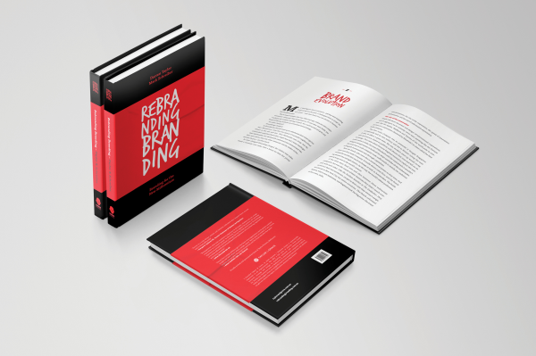
While the Kindle and PDF would make the book available to a large and international audience, the central project was the hardcover, which would become the main brand artefact for Taylor & Grace in relations with clients, business, government and thought leaders.
Project Innovation/Need
The decision to self-publish in hardcover and to use an Australian printer was itself unusual, as most books are now either sold to publishers, self-published in
soft-cover and outsourced to printers in Asia. Darren and Mark did not even approach publishers because they thought the Taylor & Grace creative team could do as good or better than any trade publisher. However, if the book appeared below the standards of the professional book publishing community, as many self-published books do, it would devalue its message and hurt Taylor & Grace’s own brand.
Design Challenge
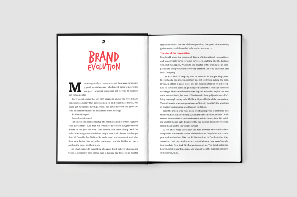
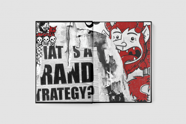
The challenge for Taylor & Grace was to publish a hardcover book at the highest professional standards for a target market, CEOs, an audience that doesn’t have much time to read books. We decided to incorporate design not just on the object level but thematically through the whole process. This meant writing a short book with large print, enticing chapter titles, no charts, footnotes or index. Instead of traditional photos or illustrations we used word maps and provocative graffiti-style graphics over two-page spreads. But our main point of differentiation was an abbreviated dust jacket that only partially covered the cloth cover, expressing the idea of transforming from the old model to the new.
Effectiveness
The response to the book has been beyond our expectations. It has only been two months since publication, but already we have gained new business offers as a result and clients, partners and friends are looking at us with fresh eyes. Most notably, people are really drawn to the book. When they see it they can’t resist picking it up, examining the dust jacket, and leafing through the pages. Many have told us they have read it in one sitting.
Tags
Graphic Design - Publication
This award celebrates creative and innovative design in the traditional or digital visual representation of ideas and messages. Consideration given to clarity of communication and the matching of information style to audience.
More Details