Key Dates


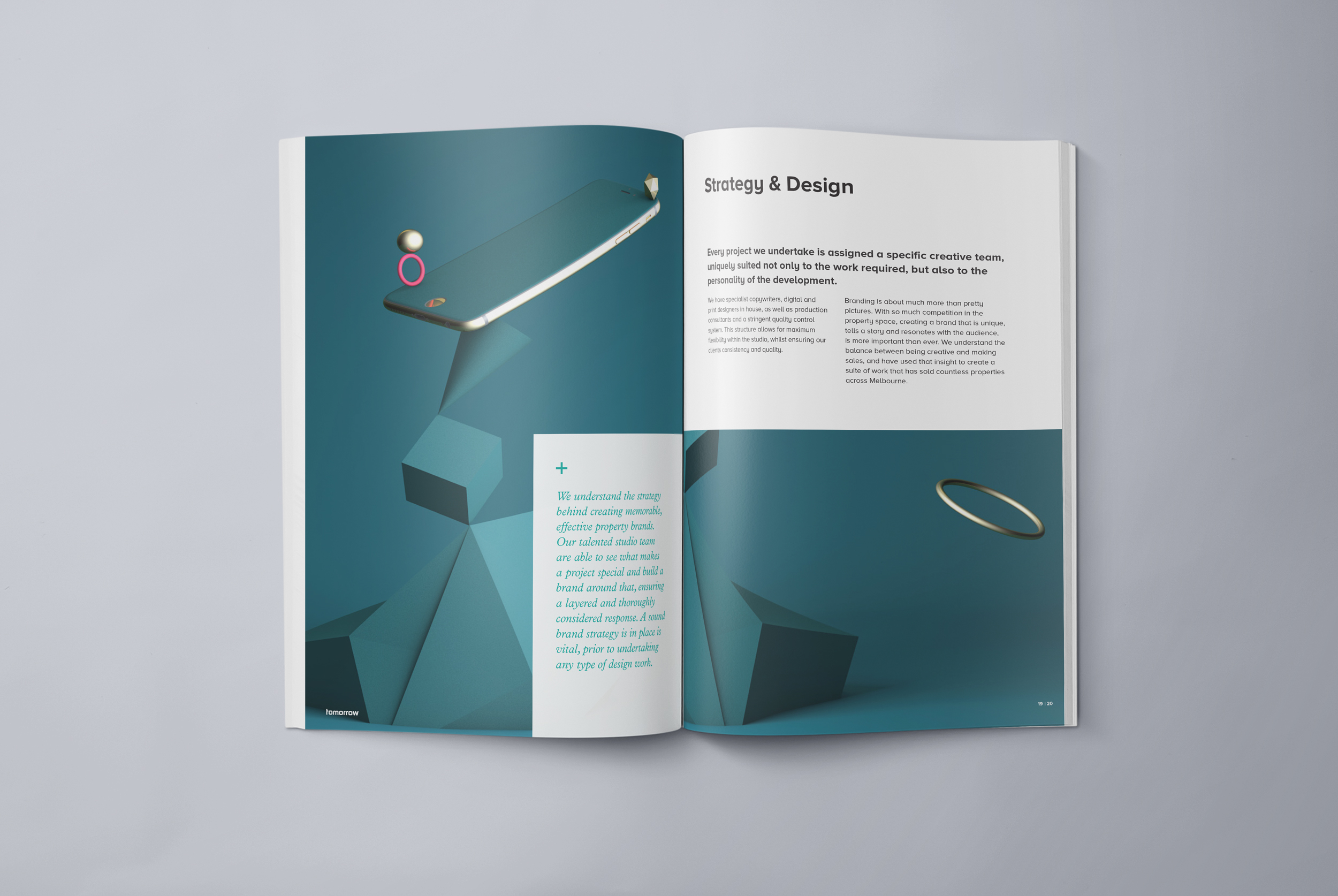

Image Credit : Cass Mackenzie and Alysha Sandow
Project Overview
All brands need to be continually monitored and refreshed in order to stay relevant and current. After 7 years, the tomorrow brand was in need of a little tweaking in order to adequately represent the evolution the agency had undergone over that time.
Organisation
Team
Cass Mackenzie - Senior Designer/3D Artist Alysha Sandow -Design Director Lars Weisenberger - Creative Director/Copywriter
Project Brief
Anyone will tell you that the hardest brand to work on is your own. That was definitely the case when we began the process of evolving the tomorrow brand.
Since its inception, tomorrow had been a simple, bold brand, known predominantly for the use of a vivid red as the core visual element. This approach had served us well, but had begun to feel a little dated. The agency had moved so far in the last 7 years that we wanted to reflect that in our visual style, but without loosing the equity we had built up in our existing brand.
So, first thing to do was bid farewell to the red and move instead to a more sophisticated, classic black. However, we didn't want to dispense with colour altogether, so ultimately, we decided to create a suite of 3D illustrations that would subtly reference different parts of the agency offering. We chose 3D art as it has a modern, futuristic feel which sits well with the name tomorrow, but also because it presented us with the challenge of doing something we had never done before.
Project Innovation/Need
The innovation we have brought to the table with this project centres around how we evolved our visual style to mirror the growth within the agency.
We had found that over time the strength of our media department had detracted from our creative services, leading to some clients to not realising that we had a great design studio. We really wanted to bust this perception in a way that demonstrated the creative skill we possessed.
The digital side of our business had also seen significant growth in a relatively short period of time, with a whole range of new services, from web development to search and social marketing, all now handled in-house. As an area that offered amazing growth potential, we also wanted to make it a focal point of the new tomorrow.
Taking those two key areas into account, we thought about how we could best represent art and digital know how and that organically led us to the notion of 3D art. It embraced both notions in a way that was subtle, striking and filled with opportunity.
Design Challenge
Apart from the initial challenge of simply determining what to do to achieve our goals, the actual creation of the artworks was clearly a great challenge. One of our Senior Designers, Cass Mackenzie, effectively taught herself to render the images from scratch and over time, pushed that knowledge further and learnt how to animate them. This culminated in the short video attached to this entry that links all the images together.
One of the catalysts for the creation of the 3D images was the fact that we were about to design a new agency website and were looking for a way to bring colour and excitement to the design. Having designed the images and website in tandem, they clearly came together naturally. At that point we were faced with the challenge of then implementing the images into other aspects of our corporate collateral.
This proved quite challenging as we didn't want it to feel forced, particularly in our print and digital credentials documents. We trialled many different approaches and gradually determined the best manner in which to get the visual impact we were after whilst retaining the "tomorrow" personality.
Effectiveness
Although our new website has only been live for around 4 weeks, we have seen a dramatic increase in traffic, as well as the time visitors are spending on the site. However, what has been even more pleasing is the feedback we have been receiving from our clients and suppliers. They have been overwhelmingly positive, demonstrating that the change had been accepted as a natural evolution of the brand.
As we begin to get our new collateral out into the marketplace over the next month, we will start to see if the change yields an increase in work, however, that would be a bonus. The real purpose of the refresh was to start a new conversation around the agency and demonstrate how we are changing and growing. From that perspective, it has already been a great success.
Graphic Design - Illustration and Type
This award celebrates creativity and innovation in the traditional or digital visual representation of ideas and messages. Consideration given to clarity of communication and the matching information style to audience.
More Details