


Image Credit : Nissen Richards Studio or Gareth Gardner

Project Overview
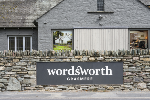
Nissen Richards Studio has created the new branding for Wordsworth Grasmere, a complex, multi-building visitor attraction, which encompasses the former Lake District home of the great English Romantic poet William Wordsworth and his sister Dorothy at Dove Cottage as well as a newly-expanded Museum (incorporating a shop and café), plus the Jerwood Centre - created at the turn of the millennium to house a world-class collection of Wordsworth manuscripts, first editions and paintings – along with a number of supporting buildings, gardens and a car park. The Museum was remodelled and extended by basebuild architects Purcell, whilst Nissen Richards Studio created the interior and exhibition spaces for both the Museum and Dove Cottage, as well as the scheme’s identity, branding, wayfinding and signage.
Project Commissioner
Project Creator
Team
Director: Pippa Nissen
Head of Graphic Design: Candy Wall
Graphic designers: Dario Pianesi, Terry Hearnshaw
Project Architect: Andrea Hickey
Graphics Contractor: Leach (Internal)
Slate Signage: Gordon Greaves Slate (external)
Project Brief
To create a new identity and branding system that would preserve William Wordsworth’s heritage and encapsulate his innovative approach to poetry. The new branding needed not only to create a new Wordsworth Grasmere identity, but a system that would be suitable for use across digital applications, as well as a range of products. It needed to tie in very closely with the overall brief for the site and its mission to honour and communicate the poetry of William Wordsworth and the lives once lived at Dove Cottage by William and his sister Dorothy, as well as reflecting a sense of place.
Project Innovation/Need
The classic and the contemporary were brought together for the new identity system by the design team at Nissen Richards Studio through bespoke characters initially inspired by Baskerville, the typeface designed by John Baskerville and used to print the first Wordsworth editions of poetry. The primary typeface used for the identity is Soleil, an inclusive sans-serif based on modernist ideas of simplicity, clarity and reduction to essential forms. The identity is in a friendly and contemporary lower case, with GRASMERE capitalised in Sans Serif.
The logo’s unique ligature is inspired by a set of glyphs taken from the first edition of Wordsworth and Coleridge’s Lyrical Ballads, forming part of an instruction from Wordsworth to his printer. The identity, designed to be as inclusive as possible and to appeal to a broad audience, also features a marque that suggests the stain of ink and the echo of handwriting. Each shape has a unique feel and has been created especially, with the colours of the identity inspired by the Lake District and by paintings by English Romantic masters.
The branding also found expression in the three-dimensional gallery design by Nissen Richards Studio, with ink stains used within Gallery Three’s decoration to accompany the manuscripts, referencing the branding language.
Design Challenge
The new identity and branding system had to be specific to Wordsworth, reflecting his poetry and creative approach, but also highly contemporary and appealing to a wide range of visitors. It needed to work well on its own, as well as on a variety of digital and product applications, together with integrated signage for the site’s architecture and interiors.
Effectiveness
‘The new brand that Nissen Richards Studio have designed for Wordsworth Grasmere perfectly captures the essence of Wordsworth’s legacy. It is contemporary and inspirational with a timeless feel and will be invaluable in helping us to shape a new identity for our organisation. We couldn’t be happier with it!’
(Emily Burnham, Marketing and Communications Manager, The Wordsworth Trust)
Graphic Design - Identity and Branding
This award celebrates creative and innovative design in the traditional or digital visual representation of ideas and messages. Consideration given to clarity of communication and the matching information style to audience.
More Details