


Project Overview
Addressing the pressing issue of affordably priced housing in London, we came up with a new way of living for an audience that has given up on ‘stuff’.
We developed a brand strategy and identity for a development of micro-units, that turned small spaces into a big opportunity. By maximising every millimetre, minimising all that fancy fuss, and turning an apartment into an experience, we were able to convince a generation of non-buyers to buy their first home.
Project Commissioner
Project Creator
Team
Mark Whiteway Managing Director
Matt Partis Creative Director
Tom Feilla Designer
Hailey Hamilton Designer
Carmel Conway Designer
Katharine Lewis Account Manager
Paul Howard Head of Production
Project Brief
Paradigm Land asked us to create a brand for their latest residential development – a series of micro-units overlooking Gunnersbury Park, with more developments set to be built across West London. With space in London at a premium, and affordable apartments often unremarkable, we had to inspire a generation of non-buyers make their first home purchase, and put a positive spin on these smaller-than-average spaces.
We took a long, hard, look at our target audience – first-time buyers – and came up with a key insight: they just don’t want things. Endless piles of stuff has been replaced with experiences, as younger people seek to buy less, and live more.
So we needed to create a concept that was bigger than just a building – a concept for living. One that not only recognises the rapidly changing needs of this ‘asset light’ audience, but positions Paradigm Land at the center of that change. A concept that could live well beyond one building, and change how people thought about small spaces.
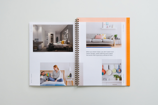
So we built a brand that fits the way people actually live. Getting rid of all the clutter, and maximising the experiences that matter. And making apartments a little more Apt. We highlighted this to our audience through some clever naming, a clean-cut visual identity, and a suite of marketing assets, that highlighted the multi-purpose, always-useful, experience-full spaces. Showing off all the little extras packed into one, affordable, optimised space.
Project Innovation/Need
This project innovated by creating a concept for living, that actually reflects how people live. We knew that our audience wanted to live asset-light, so we created a brand that was asset-light too.
So rather than luxury and excess (as is the case in so much property advertising), we trimmed everything down to its essential elements but packed it full of experience.
From the logo, that brought the name to life by quite literally showing how we made ‘apartment’ more Apt (and turned the traditional property market on its head in the process) to the tone of voice that spoke like our audience, and not like agents, we made sure every single element of the brand had a function, and brought a new layer of understanding to our audience.
This clean-cut approach allowed us to put the concept front and centre, and helped to make it truly ownable, the brand truly embodied it’s philosophy – everything you need, nothing you don’t.
Design Challenge
We had to address the unavoidable fact that these were small apartments – even for London, a city well known for the size (or lack thereof) of its housing. And having been built in a refurbished office space, this wasn’t the most photogenic building around. We also had to consider how the design could span across multiple developments, with Paradigm set to build more micro-units across West London.
So rather than competing with every other property ad out there, showing sweeping views of architecture or spacious interior shots that simply never live up to expectations, and tie a brand to a particular location, or building, we decided to think a little bigger.
We faced the problem head on, and created a way of life that turned small spaces into a big opportunity. So our marketing assets focused on the experience, showing off a lifestyle that let people live more, with less stuff.
This meant that we were able to cut through our competitors, and hero the design innovations within the space, without tying it down to a particular location.
Effectiveness
Apt was a hit from the very start, with a queue of 100 people outside the marketing suite from its opening weekend. And not only did we get people in the door, but people were buying into the concept (and into flats) there and then, with 90% exchanging in the room.
And as the Apt brand expands to more locations, opening up in Brentwood and Kew Bridge, it’s clear that our audience think this way of life is pretty apt, too.
Graphic Design - Identity and Branding
This award celebrates creative and innovative design in the traditional or digital visual representation of ideas and messages. Consideration given to clarity of communication and the matching information style to audience.
More Details