Key Dates
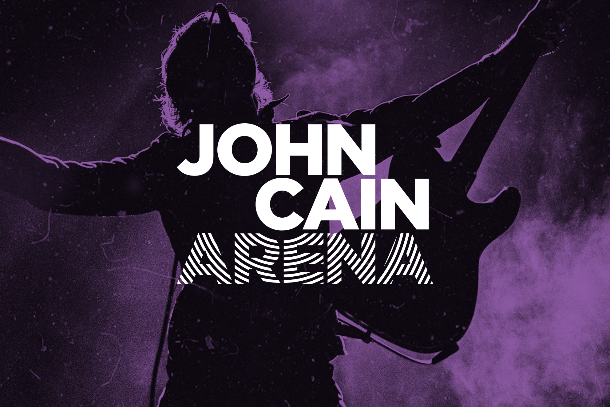
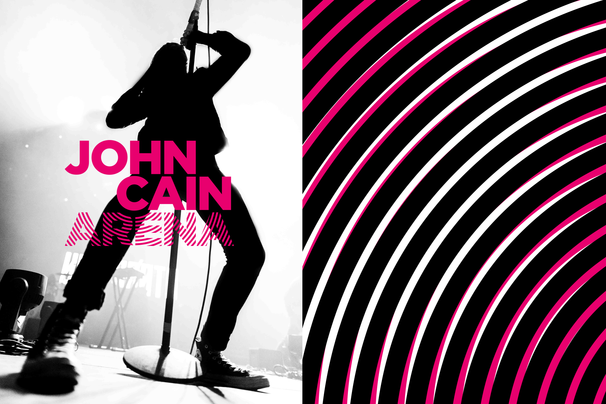
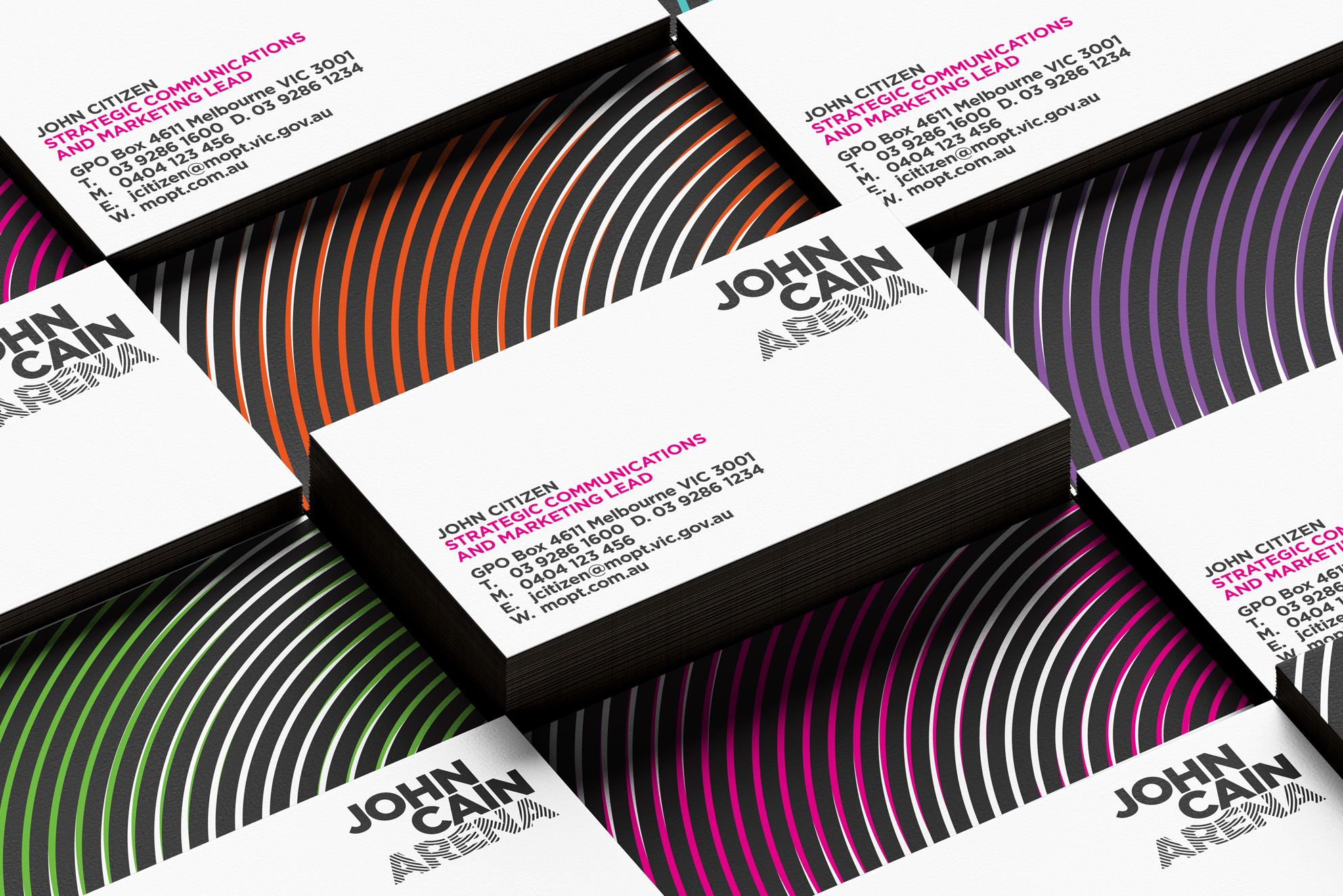
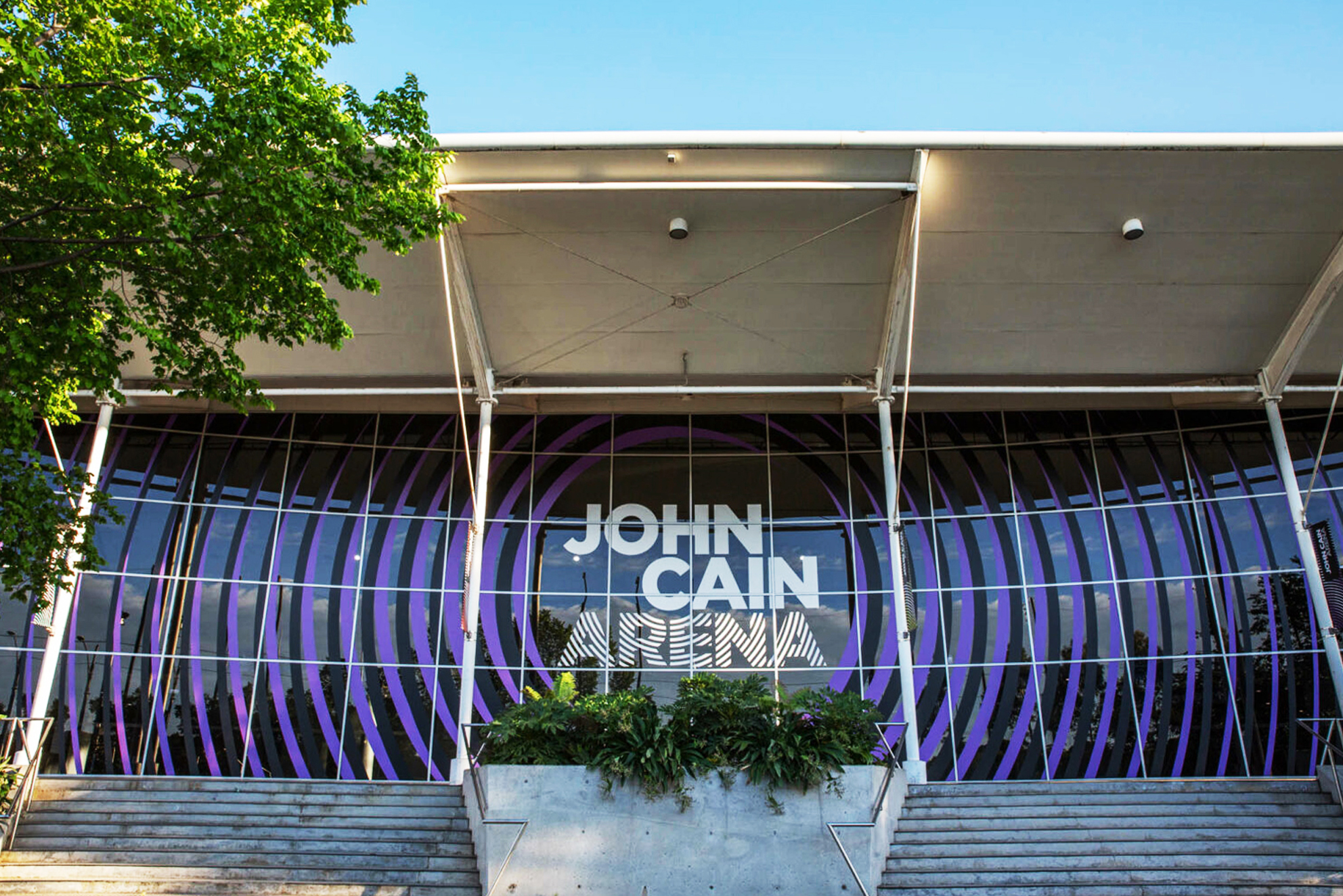
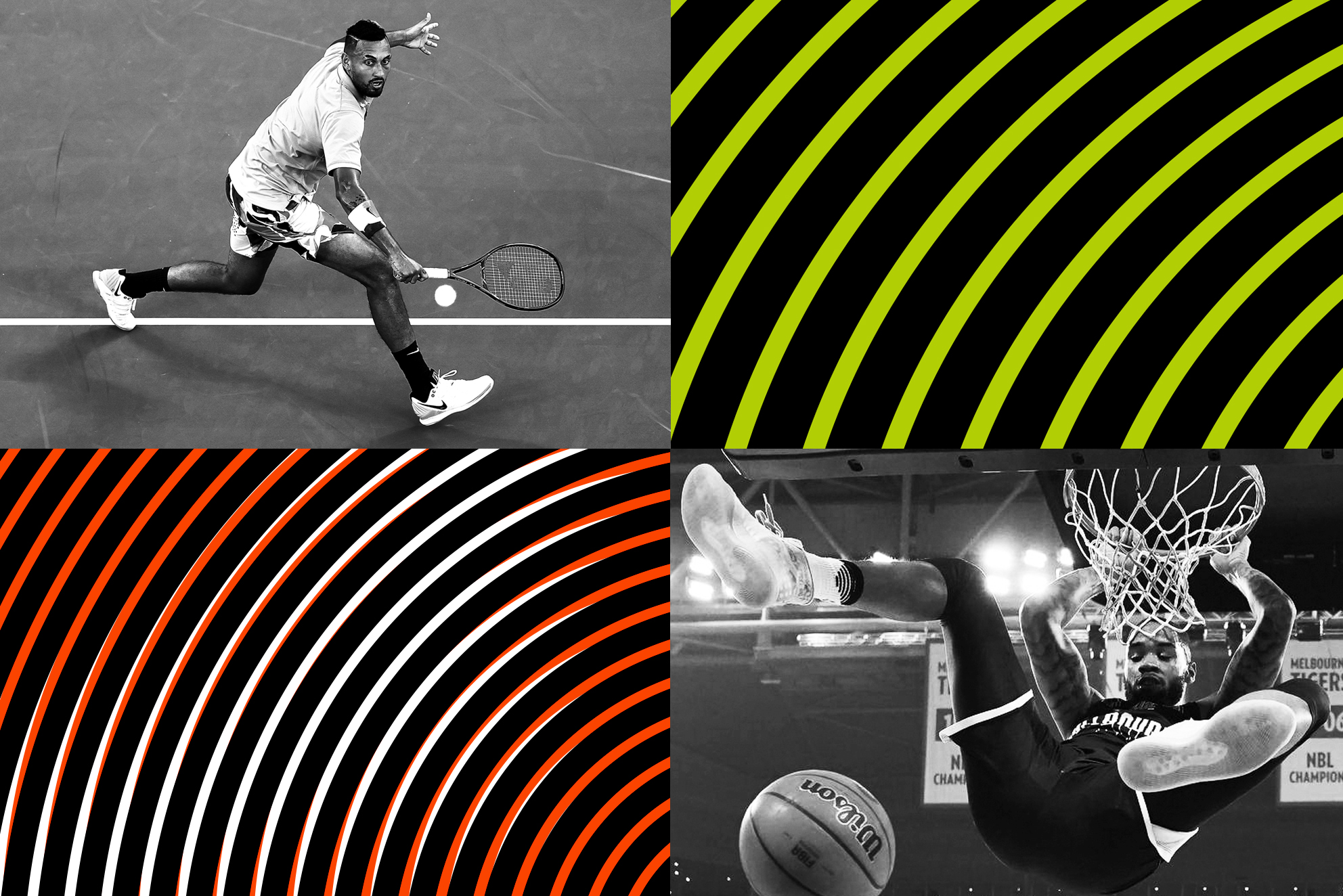
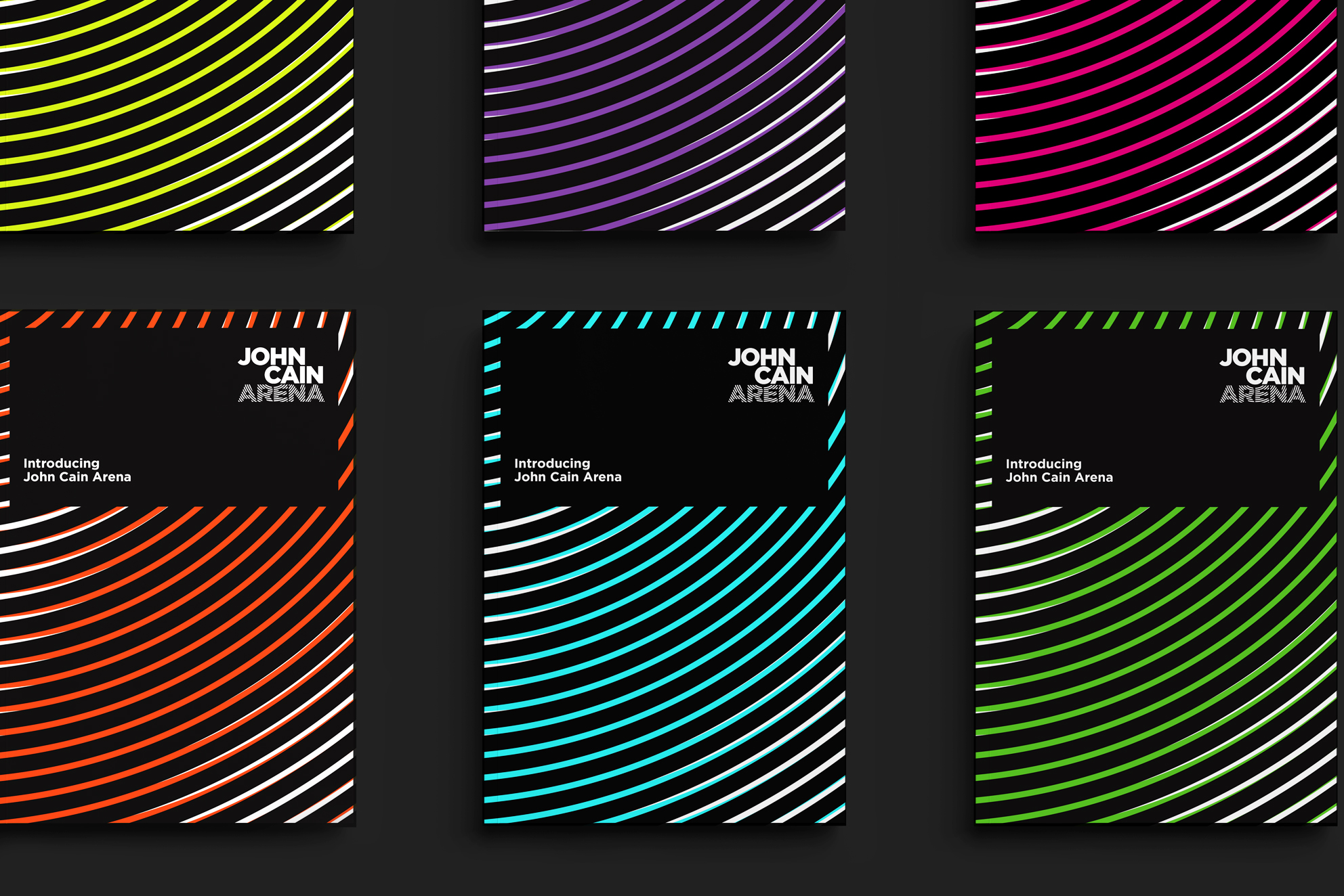
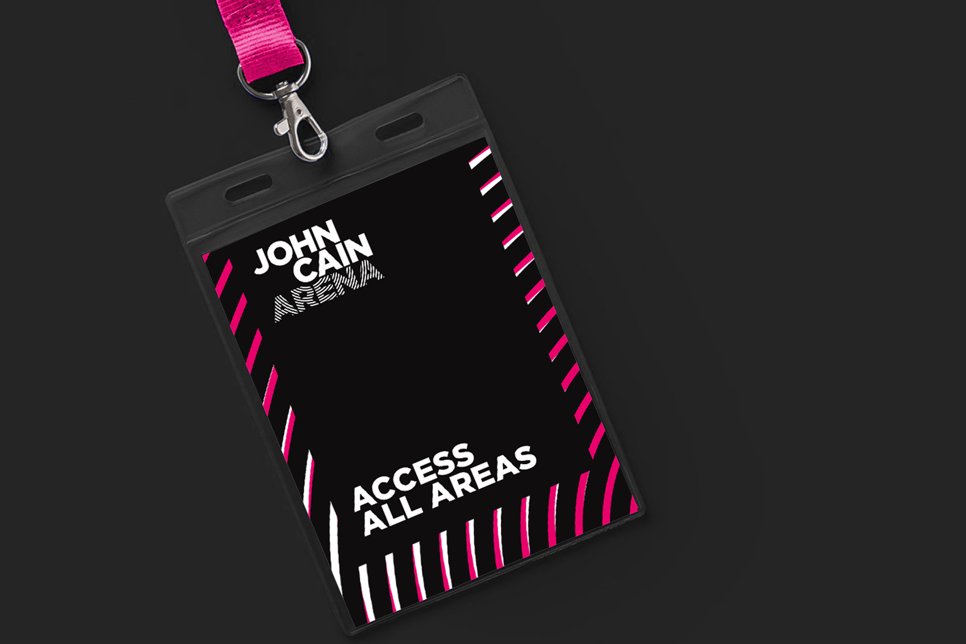
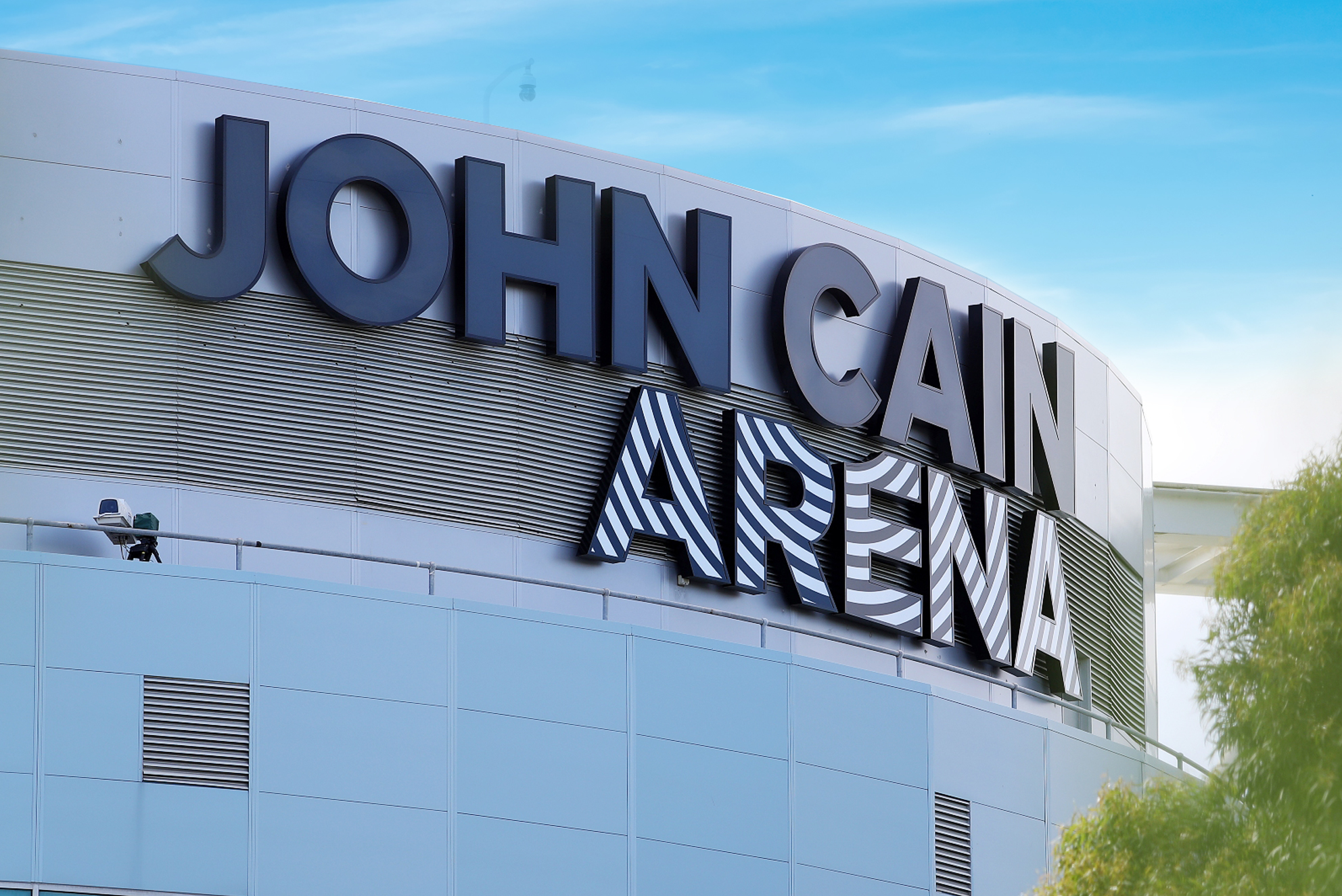
Image Credit :
Project Overview
R-Co was engaged to develop the identity for the John Cain Arena to replace the previous Melbourne Park branding. The project involved strategic positioning of the John Cain Arena within the Melbourne Olympic Park (MOP) precinct and engagement with stakeholders who use the John Cain Arena as their home. Then to undertake creative development of an identity that would reflect the stature of John Cain’s contribution to MOP as an inspiring driving force; the experience of being there by both performer and fans; the ability of the identity to be extended into signage and communication effect. In other words to brand the John Cain Arena with significance.
Organisation
Team
JCA: Director of Communications and Stakeholder Relations: Katherine Oakley Strategic Communications and Marketing Lead: Georgia Pedersen R-Co: Creative Director: Richard Henderson Design Director: Michael Canturi Designer: Peter Nedanovski Project Administrator: Karen Liang Strategist: Brigette McGuire
Project Brief
The Brief (from client)
“This project will develop the logo and brand elements of John Cain Arena, creating a visual expression that respects the incredible legacy of John Cain, while acknowledging the important role the venue plays in Melbourne’s sport and entertainment landscape.
With a space this versatile, that hosts hundreds of thousands of diverse fans across a range of events each year, most notably as a key venue of the Australian Open, it is imperative the brand is as distinct as it is universal.
A key challenge of this brief is to design branding that is modern and future focused, juxtaposed against the legacy and historic importance of the name the venue has been assigned.
Additionally, the brand should have a highly level of usability to be applied in a range of contexts including large format signage, digital advertising and on merchandise or uniforms.”
Project Innovation/Need
For R-Co this project represented an opportunity to make John Cain Arena a centerpiece of the MOP precinct and honour John Cain the man, and his role in the history of the MOP development. We referenced this quote – “John Cain once told me all political careers end in failure. I dare to disagree, some people, like your good self, endure ever after death as models of civic virtue” Martin Flanagan, 1.40am 23/12/2019
By placing emphasis on the name and lock up, with graphic elements that expressed emotion and a focus on the experience, the identity expressed significance with excitement. The innovation within the project can be seen in:
1/ the ability of the R-Co design process to engage with the Cain family, MOP, stakeholders, Government and parties.
2/ The strength of the strategy and the design solution that followed, which created a sense of place with a graphic impression symbolic of the experience. No other venue at MOP has this brand impact or it’s integration with the building design.
Design Challenge
The design challenge was to engage with stakeholders, demonstrate to the Cain family the reasons behind the solution, provide a recognition of John Cain’s contribution, in keeping with the persona of John Cain himself, and liaise with the MOP stakeholder to unfold what effective brand design could do, by creating a Look & Feel inbuilt into the Brand Identity that can be extended across a variety of applications – simply and effectively.
This emphasised sense of place and sense of style of the John Cain Arena, beyond the architecture and function of destination.
Engagement with the many stakeholders including Government was key to achieving the best outcome without compromising the design.
Effectiveness
All applications of the John Cain Arena brand identity are implemented with local suppliers. The efficiency of the identity delivered a “less is more” outcome through impact and visual effectiveness. Digital enhancement was used in signage applications using colour to align the John Cain Arena with events when they happen (e.g. Australian Open) and the Sporting Clubs that perform there. This amplified the activity nature of the Arena.
Graphic Design - Corporate Identity & Branding
This award celebrates creative and innovative design in the traditional or digital visual representation of brand, ideas and messages. Consideration given to clarity of communication, representation of brand values and the matching information style to audience.
More Details