


Image Credit : Larraine Henning
Reuben Ross

Project Overview
A complete family
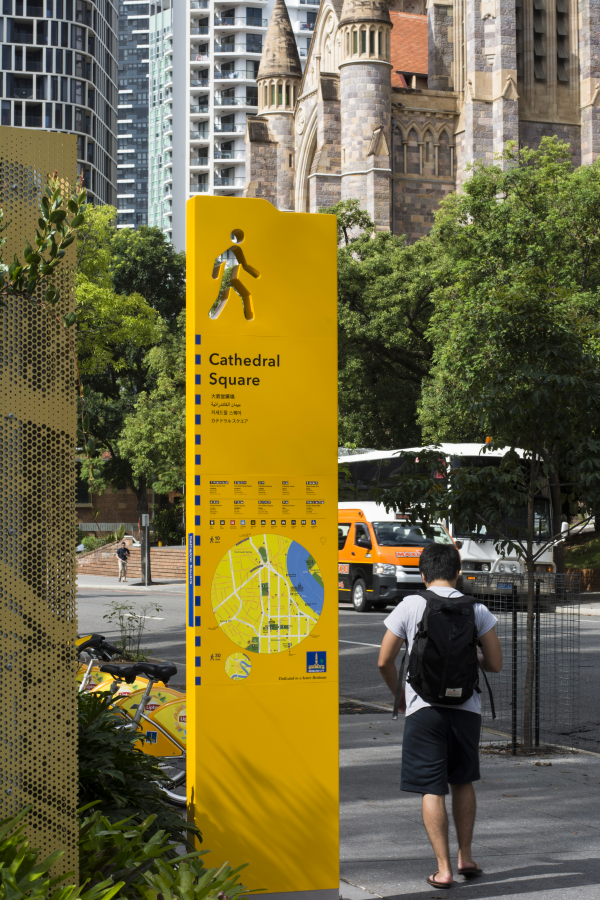
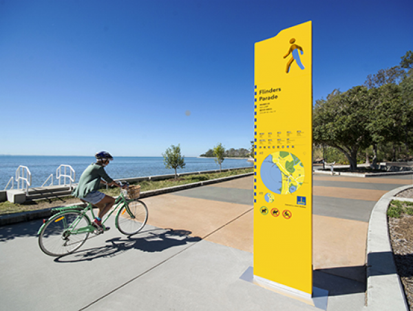
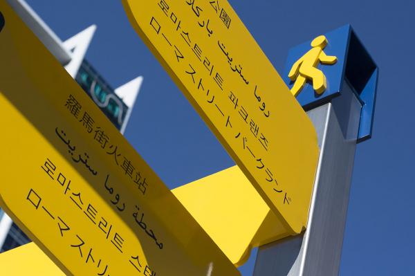
The newly constructed Brisbane City Council hub signs are the towering, vibrant parent signs to the current multilingual finger sign family. Dotted throughout Brisbane City and surrounds, these signs stand as major information nodes in Brisbane’s pedestrian wayfinding system.
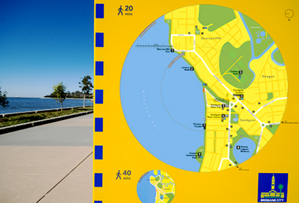
Located on footpaths throughout the City of Brisbane, the hub signs offer a pedestrian focused walking map, with key destinations noted in Korean, Japanese, Traditional Chinese and Arabic.
Providing a high contrast to their surrounding urban environment, these distinct yellow signs attempt to draw attention whilst still integrating into their surroundings and causing minimal impediment on pedestrian traffic flow.
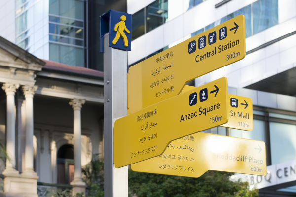
The hub signs reference the vibrant yellow colour palette and angular profile of the directional finger signs, allowing for a recognisable trail of visually connected pedestrian information throughout the city.
The now completed signage network intends to encourage pedestrian movement, displaying a circular map which highlights walking times to surrounding destinations.
Project Commissioner
Project Creator
Team
Mark Ross - Design Director
Peter Rudledge - Designer
Rainy Shen - Designer
Dan Pike - Designer
Charles Willmore - Designer
Laura Beattie - Designer
Steve McFeat - Designer
Project Brief
The hub signs needed to provide information and orientation for users, communicating the following information and services:
• Designed in five languages, Korean, Traditional Chinese, Japanese, Arabic and English as the dominant language
• Place name. e.g. Chinatown Mall
• Directional information to nearby services
• Visitor orientation through mapping of immediate, local and broader areas.
• Regulatory information to advise visitor behaviour, video monitoring, etc
• Emergency contact information
• Promotion of upcoming events in the precinct
• Linkage to further digital information such as maps, Council’s website, timetables and interpretation, through media such as QR codes and NFC.
• Step-Hear Navigation and Information system visually impaired users.
• BCC branding including tagline, logo and cleat integrated within the sign.
Project Innovation/Need
As part of the design process, consideration was given to the evolution of the ‘walking man’ identifier. The cut-through walking man comes alive as it elegantly and dynamically frames it’s context.
This element was developed through an approach of gestalt thinking - that is, the walking man is ‘of the sign’ rather than applied.
Historically graphic designers have applied Gestalt Principles extensively, crafting designs with well-placed elements that catch the eye as larger, whole images so viewers instantly make positive connections with the organizations represented.
Design Challenge
Simplicity predicated the development of information design.
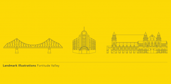
The destination hierarchy was defined by communicating transport, urban centres and precincts, retail centres, malls and significant places of tourism or geographic interest. Landmarks were illustrated to assist users to form cognitive boundaries and touchpoints.
The legend carried information in five languages, Korean, Mandarin, Japanese, Arabic and as with the directional finger signs, English was the dominant language.
All maps were designed heads up, and following on from the earlier colours selected from the City’s brand identity. For both the context and local area map, geographic boundaries were determined by walking distance.
The physical presence of the signs achieved a number of solutions. Firstly, the key to consistency was to ensure the hub signs conveyed a visual relationship with the current multilingual finger signs to appear as one suite of sign types.
Sustainability
The signs were designed to be sited in busy footpaths and walkways with minimal impediment on pedestrian traffic flow. It was imperative that the sign forms be of a size and visual impact that drew attention while still integrating into a range of different urban environments and include illumination for night use.
It was critical that we follow design principles that contribute to a universally accessible and inclusive Brisbane, particularly in the planning and design of signs that are safe and provide maximum benefit and value.
Wayfinding
This award celebrates creative and innovative design in the ways people orient themselves in physical space, and navigate from place to place. Consideration given to signage and other graphic communication, clues in the building's spatial grammar, logical space planning, audible communication, tactile elements and provision for special-needs users.
More Details